Page MenuHomePhabricator

Reading focus mode
Closed, ResolvedPublic

Description

User story

When looking up an article on Wikipedia, I want to focus on reading its contents and not be confronted with edit asks, so that I can process information more efficiently and have a distraction free reading experience.

Concept
0506
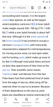
Custom experience 05.png (1×720 px, 93 KB)
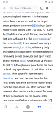
Custom experience 06.png (1×720 px, 125 KB)

👉 Please check out the original designs on Figma with the latest updates. The screenshots below might have been updated in the meantime.

05) Enabling the Reading focus modesetting...

06) ...does two things to guarantee a distraction free reading experience:

  1. It hides the bottom bar on scroll
    • When users scroll back up, the app and bottom bar is revealed.
    • Note: The app bar in the production version of the app already features that behavior. We’re now applying it in the bottom bar.
  2. It hides all edit call to actions, this includes the following UI elements:
    • ADD IMAGE CAPTION
    • ADD IMAGE TAGS
    • All EDIT pencil buttons/icons
  3. The future talk page bubble with active discussions will be hidden but the link to talk pages will be available in the overflow menu

To be discussed / added by design on Dec 7

  • How does logged in / out state affect these settings?

Event Timeline

There are a very large number of changes, so older changes are hidden. Show Older Changes
Charlotte renamed this task from Build reading focus mode (no nav, etc) to [EPIC] Reading focus mode (no nav, etc).Sep 28 2020, 3:45 PM
scblr renamed this task from [EPIC] Reading focus mode (no nav, etc) to Reading focus mode.Oct 2 2020, 2:41 PM
scblr updated the task description. (Show Details)

Thanks @Dbrant — looks good. This leaves me with lust for more and be even more experimental. I’d like to go a step further and explore hiding the status bar. This, distraction-free territory, is something that no other Android app has explored yet. Are you up to create an APK to test it out? I know there are cons to this, but also pros!

Disclaimer: given that we’re still planning usability tests in regards to the new search (T259883), we might need to be careful with releasing this in a rush. Since the toolbar is hidden after scroll, search is going to be harder to find. Again, pros and cons.

Thanks @Dbrant — looks good. This leaves me with lust for more and be even more experimental. I’d like to go a step further and explore hiding the status bar. This, distraction-free territory, is something that no other Android app has explored yet. Are you up to create an APK to test it out? I know there are cons to this, but also pros!

Unfortunately that's not how the status bar works; it cannot be hidden/shown based on scrolling.

Okay gotcha. Then let’s try hiding it on tap rather than scroll, as outlined below:

https://www.dropbox.com/s/djg0fwckjlfbysw/hide-interface.MP4?dl=0

I’m really interested in usability testing a completely distraction free concept against the one that we already have (T254771#6569005).

Okay gotcha. Then let’s try hiding it on tap rather than scroll, as outlined below:

https://www.dropbox.com/s/djg0fwckjlfbysw/hide-interface.MP4?dl=0

I’m really interested in usability testing a completely distraction free concept against the one that we already have (T254771#6569005).

What device was that video taken from?

This above is the Apple Books app on iOS.

The Kindle app on Android does the exact same thing though:

Focus modeTapping the screen (except article links)
Screenshot_20201105-133811.png (2×1 px, 552 KB)
Screenshot_20201105-133827.png (2×1 px, 277 KB)

Video:
https://www.dropbox.com/s/sjabm1t2dunbgjp/20201105_133618.mp4?dl=0

Imagine reading Wikipedia, an edge to edge experience on your screen, no distractions – just the content – and you.

scblr updated the task description. (Show Details)

Since the other appearance options like Theme and Font Size are tracked in the MobileWikiAppAppearanceSettings schema, we could add "reading_focus_mode" as an action and track changes in MobileWikiAppAppearanceSettings. That schema does not track whether user is anon or not, which makes sense since I don't think we save setting changes for Anon users - but will Reading Focus Mode be available to Anon users? If it is available (like on a per session basis) can we also add an anon filed to this schema to track when Anon users use this feature?

@schoenbaechler @JTannerWMF Here is a preliminary prototype build that contains Focus Mode:

https://github.com/wikimedia/apps-android-wikipedia/actions/runs/1555576120

Nice one @Dbrant! It feels good to get the “clutter” out of the way. Some comments:

  1. Can we show the entire bottom sheet when screen estate allows it? Currently, scrollling up is needed to see other options. Given that 'Customize toolbar' might be coming soon, I think it’d be better to surface it (when screen estates allows for it).
  1. Can we hide the app bar once theme settings are enabled? This leads us to more space at the top to view the theme options. Once users tap outside the bottom sheet, show the app and bottom toolbar.
  1. The Kindle app on Android hides the entire interface on scroll, including status + navigation bar, see this video. Can we explore a variant with this?
  1. Wow, I love how you implemented tapping to show and hide the app/bottom toolbar. I’m wondering how it would feel without revealing the app and bottom toolbar on scroll up. Can we explore this direction? Maybe together with #3?

Excited about this!

@Dbrant

In T254771#7559054, @schoenbaechler wrote:

@schoenbaechler @JTannerWMF Here is a preliminary prototype build that contains Focus Mode:

https://github.com/wikimedia/apps-android-wikipedia/actions/runs/1555576120

Nice one @Dbrant! It feels good to get the “clutter” out of the way. Some comments:

  1. Can we show the entire bottom sheet when screen estate allows it? Currently, scrollling up is needed to see other options. Given that 'Customize toolbar' might be coming soon, I think it’d be better to surface it (when screen estates allows for it).

Done per conversation with DB.

  1. Can we hide the app bar once theme settings are enabled? This leads us to more space at the top to view the theme options. Once users tap outside the bottom sheet, show the app and bottom toolbar.

Per discussion with DB, we’ll keep the current behavior.

  1. The Kindle app on Android hides the entire interface on scroll, including status + navigation bar, see this video. Can we explore a variant with this?

RS will create [SPIKE] for this → Reading focus mode. Per DB it should be on the backlog as it’s “extremely tricky”.

  1. Wow, I love how you implemented tapping to show and hide the app/bottom toolbar. I’m wondering how it would feel without revealing the app and bottom toolbar on scroll up. Can we explore this direction? Maybe together with #3?

DB will investigate on implementing this.

Adding a note here to clarify - we do allow Anons to save settings so the plan is to add an anon column to the MobileWikiAppAppearanceSettings schema so we can compare user activity w/r/t RFM. Once feature is ready we can coordinate on any additional instrumentation that may need to be added.

The Kindle app on Android hides the entire interface on scroll, including status + navigation bar, see this video. Can we explore a variant with this?

I'd prefer we not do this, or at the very least we discuss it before deviating this far from what was discussed originally.

I added this task to our planning agenda.

Since the other appearance options like Theme and Font Size are tracked in the MobileWikiAppAppearanceSettings schema, we could add "reading_focus_mode" as an action and track changes in MobileWikiAppAppearanceSettings. That schema does not track whether user is anon or not, which makes sense since I don't think we save setting changes for Anon users - but will Reading Focus Mode be available to Anon users? If it is available (like on a per session basis) can we also add an anon filed to this schema to track when Anon users use this feature?

Yes we should make Reading mode available for anon users

Since the other appearance options like Theme and Font Size are tracked in the MobileWikiAppAppearanceSettings schema, we could add "reading_focus_mode" as an action and track changes in MobileWikiAppAppearanceSettings. That schema does not track whether user is anon or not, which makes sense since I don't think we save setting changes for Anon users - but will Reading Focus Mode be available to Anon users? If it is available (like on a per session basis) can we also add an anon filed to this schema to track when Anon users use this feature?

Just to clarify:
"Reading Focus Mode" is just another minor convenience that we're adding to our list of settings, which includes things like color theme, image dimming, auto-collapsing tables, showing link previews, etc. None of these settings are connected with the user being logged in, or anything related to the current session -- these are just local preferences for the user to customize the behavior of the app.

We can certainly add an anon field to the AppearanceSettings schema, and should probably generalize even further to create a convention of having an anon field in all new schemas (similar to client_dt and app_install_id).

Thanks. I added an anon column to MobileWikiAppAppearanceSettings, note new schema revision is 22448194, which needs to be updated in code when anon data point is added to instrumentation. (Old revision is 20566858). Agree we should add an anon dimension by default to all Android schemas going forward.

Change 752693 had a related patch set uploaded (by Dbrant; author: Dbrant):

[mediawiki/services/mobileapps@master] Allow isEditable to be an initial setup parameter.

https://gerrit.wikimedia.org/r/752693

Wasn’t able to test this since the Alpha crashes on start. @Dbrant is currently looking into it (thanks!).

@Dbrant mostly looks good to me, I noticed some glitches with the app bar when enabling/disabling reading focus mode, could you look into it? Here’s a video of the glitches 👇

https://www.dropbox.com/s/vx10ygd1mm2dvno/screen-20220112-185901.mp4?dl=0

Trying to describe this in words:

When the app bar is hidden and the user enables reading focus mode → the app bar is half visible

Ideal behavior: the app bar should remain hidden

When the app bar is visible and the user enables reading focus mode → the app bar stays visible

Ideal behavior: the app bar should disappear

When the app bar is visible and the user enables and disables reading focus mode → the app bar is half visible

Ideal behavior: the app bar should be visible again

FYI @Pginer-WMF — following up on our discussions re: different designs to indicate to users that reading focus mode is enabled. Here are the variants we’ve been exploring 👇

Robin
02.png (1×720 px, 127 KB)
Custom experience 14.png (1×720 px, 132 KB)
Custom experience 17.png (1×720 px, 127 KB)
Custom experience 28.png (1×720 px, 127 KB)
Custom experience 18.png (1×720 px, 126 KB)
Custom experience 23.png (1×720 px, 127 KB)
Custom experience 29.png (1×720 px, 127 KB)
Custom experience 25.png (1×720 px, 131 KB)
Custom experience 24.png (1×720 px, 132 KB)
Custom experience 19.png (1×720 px, 130 KB)
Custom experience 26.png (1×720 px, 132 KB)
Custom experience 16.png (1×720 px, 132 KB)
Custom experience 27.png (1×720 px, 127 KB)
Pau
01.png (877×1 px, 851 KB)
Custom experience 20.png (1×720 px, 132 KB)
Custom experience 21.png (1×720 px, 134 KB)
Custom experience 22.png (1×720 px, 134 KB)

👉Link to Figma

After discussing this with @JTannerWMF, the plan is to user test it without a “reading focus mode on” indication first in T298978. Here’s why:

  • Reading focus mode is not the default, so it needs to be deliberately turned on via theme settings
  • If users enable it deliberately, our assumption is that they should know where to find it again once needed
  • We will test if people know how to disable it again after enabling (and distracting them with another task between the enabling/disabling).
  • We will monitor data and see if most people keep it on after a certain amount of time (e.g. 1 month, 3 months, 6 months) and forget about editing
  • If we observe issues in either the usability tests or data, we will think about introducing one of the options Pau and I have explored or some kind of reminder tooltip that reading focus mode is on.

Thanks all!

In T254771#7619124, @schoenbaechler wrote:
  • We will test if people know how to disable it again after enabling (and distracting them with another task between the enabling/disabling).

Evaluating the potential issue first makes sense. I guess the specifics for testing will be defined later, but one particular scenario that I think would be relevant to test would be this one: ask participants to correct a typo that's visible on a page after they have enabled the reading mode on a previous task before.

That would help to check if participants are able to connect the dots: looking for the edit pencil -> it is not there because I'm on reading mode -> find where to disable reading mode. This is a bit broader than just asking to disable the reading mode, making it about access to the features not available because of this mode.

Thanks for taking the time to explore this @schoenbaechler and give additional feedback @Pginer-WMF . I'm going to capture this on the testing task so we can remember to take this approach when testing.

In T254771#7617426, @schoenbaechler wrote:

When the app bar is hidden and the user enables reading focus mode → the app bar is half visible
When the app bar is visible and the user enables and disables reading focus mode → the app bar is half visible

The "half-visible" issues are indeed bugs, and will be fixed. However:

When the app bar is visible and the user enables reading focus mode → the app bar stays visible

This is expected. Focus mode has no effect on the app bar. It behaves as it always has: it responds to scrolling of the WebView, and slides up and down as you scroll the article. Merely enabling focus mode can't have any effect on the app bar, because no scrolling has taken place. Also, the caption under the "Reading focus mode" switch talks about hiding editing features and the bottom toolbar, but makes no mention of hiding the app bar.

Change 752693 merged by jenkins-bot:

[mediawiki/services/mobileapps@master] Allow isEditable to be an initial setup parameter.

https://gerrit.wikimedia.org/r/752693

thanks for the work and explanations @Dbrant — looks good to me now

Tested on 2.7.50392-beta-2022-01-24

I found an issue with smooth scrolling. On the first article tapped (any article from the explore feed), smooth scrolling works fine. Tapping and selecting another article from within the first article causes smooth scrolling to stop. Please see video:

I had to upload to google drive - https://drive.google.com/file/d/1729gC8984KO_dpryBSPtMsibtJj77LII/view?usp=sharing

@ABorbaWMF I can't access the video. (Note: you can now drop videos directly into Phab)

@Dbrant - Apologies, I tried adding this video in 2 different formats and they were rejected by phab. I sent the video via email. I will try to find a different format that will work.

@ABorbaWMF I'm not quite sure that the issue you spotted is related to this new feature (reading focus mode). Does the same behavior happen if you turn off Reading focus mode?
And what device and Android version was that?

@Dbrant - I tried a few things. If I do a fresh install and never turn on reading focus mode, then I am not seeing the issue. If I turn on reading focus mode, then I do see it. If I turn it on and then off again, I still see it.

Testing on OnePlus 8 with Android 11

@Dbrant - I am now seeing different behavior. Whether using reading focus mode or not, I no longer see the problem with smooth scrolling. My guess is that the issue may be related to a fresh install and login when things like the saved articles are being downloaded. I'll look into it more, but for now I will pass this ticket to PM signoff.