Modal  Edit
Edit
Modals give users information and choices related to a task they’re trying to accomplish. They can contain critical information, require decisions, or involve multiple tasks.
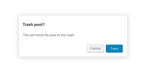
Table of contents Table of contents
Design guidelines Design guidelines
Usage Usage
A modal is a type of floating window that appears in front of content to provide critical information or ask for a decision. Modals disable all other functionality when they appear. A modal remains on screen until the user confirms it, dismisses it, or takes the required action.
While modals can be an effective way to disclose additional controls or information, they can also be a source of interruption for the user. For this reason, always question whether a modal is necessary, and work to avoid the situations in which they are required.
Principles Principles
- Focused. Modals pull user attention away from the rest of the screen to focus their attention, ensuring that the modal’s content is addressed.
- Direct. Modal text should communicate important information and be dedicated to helping the user appropriately complete a task.
- Helpful. Modals should appear in response to a user task or an action to offer relevant and contextual information.
When to use When to use
Modals are used for:
- Errors that block normal operation.
- Critical information that requires a specific user task, decision, or acknowledgement.
- Contextual information that appears in response to a user task or action.
Anatomy Anatomy

- Container
- Title
- Supporting text
- Buttons
- Scrim
- Close button (optional)
Modal box and scrim Modal box and scrim
A modal is a type of window. Access to the rest of the UI is disabled until the modal is addressed. All modals are interruptive by design – their purpose is to have the user focus on content, so the modal surface appears in front of all other surfaces.
To clarify that the rest of the screen is inaccessible and to focus attention on the modal, surfaces behind the modal are scrimmed — they get a temporary overlay to obscure their content and make it less prominent.
Title Title
A modal’s purpose is communicated through its title and button text.
All modals should have a title for accessibility reasons (the contentLabel prop can be used to set titles that aren’t visible).
Titles should:
- Contain a brief, clear statement or question
- Avoid apologies (“Sorry for the interruption”), alarm (“Warning!”), or ambiguity (“Are you sure?”).
Do
This modal title poses a specific question, concisely explains the purpose the request, and provides clear actions.

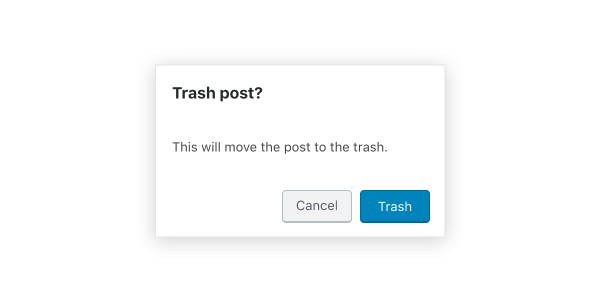
Don’t
This modal creates ambiguity, and therefore unease — it leaves the user unsure about how to respond, or causes them to second-guess their answer.
Buttons Buttons
Side-by-side buttons (recommended) Side-by-side buttons (recommended)
Side-by-side buttons display two text buttons next to one another.
Stacked or full-width buttons Stacked or full-width buttons
Use stacked buttons when you need to accommodate longer button text. Always place confirming actions above dismissive actions.

Behavior Behavior
Modals appear without warning, requiring users to stop their current task. They should be used sparingly — not every choice or setting warrants this kind of abrupt interruption.
Position Position
Modals retain focus until dismissed or the user completes an action, like choosing a setting. They shouldn’t be obscured by other elements or appear partially on screen.
Scrolling Scrolling
Most modal content should avoid scrolling. Scrolling is permissible if the modal content exceeds the height of the modal (e.g. a list component with many rows). When a modal scrolls, the modal title is pinned at the top and the buttons are pinned at the bottom. This ensures that content remains visible alongside the title and buttons, even while scrolling.
Modals don’t scroll with elements outside of the modal, like the background.
When viewing a scrollable list of options, the modal title and buttons remain fixed.
Dismissing modals Dismissing modals
Modals are dismissible in three ways:
- Tapping outside of the modal
- Tapping the “Cancel” button
- Tapping the “Close” icon button, or pressing the
esckey
If the user’s ability to dismiss a modal is disabled, they must choose a modal action to proceed.
Development guidelines Development guidelines
The modal is used to create an accessible modal over an application.
Note: The API for this modal has been mimicked to resemble react-modal.
Usage Usage
The following example shows you how to properly implement a modal. For the modal to properly work it’s important you implement the close logic for the modal properly.
import { Button, Modal } from '@wordpress/components';
import { useState } from '@wordpress/element';

const MyModal = () => {
    const [ isOpen, setOpen ] = useState( false );
    const openModal = () => setOpen( true );
    const closeModal = () => setOpen( false );

    return (
        <>
            <Button variant="secondary" onClick={ openModal }>
                Open Modal
            </Button>
            { isOpen && (
                <Modal title="This is my modal" onRequestClose={ closeModal }>
                    <Button variant="secondary" onClick={ closeModal }>
                        My custom close button
                    </Button>
                </Modal>
            ) }
        </>
    );
};
Props Props
The set of props accepted by the component will be specified below.
Props not included in this set will be applied to the input elements.
title title
This property is used as the modal header’s title.
Titles are required for accessibility reasons, see aria.labelledby and contentLabel for other ways to provide a title.
- Type:
String - Required: No
onRequestClose onRequestClose
This function is called to indicate that the modal should be closed.
- Type:
function - Required: Yes
contentLabel contentLabel
If this property is added, it will be added to the modal content div as aria-label.
Titles are required for accessibility reasons, see aria.labelledby and title for other ways to provide a title.
- Type:
String - Required: No
aria.labelledby aria.labelledby
If this property is added, it will be added to the modal content div as aria-labelledby.
Use this when you are rendering the title yourself within the modal’s content area instead of using the title prop. This ensures the title is usable by assistive technology.
Titles are required for accessibility reasons, see contentLabel and title for other ways to provide a title.
- Type:
String - Required: No
- Default: if the
titleprop is provided, this will default to the id of the element that renderstitle
aria.describedby aria.describedby
If this property is added, it will be added to the modal content div as aria-describedby.
- Type:
String - Required: No
focusOnMount focusOnMount
If this property is true, it will focus the first tabbable element rendered in the modal.
- Type:
boolean - Required: No
- Default: true
shouldCloseOnEsc shouldCloseOnEsc
If this property is added, it will determine whether the modal requests to close when the escape key is pressed.
- Type:
boolean - Required: No
- Default: true
shouldCloseOnClickOutside shouldCloseOnClickOutside
If this property is added, it will determine whether the modal requests to close when a mouse click occurs outside of the modal content.
- Type:
boolean - Required: No
- Default: true
isDismissible isDismissible
If this property is set to false, the modal will not display a close icon and cannot be dismissed.
- Type:
boolean - Required: No
- Default: true
className className
If this property is added, it will an additional class name to the modal content div.
- Type:
String - Required: No
role role
If this property is added, it will override the default role of the modal.
- Type:
String - Required: No
- Default:
dialog
overlayClassName overlayClassName
If this property is added, it will an additional class name to the modal overlay div.
- Type:
String - Required: No
isFullScreen isFullScreen
This property when set to true will render a full screen modal.
- Type:
boolean - Required: No
- Default:
false
__experimentalHideHeader __experimentalHideHeader
When set to true, the Modal’s header (including the icon, title and close button) will not be rendered.
Warning: This property is still experimental. “Experimental” means this is an early implementation subject to drastic and breaking changes.
- Type:
boolean - Required: No
- Default:
false
Related components Related components
- To notify a user with a message of medium importance, use
Notice.