RangeControl  Edit
Edit
RangeControls are used to make selections from a range of incremental values.

A RangeControl for volume
Table of contents Table of contents
Design guidelines Design guidelines
Anatomy Anatomy

A RangeControl can contain the following elements:
- Track: The track shows the range available for user selection. For left-to-right (LTR) languages, the smallest value appears on the far left, and the largest value on the far right. For right-to-left (RTL) languages this orientation is reversed, with the smallest value on the far right and the largest value on the far left.
- Thumb: The thumb slides along the track, displaying the selected value through its position.
- Value entry field: The value entry field displays the currently selected, specific numerical value.
- Icon (optional): An icon can be displayed before or after the slider.
- Tick mark (optional): Tick marks represent predetermined values to which the user can move the slider.
Types Types
Continuous sliders Continuous sliders
Continuous sliders allow users to select a value along a subjective range. They do not display the selected numeric value. Use them when displaying/editing the numeric value is not important, like volume.
Discrete sliders Discrete sliders
Discrete sliders can be adjusted to a specific value by referencing its value entry field. Use them when it’s important to display/edit the numeric value, like text size.
Possible selections may be organized through the use of tick marks, which a thumb will snap to (or to which an input will round up or down).
Behavior Behavior
- Click and drag: The slider is controlled by clicking the thumb and dragging it.
- Click jump: The slider is controlled by clicking the track.
- Click and arrow: The slider is controlled by clicking the thumb, then using arrow keys to move it.
- Tab and arrow: The slider is controlled by using the tab key to select the thumb of the desired slider, then using arrow keys to move it.
- Value entry field: Discrete sliders have value entry fields. After a text entry is made, the slider position automatically updates to reflect the new value.
- Tick marks (Optional) Discrete sliders can use evenly spaced tick marks along the slider track, and the thumb will snap to them. Each tick mark should change the setting in increments that are discernible to the user.
Usage Usage
RangeControls reflect a range of values along a track, from which users may select a single value. They are ideal for adjusting settings such as volume, opacity, or text size.
RangeControls can have icons on both ends of the track that reflect a range of values.
Immediate effects Immediate effects
Changes made with RangeControls are immediate, allowing a user to make adjustments until finding their preference. They shouldn’t be paired with settings that have delays in providing feedback.
Don’t
Don’t use RangeControls if the effect isn’t immediate.
Current state Current state
RangeControls reflect the current state of the settings they control.
Values Values

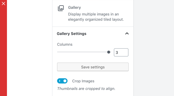
A RangeControl with an editable numeric value
Editable numeric values: Editable numeric values allow users to set the exact value of a RangeControl. After setting a value, the thumb position is immediately updated to match the new value.

Don’t
RangeControls should only be used for choosing selections from a range of values (e.g., don’t use a RangeControl if there are only 2 values).

Don’t
RangeControls should provide the full range of choices available for the user to select from (e.g., don’t disable only part of a RangeControl).
Development guidelines Development guidelines
Usage Usage
Render a RangeControl to make a selection from a range of incremental values.
import { RangeControl } from '@wordpress/components';
import { useState } from '@wordpress/element';

const MyRangeControl = () => {
    const [ columns, setColumns ] = useState( 2 );

    return(
        <RangeControl
            label="Columns"
            value={ columns }
            onChange={ ( value ) => setColumns( value ) }
            min={ 2 }
            max={ 10 }
        />
    );
};
Props Props
The set of props accepted by the component will be specified below.
Props not included in this set will be applied to the input elements.
label label
If this property is added, a label will be generated using label property as the content.
- Type:
String - Required: No
- Platform: Web | Mobile
help help
If this property is added, a help text will be generated using help property as the content.
- Type:
String|WPElement - Required: No
- Platform: Web
beforeIcon beforeIcon
If this property is added, a DashIcon component will be rendered before the slider with the icon equal to beforeIcon
- Type:
String - Required: No
- Platform: Web
afterIcon afterIcon
If this property is added, a DashIcon component will be rendered after the slider with the icon equal to afterIcon
- Type:
String - Required: No
- Platform: Web
allowReset allowReset
If this property is true, a button to reset the the slider is rendered.
- Type:
Boolean - Required: No
- Platform: Web | Mobile
disabled disabled
Disables the input, preventing new values from being applied.
- Type:
Boolean - Required: No
- Platform: Web
initialPosition initialPosition
If no value exists this prop contains the slider starting position.
- Type:
Number - Required: No
- Platform: Web | Mobile
isShiftStepEnabled isShiftStepEnabled
Passed as a prop to the NumberControl component and is only applicable if withInputField is true. If true, while the number input has focus, pressing UP or DOWN along with the SHIFT key will change the value by the shiftStep value.
- Type:
Boolean - Required: No
marks marks
Renders a visual representation of step ticks. Custom mark indicators can be provided by an Array.
Example:
const marks = [
    {
        value: 0,
        label: '0',
    },
    {
        value: 1,
        label: '1',
    },
    {
        value: 8,
        label: '8',
    },
    {
        value: 10,
        label: '10',
    },
];

const MyRangeControl() {
    return (<RangeControl marks={ marks } min={ 0 } max={ 10 } step={ 1 } />)
}
- Type:
Array|Boolean - Required: No
- Platform: Web
onChange onChange
A function that receives the new value. The value will be less than max and more than min unless a reset (enabled by allowReset) has occurred. In which case the value will be either that of resetFallbackValue if it has been specified or otherwise undefined.
- Type:
function - Required: Yes
- Platform: Web | Mobile
min min
The minimum value allowed.
- Type:
Number - Required: No
- Default: 0
- Platform: Web | Mobile
max max
The maximum value allowed.
- Type:
Number - Required: No
- Default: 100
- Platform: Web | Mobile
railColor railColor
Customizes the (background) color of the rail element.
- Type:
String - Required: No
- Platform: Web
renderTooltipContent renderTooltipContent
A way to customize the rendered UI of the value. Example:
const customTooltipContent = value => `${value}%`

const MyRangeControl() {
    return (<RangeControl renderTooltipContent={ customTooltipContent } />)
}
- Type:
Function - Required: No
- Platform: Web
resetFallbackValue resetFallbackValue
The value to revert to if the Reset button is clicked (enabled by allowReset)
- Type:
Number - Required: No
- Platform: Web
showTooltip showTooltip
Forcing the Tooltip UI to show or hide. This is overriden to false when step is set to the special string value any.
- Type:
Boolean - Required: No
- Platform: Web
step step
The minimum amount by which value changes. It is also a factor in validation as value must be a multiple of step (offset by min) to be valid. Accepts the special string value any that voids the validation constraint and overrides both withInputField and showTooltip props to false.
- Type:
Number | "any" - Required: No
- Platform: Web
shiftStep shiftStep
Passed as a prop to the NumberControl component and is only applicable if withInputField and isShiftStepEnabled are both true and while the number input has focus. Acts as a multiplier of step.
- Type:
Number - Required: No
trackColor trackColor
Customizes the (background) color of the track element.
- Type:
String - Required: No
- Platform: Web
value value
The current value of the range slider.
- Type:
Number - Required: Yes
- Platform: Web | Mobile
withInputField withInputField
Determines if the input number field will render next to the RangeControl. This is overriden to false when step is set to the special string value any.
- Type:
Boolean - Required: No
- Platform: Web
icon icon
An icon to be shown above the slider next to it’s container title.
- Type:
String - Required: No
- Platform: Mobile
separatorType separatorType
Define if separator line under/above control row should be disabled or full width. By default it is placed below excluding underline the control icon.
- Type:
String Enum - Values:
none|fullWidth|topFullWidth - Required: No
- Platform: Mobile
type type
Define if the value selection should present a stepper control or a slider control in the bottom sheet on mobile. To use the stepper set the type value as stepper. Defaults to slider if no option is provided.
- Type:
String - Required: No
- Platform: Mobile
Related components Related components
- To collect a numerical input in a text field, use the
TextControlcomponent.