Notice  Edit
Edit
Use Notices to communicate prominent messages to the user.
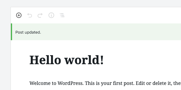
Table of contents Table of contents
Design guidelines Design guidelines
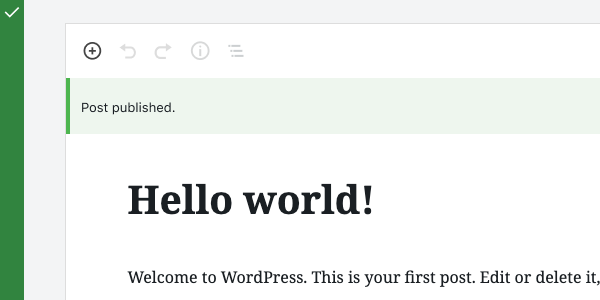
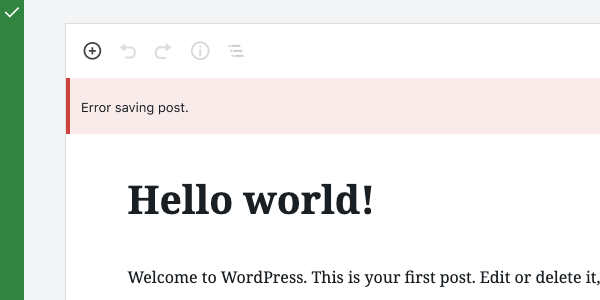
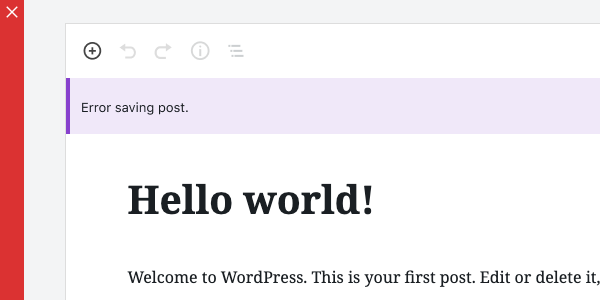
A Notice displays a succinct message. It can also offer the user options, like viewing a published post or updating a setting, and requires a user action to be dismissed.
Use Notices to communicate things that are important but don’t necessarily require action — a user can keep using the product even if they don’t choose to act on a Notice. They are less interruptive than a Modal.
Anatomy Anatomy

- Container (status indicated with color)
- Icon (optional)
- Message
- Dismiss icon (optional)
Usage Usage
Notices display at the top of the screen, below any toolbars anchored to the top of the page. They’re persistent and non-modal. Since they don’t overlay the content, users can ignore or dismiss them, and choose when to interact with them.

Notices are color-coded to indicate the type of message being communicated:
- Default notices have no background.
- Informational notices are blue.
- Success notices are green.
- Warning notices are yellow**.**
- Error notices are red.
If an icon is included in the Notice, it should be color-coded to match the Notice state.

Do
Do use a Notice when you want to communicate a message of medium importance.

Don’t
Don’t use a Notice for a message that requires immediate attention and action from the user. Use a Modal for this instead.
Do
Do display Notices at the top of the screen, below any toolbars.
Don’t
Don’t show Notices on top of toolbars.
Do
Do use color to indicate the type of message being communicated.
Don’t
Don’t apply any colors other than those for Warnings, Success, or Errors.
Development guidelines Development guidelines
Usage Usage
To display a plain notice, pass Notice a string:
const MyNotice = () => (
    <Notice status="error">An unknown error occurred.</Notice>
);
For more complex markup, you can pass any JSX element:
const MyNotice = () => (
    <Notice status="error">
        <p>
            An error occurred: <code>{ errorDetails }</code>.
        </p>
    </Notice>
);
Props Props
The following props are used to control the behavior of the component.
children: (string) The displayed message of a notice. Also used as the spoken message for assistive technology, unlessspokenMessageis provided as an alternative message.spokenMessage: (string) Used to provide a custom spoken message in place of thechildrendefault.status: (string) can bewarning(yellow),success(green),error(red), orinfo. Defaults toinfo.onRemove: function called when dismissing the noticepoliteness: (string) A politeness level for the notice’s spoken message. Should be provided as one of the valid options for anaria-liveattribute value. If not provided, a sensible default is used based on the notice status. Note that this value should be considered a suggestion; assistive technologies may override it based on internal heuristics.- A value of
'assertive'is to be used for important, and usually time-sensitive, information. It will interrupt anything else the screen reader is announcing in that moment. - A value of
'polite'is to be used for advisory information. It should not interrupt what the screen reader is announcing in that moment (the “speech queue”) or interrupt the current task.
- A value of
isDismissible: (boolean) defaults to true, whether the notice should be dismissible or notonDismiss: callback function which is executed when the notice is dismissed. It is distinct from onRemove, which looks like a callback but is actually the function to call to remove the notice from the UI.actions: (array) an array of action objects. Each member object should contain alabeland either aurllink string oronClickcallback function. AclassNameproperty can be used to add custom classes to the button styles. The default appearance of the button is inferred based on whetherurloronClickare provided, rendering the button as a link if appropriate. AnoDefaultClassesproperty value oftruewill remove all default styling. You can denote a primary button action for a notice by passing thevariantproperty with a value ofprimary.
Related components Related components
- To create a more prominent message that requires action, use a Modal.