RadioGroup  Edit
Edit
This feature is still experimental. “Experimental” means this is an early implementation subject to drastic and breaking changes.
Use a RadioGroup component when you want users to select one option from a small set of options.
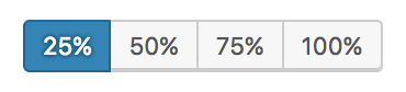
Table of contents Table of contents
Design guidelines Design guidelines
Usage Usage
Selected action Selected action
Only one option in a radio group can be selected and active at a time. Selecting one option deselects any other.
Best practices Best practices
Radio groups should:
- Be clearly and accurately labeled.
- Clearly communicate that clicking or tapping will trigger an action.
- Use established colors appropriately. For example, only use red buttons for actions that are difficult or impossible to undo.
- Have consistent locations in the interface.
- Have a default option already selected.
States States
Active and available radio groups Active and available radio groups
A radio group’s state makes it clear which option is active. Hover and focus states express the available selection options for buttons in a button group.
Disabled radio groups Disabled radio groups
Radio groups that cannot be selected can either be given a disabled state, or be hidden.
Development guidelines Development guidelines
Usage Usage
Controlled Controlled
import {
    __experimentalRadio as Radio,
    __experimentalRadioGroup as RadioGroup,
} from '@wordpress/components';
import { useState } from '@wordpress/element';

const MyControlledRadioRadioGroup = () => {
    const [ checked, setChecked ] = useState( '25' );
    return (
        <RadioGroup label="Width" onChange={ setChecked } checked={ checked }>
            <Radio value="25">25%</Radio>
            <Radio value="50">50%</Radio>
            <Radio value="75">75%</Radio>
            <Radio value="100">100%</Radio>
        </RadioGroup>
    );
};
Uncontrolled Uncontrolled
When using the RadioGroup component as an uncontrolled component, the default value can be set with the defaultChecked prop.
import {
    __experimentalRadio as Radio,
    __experimentalRadioGroup as RadioGroup,
} from '@wordpress/components';
import { useState } from '@wordpress/element';

const MyUncontrolledRadioRadioGroup = () => {
    return (
        <RadioGroup label="Width" defaultChecked="25">
            <Radio value="25">25%</Radio>
            <Radio value="50">50%</Radio>
            <Radio value="75">75%</Radio>
            <Radio value="100">100%</Radio>
        </RadioGroup>
    );
};
Related components Related components
- For simple buttons that are related, use a
ButtonGroupcomponent. - For traditional radio options, use a
RadioControlcomponent.