DropdownMenu  Edit
Edit
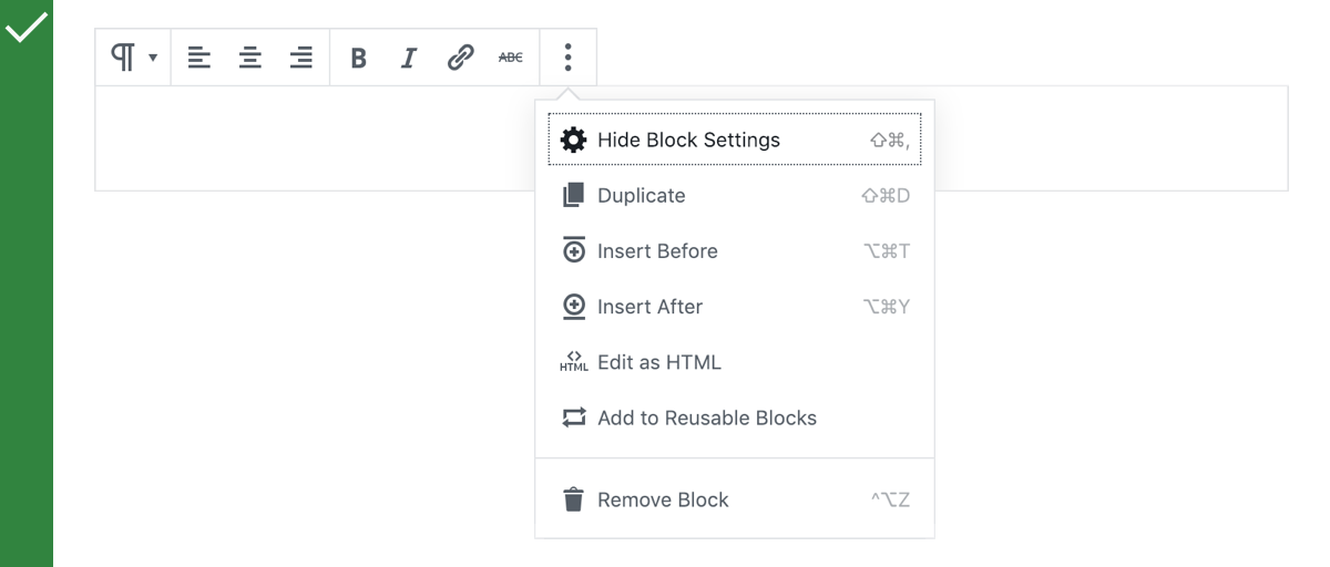
The DropdownMenu displays a list of actions (each contained in a MenuItem, MenuItemsChoice, or MenuGroup) in a compact way. It appears in a Popover after the user has interacted with an element (a button or icon) or when they perform a specific action.

Table of contents Table of contents
Anatomy Anatomy

- Popover: a container component in which the DropdownMenu is wrapped.
- Parent button: the icon or button that is used to toggle the display of the Popover containing the DropdownMenu.
- MenuItem: the list items within the DropdownMenu.
Design guidelines Design guidelines
Usage Usage
When to use a DropdownMenu When to use a DropdownMenu
Use a DropdownMenu when you want users to:
- Choose an action or change a setting from a list, AND
- Only see the available choices contextually.
If you need to display all the available options at all times, consider using a Toolbar instead.
Do
Use a DropdownMenu to display a list of actions after the user interacts with an icon.

Don’t
Don’t use a DropdownMenu for frequently used actions. Use a Toolbar instead.
Behavior Behavior
Generally, the parent button should have a triangular icon to the right of the icon or text to indicate that interacting with it will show a DropdownMenu. In rare cases where the parent button directly indicates that there’ll be more content (through the use of an ellipsis or “More” label), this can be omitted.
The parent button should retain the same visual styling regardless of whether the DropdownMenu is displayed or not.
Placement Placement
The DropdownMenu should typically appear directly below, or below and to the left of, the parent button. If there isn’t enough space below to display the full DropdownMenu, it can be displayed instead above the parent button.
Development guidelines Development guidelines
DropdownMenu is a React component to render an expandable menu of buttons. It is similar in purpose to a <select> element, with the distinction that it does not maintain a value. Instead, each option behaves as an action button.
Usage Usage
Render a Dropdown Menu with a set of controls:
import { DropdownMenu } from '@wordpress/components';
import {
    more,
    arrowLeft,
    arrowRight,
    arrowUp,
    arrowDown,
} from '@wordpress/icons';

const MyDropdownMenu = () => (
    <DropdownMenu
        icon={ more }
        label="Select a direction"
        controls={ [
            {
                title: 'Up',
                icon: arrowUp,
                onClick: () => console.log( 'up' ),
            },
            {
                title: 'Right',
                icon: arrowRight,
                onClick: () => console.log( 'right' ),
            },
            {
                title: 'Down',
                icon: arrowDown,
                onClick: () => console.log( 'down' ),
            },
            {
                title: 'Left',
                icon: arrowLeft,
                onClick: () => console.log( 'left' ),
            },
        ] }
    />
);
Alternatively, specify a children function which returns elements valid for use in a DropdownMenu: MenuItem, MenuItemsChoice, or MenuGroup.
import { Fragment } from '@wordpress/element';
import { DropdownMenu, MenuGroup, MenuItem } from '@wordpress/components';
import { more, arrowUp, arrowDown, trash } from '@wordpress/icons';

const MyDropdownMenu = () => (
    <DropdownMenu icon={ more } label="Select a direction">
        { ( { onClose } ) => (
            <Fragment>
                <MenuGroup>
                    <MenuItem icon={ arrowUp } onClick={ onClose }>
                        Move Up
                    </MenuItem>
                    <MenuItem icon={ arrowDown } onClick={ onClose }>
                        Move Down
                    </MenuItem>
                </MenuGroup>
                <MenuGroup>
                    <MenuItem icon={ trash } onClick={ onClose }>
                        Remove
                    </MenuItem>
                </MenuGroup>
            </Fragment>
        ) }
    </DropdownMenu>
);
Props Props
The component accepts the following props:
icon icon
The Dashicon icon slug to be shown in the collapsed menu button.
- Type:
String|null - Required: No
- Default:
"menu"
See also: https://developer.wordpress.org/resource/dashicons/
label label
A human-readable label to present as accessibility text on the focused collapsed menu button.
- Type:
String - Required: Yes
controls controls
An array of objects describing the options to be shown in the expanded menu.
Each object should include an icon Dashicon slug string, a human-readable title string, isDisabled boolean flag and an onClick function callback to invoke when the option is selected.
A valid DropdownMenu must specify one or the other of a controls or children prop.
- Type:
Array - Required: No
children children
A function render prop which should return an element or elements valid for use in a DropdownMenu: MenuItem, MenuItemsChoice, or MenuGroup. Its first argument is a props object including the same values as given to a Dropdown‘s renderContent (isOpen, onToggle, onClose).
A valid DropdownMenu must specify one or the other of a controls or children prop.
- Type:
Function - Required: No
See also: https://developer.wordpress.org/resource/dashicons/
className className
A class name to apply to the dropdown menu’s toggle element wrapper.
- Type:
String - Required: No
popoverProps popoverProps
Properties of popoverProps object will be passed as props to the nested Popover component.
Use this object to modify props available for the Popover component that are not already exposed in the DropdownMenu component, e.g.: the direction in which the popover should open relative to its parent node set with position prop.
- Type:
Object - Required: No
toggleProps toggleProps
Properties of toggleProps object will be passed as props to the nested Button component in the renderToggle implementation of the Dropdown component used internally.
Use this object to modify props available for the Button component that are not already exposed in the DropdownMenu component, e.g.: the tooltip text displayed on hover set with tooltip prop.
- Type:
Object - Required: No
menuProps menuProps
Properties of menuProps object will be passed as props to the nested NavigableMenu component in the renderContent implementation of the Dropdown component used internally.
Use this object to modify props available for the NavigableMenu component that are not already exposed in the DropdownMenu component, e.g.: the orientation of the menu set with orientation prop.
- Type:
Object - Required: No
disableOpenOnArrowDown disableOpenOnArrowDown
In some contexts, the arrow down key used to open the dropdown menu might need to be disabled—for example when that key is used to perform another action.
- Type:
Object - Required: No
- Default:
false