Toolbar  Edit
Edit
Toolbar can be used to group related options. To emphasize groups of related icon buttons, a toolbar should share a common container.
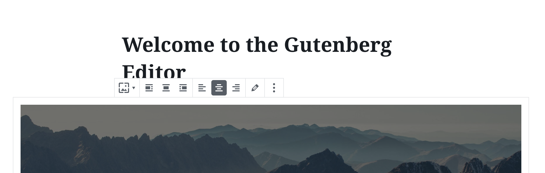
Table of contents Table of contents
Design guidelines Design guidelines
Usage Usage
Best practices Best practices
Toolbars should:
- Clearly communicate that clicking or tapping will trigger an action.
- Use established colors appropriately. For example, only use red for actions that are difficult or impossible to undo.
- When used with a block, have a consistent location above the block. Otherwise, have a consistent location in the interface.

States States
Active and available toolbars Active and available toolbars
A toolbar’s state makes it clear which icon button is active. Hover and focus states express the available selection options for icon buttons in a toolbar.

Disabled toolbars Disabled toolbars
Toolbars that cannot be selected can either be given a disabled state, or be hidden.
Development guidelines Development guidelines
Usage Usage
import { Toolbar, ToolbarButton } from '@wordpress/components';
import { formatBold, formatItalic, link } from '@wordpress/icons';

function MyToolbar() {
    return (
        <Toolbar label="Options">
            <ToolbarButton icon={ formatBold } label="Bold" />
            <ToolbarButton icon={ formatItalic } label="Italic" />
            <ToolbarButton icon={ link } label="Link" />
        </Toolbar>
    );
}
Props Props
Toolbar will pass all HTML props to the underlying element. Additionally, you can pass the custom props specified below.
label label
An accessible label for the toolbar.
- Type:
String - Required: Yes
Related components Related components
- Toolbar may contain ToolbarGroup, ToolbarButton and ToolbarItem as children.