Open source font pairings for your next theme

Mel Choyce discusses and highlights GPL-compatible fonts.

Pairing type can be hard, especially when you’re limited to using only free, open source fonts in your themes. What that means can be confusing, and there aren’t a ton of high quality sources for you to obtain compatible fonts.

I want to talk to you about font licensing, where to find high quality, expressive free fonts, and show off some examples for font combinations you can use in your own theme designs.

Let’s dive into some of the basics.

Font Licensing

Any assets included in your theme for distribution on WordPress.org must be GPL-compatible. This includes any fonts you plan on bundling with your theme.

Open source fonts are usually released under the SIL Open Font License, or OFL for short.

Finding the perfect typefaces for your theme can be challenging. Limiting yourself to the smaller bucket of available OFL fonts? Now that’s stressful. Open source fonts sometimes have a few downfalls to look out for:

  • The font might not include multiple weights and italics or obliques.
  • The kerning on the font might be spaced unevenly.
  • The fonts themselves might not be high quality.

However, constraint breeds creativity. We can still design professional, visually appealing themes using plenty of available license-compatible fonts.


Where to find free fonts

There are many places to find OFL fonts, ranging from directories, to curated collections, to individual type foundries. Here are a few sources I recommend.

Directories

Google Fonts

With almost a thousand available fonts, Google Fonts is one of the largest directories of open source fonts on the web.

Google Fonts’ filtering tools allow you to view fonts that contain a minimum number of available styles, which can often be a proxy for quality. I’ll usually search font fonts with at least four available styles (usually regular, italic, bold, and bold italic), though searching for six+ generally nets more versatile options. They’ve also recently introduced a toggle to limit results to variable fonts.

Google Fonts also gives you the option of downloading and bundling the font files in your theme, or linking to the files on their CDN.

Font Squirrel

Font Squirrel is another long-established directory of open source fonts. It provides more granular filtering options than Google Fonts. This is a great resource if you’re looking for a typeface with a very specific feel.

Font Squirrel also offers a web font generator service where you can upload your own font files, and convert them to all the different formats you’ll need to embed the fonts into your theme.

Collections

Beautiful Web Type

Beautiful Web Type showcases a curated collection of high-quality open source typefaces. Instead of a list of fonts, this website actually demos them in action, allowing you to get a good sense of how each typeface looks and feels in context.

Open Foundry

Open Foundry is similar, focused on showcasing the best and newest high quality open source fonts.

You can type in your own text directly into the font listings to preview how it will look, and adjust the font size, line-height, and letter spacing of the text. You can also dive deeper into each typeface and see a type specimen.

Type Foundries

Velvetyne

Velvetyne is a collection of type designers who create and distribute open source fonts. Their philosophy and ethos resonate strongly with WordPress’ own.

Looking for a striking, experimental, or overall fun typeface to use in your next project? Velvetyne’s got your back.

Collletttivo

Collletttivo is another collection of individual type designers who release open source fonts under the same foundry. Their fonts feel punchy, and eye-catching, and many push the envelope of modern typography.

League of Movable Type

The League of Movable Type is the oldest open source font foundry, opening its virtual doors in 2009. This group was my introduction to web type. They offer a diverse array of high-quality typefaces ranging across many different styles.


Pairings

If you’re looking for somewhere to start, here are seven hand-picked open source font pairings you can use in your next theme design. I’ve shown each in a potential context so you can get a feel for how the pairings could work in action.


Luiss Serif & Luiss Sans

Luiss Serif and Luiss Sans by Antonio Pace showcase the beauty of font families. Designed with similar characteristics and proportions, these sans and serif typefaces match beautifully.

While versatile, I think using this pairing in a theme meant for longform text will help it shine brightest.


Ribes & Subjectivity

This font combination will infuse your theme with funky, retro vibes.

Ribes by Luigi Gorlero takes inspiration from the ’50s funk and jazz aesthetic. I love how the horizontal slant of the counters make the typeface look like it’s squinting at you.

Subjectivity is a display geometric typeface by Alex Slobzheninov. Its funky qualities play well off of Ribes. Generally, display faces are not suited for longform text, and that’s also the case here.

Use this combo in your next landing, splash, or marketing page theme design.


Mazius & Montserrat

Mazius is a gorgeous calligraphic serif by Alberto Casagrande, featuring not one, but two italic styles (the second of which is shown in this demo).

Montserrat by Julieta Ulanovsky has been around for a while, but was redrawn and expanded in 2017 with new weights.

Mazius works great for large headings, while Montserrat is versatile enough to take up the slack for smaller headlines and all body content. This pairing works well for any theme needing a just touch of elegance.


Facultad & DM Sans

Facultad is a sans serif typeface designed by Andrés Torres for the Faculty of the Arts at the University of Cuenca. Its calligraphic construction, wide counters, and generous x-height make Facultad a great choice for any modern academic news or magazine theme.

With its even, round shapes, DM Sans by Colophon pairs well with Facultad because of its differences. Its geometric qualities draw more attention to Facultad’s interesting calligraphic details.

Together, the pairing feels warm and inviting, while also strikingly smart.


Le Murmure & Compagnon

Sometimes you need to let some personality shine through. This pairing is bold and unconventional, but with two typefaces from Velvetyne, it might work for your next personal portfolio theme.

Le Murmure by Jérémy Landes was designed for the French design agency Murmure. This condensed titling font reminds me of the interesting angles achieved when you squeeze a handful of pipe cleaners. Only, you know, cooler.

Compagnon is a family with five different styles, inspired by old typewriter specimens. It’s super funky and fun to play with. If you use it, you’ll want to make sure your theme supports editor styles; this is a font that needs to be live-previewed.


Big Shoulders Text & Space Mono

Big Shoulders Text is a condensed sans-serif typeface by Patric King, created for the City of Chicago’s Brand Standards and inspired by “Chicago’s multiple histories in railway transport, journalism, advertising, and public political action.”

Space Mono was designed by Colophon for Google Fonts. It was designed for headline and display type, but I think it can be safely used for body copy if your size is large enough and your text sparse enough. So: okay for things like restaurant menus, bad for longform.

Combined, these typefaces remind me of old offset printed menus and the newer hipster styles that harken back to them.


Ibarra Real Nova & Inter

Ibarra Real Nova is an elegant serif typeface, designed by José María Ribagorda and Octavio Pardo based on 18th century Spanish type.

Conversely, Inter by Rasmus Andersson is a highly readable modern font created specifically for screens.

In this pairing, Ibarra Real Nova sets the overall elegant and classical tone, with Inter as a supporting actor. Use in any theme with a flair for the dramatic.


I hope these provide some inspiration to all you themers out there. If you use any of these font pairings in your next theme, let me know! I’d love to check them out đź

Adding Block Patterns to Your Theme

Block patterns are unique, predefined combinations of blocks you can use and tweak to create stunningly designed sections of your website.

From global styles, to entirely block-based themes, the WordPress block editor is aiming high. Amongst the newest experimental features are block patterns. Block patterns are unique, predefined combinations of blocks you can use and tweak to create stunningly designed sections of your website.

The possibilities for block patterns are extremely exciting, especially for those of us providing tools to help people create their own websites. Patterns start to tackle the user question of, “How do I make my website look like this theme demo?”

By providing our users with predefined portions of layout, they can build and customize their own unique pages with a click — no coding or advanced block building knowledge required.

The Patterns API

Gutenberg 7.8 introduced a new, experimental API we can now use to register custom block patterns:

register_pattern(
    'my-plugin/hello-world',
    array(
        'title'   => __( 'Hello World', 'my-plugin' ),
        'content' => "<!-- wp:paragraph -->\n<p>Hello World</p>\n<!-- /wp:paragraph -->",
    )
);

View Documentation

The API really only contains two things: a name for your pattern, and the raw HTML output that you can copy and paste from the Code editor view. This means you can design your patterns straight in the editor, no coding knowledge required.

When you add a new pattern to your theme, it shows up in a new sidebar in the editor, along with any other pattern you might have installed:

Note: The new Block Pattern sidebar is a temporary proof-of-concept and is subject to change.

Using this API, we can start to introduce block patterns into our themes.

Adding Block Patterns to Twenty Twenty

Let’s take a look at adding a block pattern to the Twenty Twenty theme.

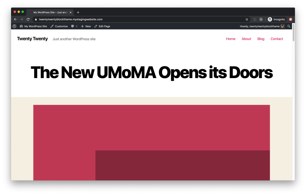
The Twenty Twenty demo site showcases content that highlights the strengths of the theme. We can grab some of that content, and make it into a pattern that can be included with the theme. Now, rather than trying to replicate the site demo by hand, people using Twenty Twenty can insert the pattern directly into their own sites.

On the homepage, one of the sections that catches my eye is the exhibitions list, which is a mix of images and text displayed in a grid. Not only does it look great, the combination of content is generic enough to be used for many different purposes, making it an ideal pattern to abstract out for reuse.

The Twenty Twenty theme demo, showing a section of the page in which four items are arranged in a 2 column grid. The top two are fully visible, and each column contains an abstract red image, a heading, a large paragraph, and then a button that says "Read More."

Let’s break this content down into its basic blocks:

__ Columns
____ Column
________ Image
________ Heading
________ Paragraph
________ Button
____ Column
________ Image
________ Heading
________ Paragraph
________ Button

The Columns block here acts as a wrapper for the exhibitions content, and provides a structure for it to collapse down into one column on smaller screens.

The single Columns block is the smallest atomic unit we can include to make this a complete pattern. Even if the demo shows multiple rows of exhibitions, we’ll stick to just this single row of two items. If someone wanted to add a bunch of exhibitions on their own website, they could reuse this pattern multiple times.

In order to convert this into a block pattern, we’ll need to grab the HTML output from the block in the Code view of the editor:

The WordPress editor, open to the Code editor view. The settings menu is open to show where you can toggle on the Code editor.

We need to copy this HTML, escape it, and add it to a register_pattern function inside of Twenty Twenty’s functions.php file.

(I’ve used onlinestringtools.com to escape the raw html output, but there are also code editor tools that can do this.)

/**
 * Register Block Patterns.
 */
 
register_pattern (
    'twentytwenty/exhibitions-pattern',
    array (
        'title'   => __( 'Two columns of mixed content', 'twentytwenty' ),
        'content' => "<!-- wp:columns {\"align\":\"wide\"} -->\n<div class=\"wp-block-columns alignwide\"><!-- wp:column -->\n<div class=\"wp-block-column\"><!-- wp:image {\"sizeSlug\":\"large\"} -->\n<figure class=\"wp-block-image size-large\"><img src=\"https://2020.wordpress.net/wp-content/uploads/2019/10/2020-three-quarters-1.png\" alt=\"\"/></figure>\n<!-- /wp:image -->\n\n<!-- wp:heading -->\n<h2>Works and Days</h2>\n<!-- /wp:heading -->\n\n<!-- wp:paragraph {\"fontSize\":\"larger\"} -->\n<p class=\"has-larger-font-size\">August 1 – December 1</p>\n<!-- /wp:paragraph -->\n\n<!-- wp:buttons -->\n<div class=\"wp-block-buttons\"><!-- wp:button {\"className\":\"is-style-outline\"} -->\n<div class=\"wp-block-button is-style-outline\"><a class=\"wp-block-button__link\">Read More</a></div>\n<!-- /wp:button --></div>\n<!-- /wp:buttons --></div>\n<!-- /wp:column -->\n\n<!-- wp:column -->\n<div class=\"wp-block-column\"><!-- wp:image {\"sizeSlug\":\"large\"} -->\n<figure class=\"wp-block-image size-large\"><img src=\"https://2020.wordpress.net/wp-content/uploads/2019/10/2020-three-quarters-2.png\" alt=\"\"/></figure>\n<!-- /wp:image -->\n\n<!-- wp:heading -->\n<h2>The Life I Deserve</h2>\n<!-- /wp:heading -->\n\n<!-- wp:paragraph {\"fontSize\":\"larger\"} -->\n<p class=\"has-larger-font-size\">August 1 – December 1</p>\n<!-- /wp:paragraph -->\n\n<!-- wp:buttons -->\n<div class=\"wp-block-buttons\"><!-- wp:button {\"className\":\"is-style-outline\"} -->\n<div class=\"wp-block-button is-style-outline\"><a class=\"wp-block-button__link\">Read More</a></div>\n<!-- /wp:button --></div>\n<!-- /wp:buttons --></div>\n<!-- /wp:column --></div>\n<!-- /wp:columns -->",
    )
);

When we go over and create a new page or post, we now see this pattern listed in the Block Patterns sidebar:

The WordPress editor, with the Block Patterns sidebar open. The newly registered two-column pattern is highlighted within the sidebar.

VoilĂ ! Twenty Twenty now comes with a pattern.

You can view these changes in the Theme Experiments GitHub repo.


You can add any number of patterns to your theme, and even unregister core patterns if you only want your patterns to be available to people using your theme. Create some great patterns that show off just what your theme is capable of! The only limitation is your imagination.

Have you added patterns to your theme already? Tell us about it 👇

Creating a Block-based Theme Using Block Templates

This post outlines the steps I took to create a block-based theme version of Twenty Twenty. Thanks to Kjell Reigstad for helping develop the theme and write this post.

There’s been a lot of conversation around how theme development changes as Full Site Editing using Gutenberg becomes a reality. Block templates are an experimental feature of Gutenberg (as of 7.2.0), and using them to create block-based themes is in exploratory stages of development. 

A block-based theme is a WordPress theme with templates entirely composed of blocks so that in addition to the post content of the different post types (pages, posts, …), the block editor can also be used to edit all areas of the site: headers, footers, sidebars, etc.

Gutenberg Handbook

Before diving in, I’ll reiterate that much of how this works is subject to change. This spec is in a very early stage. I hope by writing this, your interest is piqued to learn more and contribute your own experiment to the WordPress theme experiments repository.

Step 1: Create the theme project

In its simplest state, a block based-theme’s structure should look something like this:

theme
|__ block-templates
    |__ index.html
|__ block-template-parts
    |__ header.html
    |__ footer.html
|__ functions.php
|__ index.php
|__ style.css

This is refreshingly simpler than most WordPress theme boilerplates. Here’s a quick overview what each file and directory does:

  • block-templates/: page templates that are composed of blocks. These follow the same template hierarchy as traditional themes.
    • index.html: the primary / fallback template to generate a post or page. (Analogous to index.php in traditional theme templates.)
  • block-template-parts/: the common collections of blocks to be used in block templates.
    • header.html: The global header, expressed in Gutenberg-generated HTML.
    • footer.html: The global footer, expressed in Gutenberg-generated HTML.
  • functions.php: This contains the usual theme setup and any other reusable functions.
  • index.php: This is actually just an empty file. You can technically remove it, but it’s a good habit to include an index file in every directory.
  • style.css: Contains your theme’s styles as usual.

Recreating Twenty Twenty as a block-based theme required adding a few extra stylesheets. Overall, I chose to add no extra page templates to keep the demo as understandable as possible.

Step 2: Create the block templates + block template parts

There were just two that needed to be totally rebuilt as blocks: the header and footer. The process for turning these areas into block templates was something along the lines of:

  1. Attempt to create the template parts in the block editor
    • This can be done in a draft post or page. If you’ve enabled the Full Site Editing experiment in the Gutenberg plugin, you’ll see a new admin panel area Appearance/Template Parts — an area where in the future I could create, store, and edit the block template parts in my theme.
  2. Style them as closely as possible using the editor
  3. Add block style variations + additional theme CSS to address any gaps that the core editor
    • Most of these styles were already present somewhere in the Twenty Twenty theme CSS, so I just needed to make minor modifications to assign them to the new blocks.

Step 3: Save those block templates + template parts as distinct files

When Full Site Editing is enabled via the Gutenberg > Experiments panel, Gutenberg will expect that your theme provides block templates, overriding the normal templating behavior:

Once I had my template parts designed and displaying properly, I would switch over to the Code Editor view, copy the markup generated, and paste the code into its respective file within my theme directory’s block-template-parts folder.

Edit: there’s an easier way to do this without switching to the code editor. You can select all blocks (Meta+A), copy (Meta+C), and paste into your text editor.

Step 4: Add theme starter content

In order for the theme to be populated with pages and content, I borrowed the official TwentyTwenty theme starter content. This step wasn’t 100% necessary, but a nice addition to have some content when someone activates the theme on a fresh WordPress site.

Demo

Here is the result: a site running the block-based Twenty Twenty.

Home page of the Twenty Twenty block based theme demo site.

Potential Block Improvements

Converting the header and footer to blocks helped me identify some functionality that would be nice to add to core blocks. Some of these are already in the works.

  • Navigation block
    • Control over how the menu is laid out and collapses in different viewports (#16829)
  • Columns Block
    • The ability control the padding and margins (#10730, #16660)
    • Adjusting the size of one column, the remaining columns don’t resize equally (#19515)

How is this better than what we have now?

The structural block-based theme changes are generally not obvious on the front end. The process of switching between the Code editor, a template file, and previewing the site to achieve the intended design was tedious. However, this is just an interim step before we’re hopefully able to create and edit our theme (and your entire site) via Gutenberg.

WordPress admin screen showing a block template part being edited.

The end benefit will become most apparent when the user can edit every piece of the page individually using Gutenberg. Being able to compose, manage, and reuse parts of your theme all within one visual interface is an exciting idea and one that’s close to reality.

The other exciting aspect of this process was that it required very little PHP — just a few block style variation declarations and standard theme support registration. Everything else is CSS and HTML generated by the editor. To me this feels like a step in the right direction, lowering the barriers to entry for folks that are new to theme development and WordPress.


I invite you to try it out; your comments and feedback are more than welcome. The source code for this theme is available on GitHub:

https://github.com/WordPress/theme-experiments/tree/master/twentytwenty-blocks

In that repository, you’ll find a handful of other block-based theme experiments: converted versions of Twenty Nineteen, the Gutenberg Starter Theme, and a theme called Parisienne. Each contains instructions for installation and activation.

By the way, the theme-experiments repository is open for PRs! I’d love to see more people creating and testing themes that use this method: that’s the only way it’ll grow and improve.

Feel free to ask questions in the comments or in the repository, and thanks for reading!

The Developer’s Guide to Supporting Your Themes

At this year’s WordCamp Europe, some members of the WordPress.org support team brainstormed how we might be able to share support skills and strategies with the broader WordPress community. We decided to offer some workshops to share support knowledge, and the first one –  by yours truly – has been announced. Details are below.

Hope to see you there!

Update: The recording, slides, and notes are available.

The Developer’s Guide to Supporting Your Themes

Providing support for your themes offers tremendous opportunities to educate WordPress users, from explaining how to make a child theme to offering simple CSS customizations. It also presents challenges, like figuring out how to help people who aren’t tech-savvy or need support beyond the scope of what you can provide. While many developers dread doing support, with some concrete strategies and techniques in hand, helping users doesn’t have to be a chore – and can even be fun! This session looks at how to make your themes’ users happy while feeling a sense of satisfaction from your own support efforts – a winning combination in the world of theme development.

When

Wednesday, August 23, 2017, 16:00 UTC. It will last for an hour and include Q&A.

How

The session will be run via videoconference and will be recorded and posted later for those who can’t make it. Please download the free Zoom app ahead of time. You can run Zoom on most desktop and mobile devices.

A link to the Zoom teleconference will be provided in the #forums WordPress.org Slack channel about 10 minutes before the session begins.

Who

In her role as Theme Whisperer on the Theme Team at Automattic, Kathryn Presner provides support for hundreds of themes. She began helping people as a volunteer in the WordPress.org forums back in 2011 and was immediately hooked.

Featured image by Pixel Fantasy (CC BY-NC-ND 2.0)

WordPress Themes and User Experience

Good user experience in WordPress themes can make the difference between frustrated or happy users. Yet, it’s often overlooked. A solid user experience can feel just right, creating sound expectations and delight. If you’re looking to boost your theming skills and learn more about themes and user experience, we recommend these three recent talks by members of the Automattic Theme Team:

Kirk Wight, A Call for Simplicity: As WordPress blazes into its second decade, theming, plugin development, and WordPress core itself are reaching troublesome levels of complexity and confusion, challenging the very essence of what has gotten WordPress to where it is in the first place. Pulling from diverse areas of culture and tech, we’ll tie together our need for simplicity, and issue a call to arms for the next ten years of WordPress.

Tammie Lister, Theme, Don’t Be My Everything: It’s time to stop putting everything including the kitchen sink into themes. A theme shouldn’t be a bloated monster with an options panel that stretches out the horizon. This talk is a call to action to stop making themes that do everything and start making themes that focus.

David Kennedy, Themes are for Users: In this talk, we’ll explore user research, theme setup, theme options and more. By the end, you’ll know what makes up a theme’s user experience, and how to set your users up for success.

And if you’re still getting started with theming, or even WordPress, wondering how you could ever contribute to WordPress and add value – you’re not alone. Check out Kathryn Presner’s The Techie Continuum, and start contributing to WordPress today!

Online Resources to Help You Learn All The Things

The web industry is always changing. Just when you get settled into a routine, the flow of technological innovations force you start a new one. Can you keep up? It never hurts to set aside some time for learning new skills and sharpening your current ones.

In this post, I’ll outline a few online resources that can help you continue your education in web design and development (or to get started, if you’re just joining us).

Continue reading “Online Resources to Help You Learn All The Things”

So You Want To Create WordPress Themes, Huh?

Update: It’s live! It’s happening! Go read How To Create a WordPress Theme and learn how to code up something awesome.


Does that title sound familiar? Over 2 years ago the now defunct WPDesigner.com published a series of posts under that banner, teaching beginners how to create WordPress Themes from scratch.

2 years ago is a long time online: Things have changed.

Starting next week, ThemeShaper will publish a series of daily lessons that will teach you how to create your very own modern WordPress Theme—from scratch—using the latest best practices.

And it won’t be just any old WordPress theme you’ll have in your hands. In a lot of ways it will surpass what’s been done with the popular Thematic Theme Framework. Except, it’ll be a little leaner, a little meaner, and it’ll be all yours.

Here’s the laundry list of features your finished theme will be able to boast of.

  • Search-engine optimization
  • Microformats
  • Localization support for translation
  • Robust dynamic body and post classes
  • Separated Comments and Trackbacks
  • Gravatar support
  • A valid, logical, semantic XHTML structure you can use to build ANY layout
  • Valid CSS
  • A strong typographical foundation
  • Smart default layouts (that we can adapt for later layout generation)
  • 2 widget areas, with NO hard-coded widgets, that “disappear” from the markup when they’re empty.
  • Styling for WordPress Image Classes
  • And pretty much all the typical WordPress stuff

When you’re done you’ll have a complete—and completely powerful—WordPress Theme that you can edit further or build on with a WordPress Child Theme. The choice is yours.

Are you ready?