Lesson Plans: Landing page layout #153
Comments
|
@courane01 Is this the same as #147? |
|
I like the concept of grouping it using the "lesson groups" when there is an agreement on what those groups should be called. I'm not partial to any of the inspirational design layouts that have been listed. However, for consistency, it might be better to go what is currently being used .org inspirational ideas: https://developer.wordpress.org/ & https://wordpress.org/support/ |
|
Related? I think of this more as something broken down like Dev & Support, while the other lives near the lesson plan nav bar to sort and filter. Filtering can come secondarily. |
|
As I studied https://wordpress.org/support/ & https://developer.wordpress.org/ an idea occured. On /lesson-plans, can we show basically everything that is on /support, but including 3 additional cards for plugins, themes, and an speaker diversity? (we do not yet have those lessons revised but could in that timeframe) We can refine our categories in that time and reuse much of the dashicons. How does /support order the items under each icon? I do like the chapter breakdown within as well. Is that handbook? Does that function more like pages or posts? Can we enable some sort of sequence within lesson plan CPTs? I think this is a higher priority than the navbar, but am open to input. I don't see much value in a lesson plan post excerpts archive page when it's not sequential. It looks like a pile of papers on my desk. On the main page of Learn, can we have something that shows several recently published or recently updated lessons below the fold? That can happen later. The organization on /support really does make sense, but I don't want to confuse viewers in what they are seeing. |
|
I agree with you on the higher priority/impact for adding the visuals to the landing page for lesson plans vs. filtering. To avoid duplicating efforts since there's already a considerable amount of categorization for the lesson plans, I would suggest using what we already have present in Learn for "Lesson Categories" (Builder > Plugin Dev, Theme Dev; General; Speaker; Templates; User > General Admin, Plugin, Theme) and/or "Experience Level" as a start. I believe the icons are pulled from Dashicons for the Support and Dev docs, so that gives us some flexibility in terms of finding visuals that match the categories we already have (if we don't exactly copy what's on those two pages). Over time, I imagine we may add new categories or refactor them a bit, but my two cents is that this seems to me the best way to implement that organization while leveraging natural groupings we already have in place. |
|
The only thought to "Builder" is builder vs dev. Informally in the community, I've been hearing more "site builder" as one who doesn't touch code but can assemble websites for clients using plugins/themes already made. Whereas Dev would be more specifically one who writes the code. https://www.acquia.com/drupalcon-certification#block-uplifting-content:~:text=Exam%20Blueprints follows similarly. But we can delineate that later too, not a big enough issue to prevent implementing something. |
|
If I'm following correctly, it sounds like we want to have a section on the front page that has a grid of Lesson Plan categories, each with a Dashicon and a blurb, that would link out to a separate page showing all the lesson plans in that category. Is that right? If so, some follow up questions:
|
|
How about we put the grid on https://learn.wordpress.org/lesson-plans/. Seeing the lessons as they are on the lesson plan archive doesn't have much organization now. There's no idea of the sequence to it. We can still tuck that filter option in on lessons later. |
|
I think it makes sense to put it on a new lesson plans landing page. I do think the current filters are also valuable, but I'm not sure how the filters and the landing page would work alongside each other. |
|
In terms of combining the existing filters and landing page, I was picturing something like this for the Lesson Plans landing page: And then when you click on "All" or navigate through any of the filters in that bar, it could default to the current layout that exists now: If the goal is to help the workflow that appears upon first impression in particular, I think this approach can help give new visitors a sense of what's available, while then being able to navigate/search as normal as they click through the existing filters, too. |


|
I love that Erica. Backlog extension to this: later can we sort the lessons in a logical flow - accounting for prerequisites. And how support/docs use the "chapters" at left on the post/page content? https://developer.wordpress.org/block-editor/architecture/fse-templates/ That part looks like handbook. |
|
Here is a backend view of the plugin WeDocs: It shows sections such as Block Editor, DevHub, Handbook and HelpHub.
Frontend view:
Deactivating WeDocs and activating Knowledge Base for Documents and FAQs plugin and the theme MyKnowledgeBase. Viewing the Block Editor section on the frontend. Categories overview on the left underneath Table of Contents highlighting headings. It would be nicer to have the left sidebar menu like the handbooks https://developer.wordpress.org/block-editor/
I do believe finding something that works here in Learn would very likely also work with for a new look and feel for documentation as well. |


|
I think it would be good to get some help from a designer to refine @varlese 's mockup above. This is still an open question:
|
|
@StevenDufresne indicated that due to the change to include video workshops, the "lesson group" taxonomy wouldn't show anywhere yet. https://wordpress.slack.com/archives/C02RW657Q/p1605668199127800?thread_ts=1579550929.007200&cid=C02RW657Q https://wp.invisionapp.com/share/BNP0V7QXRF8#/screens/330323714 Notice the filter. Also, each of these training team workshops are a series of lesson plans intended to be part or full day presented in a series. I don't know if there was further work on ordering these within. The bottom one, WP Full Day Workshop, does order lesson plans in a logical order as one progresses down through the bullets and on to the next column. I really like this mockup when we are ready to present "units" or whatever term we use to rename "workshops" as the training team planned. The same materials could be laid out using Erica's mockup above as well. I think Erica's mockup looks like page 13 (Just realized Steve's link was all the mockups, not just one screen). I believe page 13 links would point at all lessons appearing ina sequential order, using "lesson group". I have the capacity to organize "lesson group" taxonomy before launch, but do not know how to make those appear in a sequential order. That may be an after launch portion. As a team, we can work on a new name for "workshops" as the idea is a grouping of lessons presented in a logical order. Before launch, can we get close to Erica's mockup. After launch, we could swap the sub-points from her mockup to lead to groupings of lessons or whatever should come/go off that main list. |
|
It sounds like there are two main options here:
@coreymckrill and @courane01, which is your preference at this point? In either case, we have some existing categorizations we could use (categories, duration, audience), and the second option just requires a bit more thinking and organization from Training ahead of implementation. I'm thinking the second option gets us closest to what we'd like in the long-run, and I'm happy to work with @courane01 on getting some Lesson Groups together by the end of the week or so, if that makes sense. |
|
I think option 2 is more thought out. Do we see a way to partially implement before release? I did see Hugh indicating postponing a few days to give 5.6 & PHP8 breathing room in the news. |
|
Just to sum up what we've discussed so far here, and to help us with moving forward, the main goals for visual organization here are to help educators visiting the site to better navigate what's available in lesson plans. With that in mind, the Lesson Plans landing page should make it clear:
There are some existing taxonomies within Learn WordPress that may help with this implementation (namely, Audience, Experience Level, Category, Instruction Type, and Duration). Relatedly, we do have the Lesson Groups taxonomy, which is designed for creating a group of lesson plans that form a course, but we haven't really used this just yet and this might fit better in later conversations around structuring courses for both workshops and lesson plans as a whole. For next steps, it would be ideal to:
|
|
Took a quick look at wireframing the landing page. Is this along the lines of what you're thinking, @varlese?
If so, I'll flesh this out some more. |

|
Thank you so much @melchoyce! It definitely matches what I had in mind, and I like the approach here for how someone might interact with the page :D As a secondary, but related question: I'm wondering about the flow from the landing page to the lesson plans in each section. We currently have this layout with the nav bar for lesson plans by topic. Do you (or @coreymckrill) think we can incorporate that same design for the other groups (like Audience or Duration), or would we benefit from stepping back to discuss scope and design with that in mind as well? ("It's just the landing page" - famous last words) |
|
Mel @melchoyce that looks really nice! Clear and easy to read. Thinking out loud. A question comes up.... Should there be a sidebar menu that is fixed to the left sidebar (always in view)? So the user can either choose to scroll the length of the page, or use the sidebar menu to jump (think HTML anchor) to the location on the page where a specific lesson is located. Having a sidebar menu gives an instant short overview/summary of lesson titles one can easily go to. Like an index in a book. I am looking from an even higher perspective.... As a user enters a handbook they see the landing/intro/overview page. Having a design that fits with the handbook the user enters. Here is an issue I made for the Block Editor handbook intro/landing page showing how various other sites: WordPress/gutenberg#27400 (comment) do their own landing pages. |
|
In general, I think we should try to stick as close to the Workshops pages as possible — not only to build consistency across the two sections, but to also simplify development. With that in mind, we could still do a categorized landing page, such as:
...or, we could forego the explicit categorization entirely, and add filters like the Workshop page:
Which method do you think would be more effective for people looking for lesson plans? |


|
You know, I was expecting to want to stick with the categorization, but I'm really leaning towards your second proposal here, using filters like the Workshop page :) It seems to me that it makes more sense to have a holistic search/filter experience across the site with workshops and lesson plans, while still making use of the different elements educators might be searching for. |
|
That last layout looks great - I really like the consistency with the workshops page. |
|
So I'm going to be a pain and say I like the first one (visual categorisation). To me, it looks much clearer and in line with what you already have in https://developer.wordpress.org and https://wordpress.org/support/ |
|
I am leaning toward the first option. Second option ideas:
In the first option with description:Wow - It's so pretty! Thanks @melchoyce
|
|
These are great @melchoyce! For my two cents, I think the first option does look a lot more consistent with other .org sites like make and support. I also think that the drop-down filters might be less obvious to use compared to the material icons. |
|
Cool, sounds like we'll want to move forward with one of the first options. Thanks for all your feedback, folks. Here are some ideas for the archive pages: one without a container around each item and a filter sidebar, one with a container around each item and a filter sidebar, and one in a grid of containers, without a filter sidebar. The filter sidebar would allow you to narrow down results within a particular section. So in this case, since we're in a topic, you can filter by level, duration, and format:
I also looked at bringing the single page in line with the Workshop single page:
I added in accordions to help with organization, since some of the lesson plans are quite long and hard to scan. We could potentially collapse all of the sections by default, except for the description, which isn't in an accordion section. |


|
@melchoyce Great work! I'll put some thought in this evening on the filter views. I would like the team to eventually have some control on the sequence of lessons within there. Not essential for launch on the filter view. Single view quick thoughts/impressions:Good thinking for accordions.
To reiterate, I am so thankful for your work again with the team. I found traces of your work in the years I was away. The main concern for Dec 15 is the initial lesson plan landing page. Anything else before then is icing on the cake. I'll think on the filter view for any thoughts I may be missing. I should be available to respond for those a little past noon EST Friday. |
|
Oooh, I love this @melchoyce. I'm torn between the filter with container list and the filter without a container. I can't decide! Hopefully we can a view from the Training on their thoughts in time. For the Single view - I'm also now torn between using the accordions and mimicing what @paaljoachim is doing with documentation using the table of contents and chapters. Or do we just stick to using a table of contents and chapters for documentation like handbook and use this accordion style for lesson plans..... I think we need to run it by the Training team as I can see a case for both options. Will bring it up at the meeting which is happening in the next 2 hours. Thank you. |
|
Doing my best to recap everything from our conversations here and the Training team conversation in Slack today:
Design-wise, I think that should be enough for us to go on to get started with implementation. Thank you so much @melchoyce! |
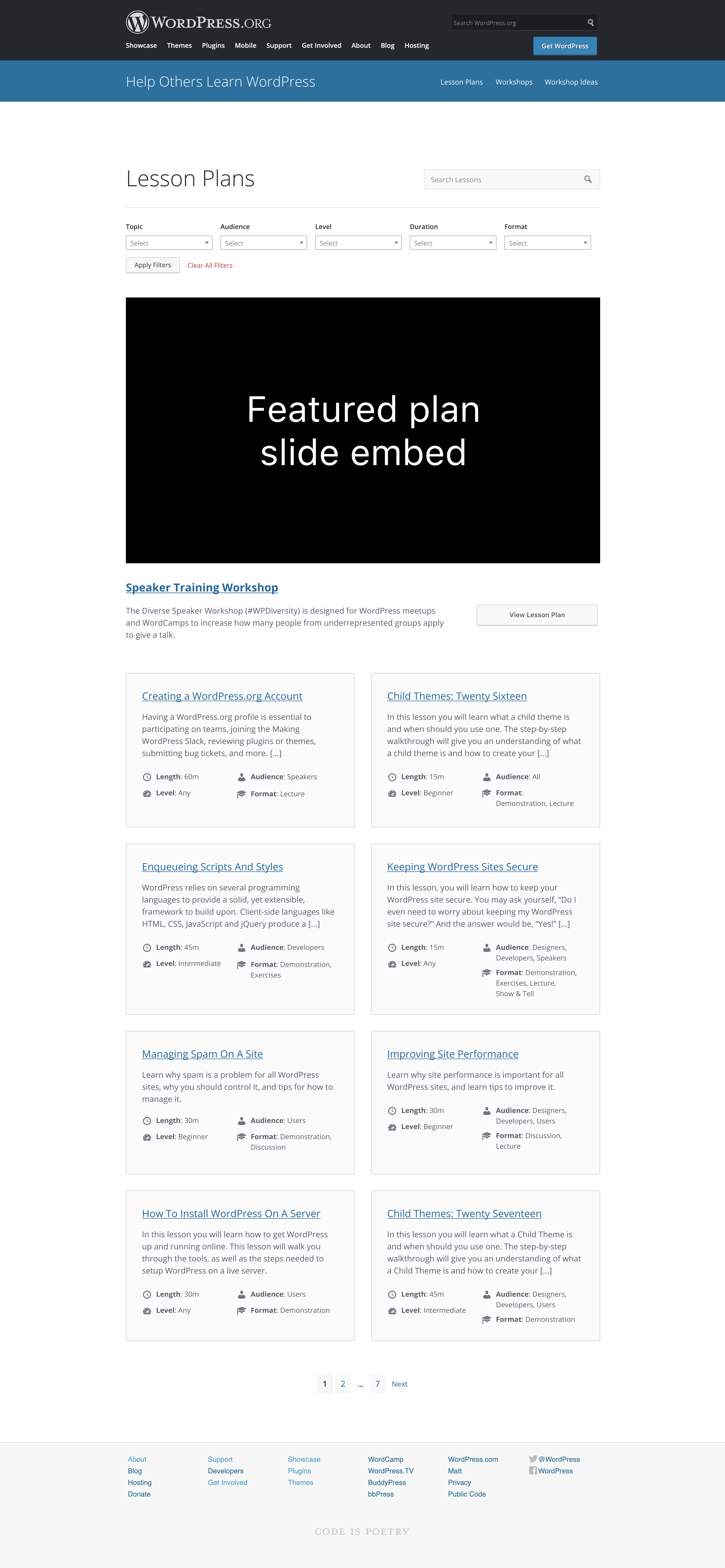
The big change in this PR is normalizing the usage of the "card" metaphor for displaying multiple posts. Before, lesson plans and search results had separate card templates and styles that were somewhat similar, but had some obvious differences. Now with this, lesson plans archives, search results, and Sensei courses archives all use the same templates and styles so there is a unified design for those parts of the site.

The Lesson Plan archive page now has its taxonomy filtering links in a sidebar instead of along the top, per the design specified in #153. It's not full blown filtering like workshops have. That will come in a later separate PR.

This also makes some important tweaks to the theme to add theme support for Sensei and prevent the plugin from outputting unnecessary wrapper markup.

Fixes #165
|
Now that we have the new Lesson Plans archive page (which looks incredible and I love it), I'm going to remove this issue from the milestone for the 15 December launch, but we can keep this issue open for further discussion about the landing page. |
|
Here is a Figma prototype I built showing the pages that were talked about last week during the Learn office hours. Click anywhere to see the blue boxes that show a link. Then click the links. -- I have added breadcrumbs. I have a few thoughts on the new design which I can get back to. |
|
@paaljoachim, I love how you've combined this with @melchoyce's original design. Landing page - yes, I'm assuming that when I click on a topic then I should also get a similar archive page. Archive page - the breadcrumbs are great as it lets me know where I am and easily allows me to get back to the landing page. Single page - I love how the chapters or overview are incorporated. I'll flag the accordions to the accessibility team for review but for now, I'm very happy. I hope the rest of the team is too. Thank you. |
|
Hi @coreymckrill how do I add the accessibility tag to this ticket? Do I need rights or am I missing something that is so obvious :-)? |
|
Some questions/comments about the landing page design:
|
|
Good questions!
|
…rch (#183)

This builds on the design for the Lesson Plans archive page in #153 to turn the links in the sidebar into filters that can be applied to change the result set. Terms from multiple taxonomies can be selected simultaneously. This also specifies an action for the search forms found on workshop, lesson plan, and course archive pages so that a 404 isn't returned when searching from an inner page of the archive results.

Fixes #182
|
Agreed that from a front-end perspective, by topic would be the natural way that people would search for a lesson plan and workshop. We (training, community) would know that categories reference topics so on that sense changing it on the back-end would be that important. Renaming the time to match the term (short, long, etc.) makes sense but can we keep it on the landing page as Short (15-30mins)? Audiences - I see Kids, maybe Organiser (as in Meetups and WordCamps?) being added to the list. Terms - happy to have a generic one in there as a placeholder |
|
During the meeting on Dec 18, the team indicated that the landing page should go on /lesson-plans. See all lessons (from the buttons) that should direct users to /all. This also would involve making prettier permalinks for all filters as well. |
|
Checking on progress |
|
For the landing page, could we move this forward by having someone draft it as a page in Gutenberg? It's mostly text and buttons. It won't look perfect, but if the content is laid out in blocks then we could have a designer work up some CSS to tweak the appearance. That would mean the content is more easily editable. And if the CSS is done well, it would then be easy to replicate similar buttons and icons on other pages as needed. Perhaps some could be made into block patterns or reusable blocks. We have a CMS, let's make the best use of it :) |
|
Hello everyone. (I will likely have missed a few things discussed above here.) In relation to the landing page design shared by @melchoyce here: https://user-images.githubusercontent.com/2846578/101688755-79264f00-3a3a-11eb-899a-fccedd032de5.png Currently there are two important features included into the design that have not yet been built into Gutenberg. 1-
2-
The two features above would be nice to first get into Gutenberg before we go ahead and the layout suggested by Mel. Alternatives. One alternative is to go to the Dashicons page. Take screenshots, adjust these to look like the design and add these into the Landing page. Another alternative is for the moment built a simpler landing page with the purpose of explaining. Here is @varlese post on Make design back in February. My conclusion would be go to with a simpler design as a first small step. A small step is a lot easier to get implemented vs a (currently in Gutenberg) big step. Focusing on guiding people to where they need to go and also clearly explaining the difference between Lesson vs Workshop. As the icons block gets added into Gutenberg and the Query block is been improved upon. Then we can revisit Mel's landing page design to see if it is easier to recreate in Gutenberg. |


At this time, the lesson plans resemble dumping a filing cabinet full of papers onto a desk. We need a way to visually organize the content. I think "lesson group" taxonomy may have been intended for that?
The team's original vision can be seen at the bottom of the staging site: https://learnwp.jco.dev/
.org inspirational ideas: https://developer.wordpress.org/ & https://wordpress.org/support/
non-.org inspiration: http://m.tri.be/kb, https://docs.wpbeaverbuilder.com/, https://www.advancedcustomfields.com/resources/
This can go below the fold, beneath "Get Involved"
We have 2 halves of the website at this time. I want to be mindful of the traffic flow. Do we show 1 visual breakdown with links to individual lesson plans AND also workshops when there is an option for each? We don't need all the answers but I do want it to consider what the future iterations can look like.
The text was updated successfully, but these errors were encountered: