The Test Team helps manage testing and triage across the WordPress ecosystem. They focus on user testing of the editing experience and WordPress dashboard, replicating and documenting bug reports, and supporting a culture of review and triage across the project.
If you’d like to help test Full Site Editing, please join the FSE Outreach Program. You can find current calls for testing for this program here and you can join the fun in #fse-outreach-experiment.
The team gathers in #core-test. Please drop by any time with questions or to help out.
For more information about this outreach program, please review this FAQ for helpful details. To properly join the fun, please head to #fse-outreach-experiment in Make Slack for future testing announcements, helpful posts, and more will be shared there.
Feature Overview
A lot has changed since the first call for testing focused on Template Editing so, if you’re worried about this being a repeat experience, don’t be. As a reminder, Template Editing Mode is the feature of Full Site Editing that unlocks the ability to switch between editing an individual’s post/page content and the template that an individual post/page uses. When this first was released, you were only able to edit a template but you couldn’t create a new one or assign a post/page to use a specific template. At this point though, you can create a new template, edit current ones, and select which template you want to use for pages/posts. Tied to this, the interface has been updated to make it clearer when you’re actually in template editing mode. For a deeper dive into this new feature, check out this video that goes more in depth.
To make this a tiny bit more realistic, we’re going to pretend we’re creating a WordCampWordCampWordCamps are casual, locally-organized conferences covering everything related to WordPress. They're one of the places where the WordPress community comes together to teach one another what they’ve learned throughout the year and share the joy. Learn more. site with a custom landing page to attract visitors from another event to join the WordCamp you’re hosting.
Testing Environment
While there’s more information below to ensure you get everything set up properly, here are the key aspects to have in place with your testing environment:
Use a test site. Do not use a production/live site. You can follow these instructions to set up a local installLocal InstallA local install of WordPress is a way to create a staging environment by installing a LAMP or LEMP stack on your local computer. or use a tool like this to set up a development site.
Use the latest version of WordPress (downloadable here).
Use the latest version of GutenbergGutenbergThe Gutenberg project is the new Editor Interface for WordPress. The editor improves the process and experience of creating new content, making writing rich content much simpler. It uses ‘blocks’ to add richness rather than shortcodes, custom HTML etc. https://wordpress.org/gutenberg/ (10.6 as of writing this).
Generally speaking, please use the latest versions of each part of the setup and keep in mind that versions might have changed since this post was shared.
Testing FlowFlowFlow is the path of screens and interactions taken to accomplish a task. It’s an experience vector. Flow is also a feeling. It’s being unselfconscious and in the zone. Flow is what happens when difficulties are removed and you are freed to pursue an activity without forming intentions. You just do it.
Flow is the actual user experience, in many ways. If you like, you can think of flow as a really comprehensive set of user stories. When you think about user flow, you’re thinking about exactly how a user will perform the tasks allowed by your product.Flow and Context
Important Note:
While this call for testing is focused on testing a specific feature, you’ll likely find other bugs in the process of testing with such a betaBetaA pre-release of software that is given out to a large group of users to trial under real conditions. Beta versions have gone through alpha testing in-house and are generally fairly close in look, feel and function to the final product; however, design changes often occur as part of the process. feature! Please know any bugs you find are welcome in your report for testing, even if they aren’t directly applicable to the tested feature.
Known issues:
While creating this call for testing, a few issues popped up that you too might experience as you go through this. Rest assured they have been reported. Here’s a non exhaustive list of the most serious items:
The “Add Block” prompt has a regression that’s causing the words “Add BlockBlockBlock is the abstract term used to describe units of markup that, composed together, form the content or layout of a webpage using the WordPress editor. The idea combines concepts of what in the past may have achieved with shortcodes, custom HTML, and embed discovery into a single consistent API and user experience.” to appear in various places, including in a way that makes the text look quite squished.
Known issues are expected to be found at this stage in development for something that’s so actively being iterated upon!
Setup Instructions:
Have a test site using the latest version of WordPress. It’s important this is not a production/live site.
Install the TT1 Blocks theme by going to Appearances > Themes > Add New. Once installed, activate the theme.
Go to the website’s admin.
Install and activate the Gutenberg pluginPluginA plugin is a piece of software containing a group of functions that can be added to a WordPress website. They can extend functionality or add new features to your WordPress websites. WordPress plugins are written in the PHP programming language and integrate seamlessly with WordPress. These can be free in the WordPress.org Plugin Directory https://wordpress.org/plugins/ or can be cost-based plugin from a third-party from Plugins > Add New. If you already have it installed, make sure you are using at least Gutenberg 10.6.
You should now see a navigation item titled “Site Editor (beta).” If you don’t see that in your sidebarSidebarA sidebar in WordPress is referred to a widget-ready area used by WordPress themes to display information that is not a part of the main content. It is not always a vertical column on the side. It can be a horizontal rectangle below or above the content area, footer, header, or any where in the theme., you aren’t correctly using the Site Editing experiment. Do not click on this as we will not be exploring the Site Editor for this test!
Creating pages
Under Pages, select “Add New” and, one by one, create three pages back to back with the titles “About”, “Contact”, and “Code of Conduct”. Publish each. These don’t need content added in as they will simply be links for a future menu.
Create a fourth page, title it something fun to bring people into your event and don’t add in any additional content. For example, I titled mine “Feeling inspired from WordCamp Couch?”.
Publish the page and keep it open.
Creating a new template
In the sidebar, open the Settings and select Page Settings (you should see Page and Block). Select “New” under the Template section to create a new template. Here’s a short video in case you get stuck.
Title the new template “WordCamp Outreach”.
From there, you’ll enter Template Editing Mode.
Customizing the template
Remove the Site Title, Site Tagline, and Separator blocks at the top of the template.
Add in a Cover Block above the Post Title Block and use any image you’d like. I downloaded this one when creating this test. You might need to use the “Insert Before” option in the toolbar of the Post Title Block.
Once you have an image added, select the Cover Block once more rather than the Paragraph Block inside it and use the width options to make it Full Width.
Drag and drop the Post Title Block into the Cover Block.
Center the Post Title Block using the block alignment settings and delete the extra Paragraph Block beneath it.
Select the Cover Block once more and apply a Duotone FilterFilterFilters are one of the two types of Hooks https://codex.wordpress.org/Plugin_API/Hooks. They provide a way for functions to modify data of other functions. They are the counterpart to Actions. Unlike Actions, filters are meant to work in an isolated manner, and should never have side effects such as affecting global variables and output. to it. Here’s a screenshot of what icon you’re looking for. Note that by selecting “Shadows” and “Highlights” you can select your own custom colors!
Add a Spacer Block underneath the Cover Block and set it to 50px.
Add a Columns Block underneath the Spacer Block and choose 50/50.
Once inserted, select the parent Columns Block and set the width to “Full Width”.
Add in brief information about your event in the first column and set any alignment you’d like.
In the second column, add in two buttons asking people to Apply to Speak and Apply to Sponsor. For the purpose of this test, it’s okay if these do not actually link anywhere. Feel free to customize the buttons to your liking too!
Underneath the Columns Block, add in an additional Cover Block and select a background color.
Once you have a color, select the Cover Block once more rather than the Paragraph Block inside it and use the width options to make it Full Width.
Inside the Cover Block, add in a discount code message and a Button Block below it encouraging people to buy tickets. Customize this text to your liking, whether in terms of alignment, custom colors, or more.
Create a custom footer
Underneath the second Cover Block, add a Template Part Block and select “New Template Part” to create a custom footer for this template.
Once created, head to the Block Settings in the sidebar to add in a Title under the Advanced section, set the Area to “Footer” under the Advanced section, and toggle on “Inherit Default Layout” under the Layout section.
From there, add a Columns Block into the Template Part and choose 30/70.
Using the Page Link option, add in your “About”, “Contact”, and “Code of Conduct” pages. Customize the Navigation Block to your liking!
From there, select “Update” and save your changes.
Create a new page & assign the new template
At this point, head back to your wp-admin dashboard and, under Pages, create a new page.
Add a title that references another pretend event that someone might attend. For example, “Feeling inspired from WordCamp Bed?”
In the Post Settings, under the Template section, select the template you just created and publish the page.
View your page and confirm it’s using the same template as your first page!
Advanced Steps
If you’re more technical and keen to test out future ideas, check out this PR. Keep in mind that you can always download the specific Gutenberg plugin version for this PR here to make it easier to explore. For context, this PR seeks to help better differentiate between when you’re editing post content vs the template by obscuring the ability to edit the post content when in template editing mode. Feel free to leave your thoughts on this PR in the comments below or on the PR directly.
Testing Video
Note that there are chapters added to the video that correspond with the steps above.
What to notice:
Remember to share a screenshot of what you created if you’re up for it!
Did the experience crash at any point?
Did the saving experience work properly?
Did you find any features missing?
What did you find particularly confusing or frustrating about the experience?
What did you especially enjoy or appreciate about the experience?
Did you find that what you created in Template Editing Mode matched what you saw on your site?
Did it work using Keyboard only?
Did it work using a screen reader?
Leave Feedback by May 26th
Please leave feedback in the comments of this post. If you’d prefer, you’re always welcome to create issues in this GitHub repo directly for Gutenberg and in this GitHub repo for TT1 Blocks. If you leave feedback in GitHubGitHubGitHub is a website that offers online implementation of git repositories that can can easily be shared, copied and modified by other developers. Public repositories are free to host, private repositories require a paid subscription. GitHub introduced the concept of the ‘pull request’ where code changes done in branches by contributors can be reviewed and discussed before being merged be the repository owner. https://github.com/, please do still comment below with the link. If you see that someone else has already reported a problem, please still note your experience with it below, as it’ll help give those working on this experience more well-rounded insight into what to improve.
In light of the 5.8 planning and next steps, I wanted to share the upcoming schedule for the FSE Outreach Program in order to ideally help people participate more in what’s to come. As changes occur and I’m able to create plans further out for 5.8, I’ll edit this post and note exactly what I changed at the very end of this post. I do expect changes so please see this all as what I anticipate vs set in stone plans.
As always, if you have any questions, feel free to ask here or to DM me in slackSlackSlack is a Collaborative Group Chat Platform https://slack.com/. The WordPress community has its own Slack Channel at https://make.wordpress.org/chat/. (@annezazu).
Calls For Testing (aka CfT):
Based on what’s planned for 5.8, the following is lined up for testing:
Call For Testing #6: focused on using template editing and the navigation blockBlockBlock is the abstract term used to describe units of markup that, composed together, form the content or layout of a webpage using the WordPress editor. The idea combines concepts of what in the past may have achieved with shortcodes, custom HTML, and embed discovery into a single consistent API and user experience. within that experience.
Call For Testing #7: TBD but likely focused on something like creating a more complex landing page using template editing and a more expansive set of theme blocks.
When I can, I’ll try to leave three weeks for testing rather than two but, due to the release timeline, this may not always be possible.
Overall Timeline:
Date
GutenbergGutenbergThe Gutenberg project is the new Editor Interface for WordPress. The editor improves the process and experience of creating new content, making writing rich content much simpler. It uses ‘blocks’ to add richness rather than shortcodes, custom HTML etc. https://wordpress.org/gutenberg/
10.6 RCRelease CandidateA beta version of software with the potential to be a final product, which is ready to release unless significant bugs emerge.
End
May 12
10.6
End
Start
May 19
10.7 RC
May 26
10.7
End
Start
June 2
10.8 RC
June 9
10.8
End
Outside of these calls for testing and questions, there will continue to be live streams, hallway hangouts, important posts flagged, etc. This post will be updated to include the relevant links as time progresses:
Help me triage feedback that come in from the calls for testing and file any necessary issues.
Help me write the calls for testing and the summary posts.
For any of the items that involve working with me directly, please comment on this post or message me directly (@annezazu) so I know you’re interested and we can talk through what helping out might mean. To those of you already doing this work, thank you so much! It all truly helps.
April 29th 2021: updated to include links to the fifth call for testing and the second round of questions.
Not many blocks get an entire milestone dedicated to them but the Query Block did! As the name implies, this is a pretty powerful blockBlockBlock is the abstract term used to describe units of markup that, composed together, form the content or layout of a webpage using the WordPress editor. The idea combines concepts of what in the past may have achieved with shortcodes, custom HTML, and embed discovery into a single consistent API and user experience. allowing you to display posts/pages on your site and customize them as you see fit. For example, you could easily use this block to show off all of your favorite recipes by setting it up to show a specific categoryCategoryThe 'category' taxonomy lets you group posts / content together that share a common bond. Categories are pre-defined and broad ranging. of posts. In the long run, you can expect this to be more of a theme author tool used when building a block theme with block variations, like the Post List Block, being more of what users will interact with. For now though, let’s be adventurous and go on a Query Quest to explore what this block can do.
If you find yourself interested in the future of this block, check out this recent GitHub issue asking for new ideas for the bundled Query Block patterns that come with the current iteration of the block and get excited about Gutenberg 10.5 which will offer more patterns to choose from.
Testing Environment
While there’s more information below to ensure you get everything set up properly, here are the key aspects to have in place with your testing environment:
Use a test site. Do not use a production/live site. You can follow these instructions to set up a local installLocal InstallA local install of WordPress is a way to create a staging environment by installing a LAMP or LEMP stack on your local computer. or use a tool like this to set up a development site.
Use the latest version of WordPress (downloadable here).
Use the latest version of GutenbergGutenbergThe Gutenberg project is the new Editor Interface for WordPress. The editor improves the process and experience of creating new content, making writing rich content much simpler. It uses ‘blocks’ to add richness rather than shortcodes, custom HTML etc. https://wordpress.org/gutenberg/ (10.4 as of writing this).
Generally speaking, please use the latest versions of each part of the setup and keep in mind that versions might have changed since this post was shared.
Testing FlowFlowFlow is the path of screens and interactions taken to accomplish a task. It’s an experience vector. Flow is also a feeling. It’s being unselfconscious and in the zone. Flow is what happens when difficulties are removed and you are freed to pursue an activity without forming intentions. You just do it.
Flow is the actual user experience, in many ways. If you like, you can think of flow as a really comprehensive set of user stories. When you think about user flow, you’re thinking about exactly how a user will perform the tasks allowed by your product.Flow and Context
Important Note:
While this call for testing is focused on testing a specific feature, you’ll likely find other bugs in the process of testing with such a betaBetaA pre-release of software that is given out to a large group of users to trial under real conditions. Beta versions have gone through alpha testing in-house and are generally fairly close in look, feel and function to the final product; however, design changes often occur as part of the process. feature! Please know any bugs you find are welcome in your report for testing, even if they aren’t directly applicable to the tested feature.
Setup Instructions:
Have a test site using the latest version of WordPress. It’s important this is not a production/live site.
Install the TT1 Blocks theme by going to Appearances > Themes > Add New. Once installed, activate the theme.
Create eight posts with two different categories and featured images of your choosing. Alternatively, you can download and import the demo Gutenberg content created especially for this test via the WordPress importer under Tools > Import.
Go to the website’s admin.
Install and activate the Gutenberg pluginPluginA plugin is a piece of software containing a group of functions that can be added to a WordPress website. They can extend functionality or add new features to your WordPress websites. WordPress plugins are written in the PHP programming language and integrate seamlessly with WordPress. These can be free in the WordPress.org Plugin Directory https://wordpress.org/plugins/ or can be cost-based plugin from a third-party from Plugins > Add New. If you already have it installed, make sure you are using at least Gutenberg 10.4.
You should now see a navigation item titled “Site Editor (beta).” If you don’t see that in your sidebarSidebarA sidebar in WordPress is referred to a widget-ready area used by WordPress themes to display information that is not a part of the main content. It is not always a vertical column on the side. It can be a horizontal rectangle below or above the content area, footer, header, or any where in the theme., you aren’t correctly using the Site Editing experiment. From there, make sure you are in the Index template (this should be the default upon opening).
General Testing Instructions:
Using the List View, select the parent Query Block and then remove this entire block. This will allow us to start fresh! Here’s a GIF that shows how to do this.
From there, where the Query Block used to be, add in a Columns Block and set up 2 columns with 50/50 spacing.
In the first column, add a Heading Block with the name of one of the Categories of posts. If you used the demo content, this will be either “Hikes” or “Travel”.
Add a Query Block just below the Heading Block. During the setup, select whichever option you want from the various sizing options.
Once inserted, open the Block Settings and under “Settings” turn off the “Inherit query from URLURLA specific web address of a website or web page on the Internet, such as a website’s URL www.wordpress.org”.
From there, you should see options to customize what posts this Query Block includes. Under “Filters”, please select one of the categories to display. If you used the demo content, this will be either “Hikes” or “Travel”.
After the Query Block is showing the posts from just one category, proceed to customize the Query Block as you’d like! For example, you can add in additional blocks like Post Author and customize it using the Block Settings option. If you get stuck here, please jump down to the “Customization Instructions/Ideas” for help.
Follow the same process with the second column and customize the additional Query Block. Make sure to select the second category of posts to display so you see new posts there!
View your site and see if what you created matches the Site Editor view.
If you’re looking for more ways to customize the experience, try changing the width of the columns, adding in additional relevant blocks, changing colors, and more.
Customization Instructions/Ideas:
Because this is a more advanced block, here are some additional instructions to help clarify how customization of this block works in case you’re getting stuck. To start, keep in mind that part of the beauty of the Query Block system is that any change you make to one of the posts/pages being queried will be made to the entire set being displayed. This might be confusing at first but it allows for consistency across each post. With that in mind, here are some additional ways to customize your Query Block:
Here’s a quick video showing how you can change the width of the column that the Featured ImageFeatured imageA featured image is the main image used on your blog archive page and is pulled when the post or page is shared on social media. The image can be used to display in widget areas on your site or in a summary list of posts. block is in to make the image larger or smaller.
Of note, each of these videos are done using the Small size option but you can choose whatever size option you’d like!
What to notice:
Remember to share a screenshot of what you created if you’re up for it!
Did the experience crash at any point?
Did the saving experience work properly?
Did you find any features missing?
What did you find particularly confusing or frustrating about the experience?
What did you especially enjoy or appreciate about the experience?
Did you find that what you created in the Site Editor matched what you saw on your site?
Did it work using Keyboard only?
Did it work using a screen reader?
Leave Feedback by May 5th, 2021
While other calls for testing have been open for two weeks, this is open for three weeks in order to see if it causes more feedback to come in. If you can help test, please amplify by sharing this post!
Please leave feedback in the comments of this post. If you’d prefer, you’re always welcome to create issues in this GitHub repo directly for Gutenberg and in this GitHub repo for TT1 Blocks. If you leave feedback in GitHubGitHubGitHub is a website that offers online implementation of git repositories that can can easily be shared, copied and modified by other developers. Public repositories are free to host, private repositories require a paid subscription. GitHub introduced the concept of the ‘pull request’ where code changes done in branches by contributors can be reviewed and discussed before being merged be the repository owner. https://github.com/, please do still comment below with the link. If you see that someone else has already reported a problem, please still note your experience with it below, as it’ll help give those working on this experience more well-rounded insight into what to improve.
This post is a summary of the third call for testing for the experimental FSE outreach program. Thank you to everyone who participated, whether through testing directly or sharing the call for testing with others. It all helps! Special thanks to the following people:
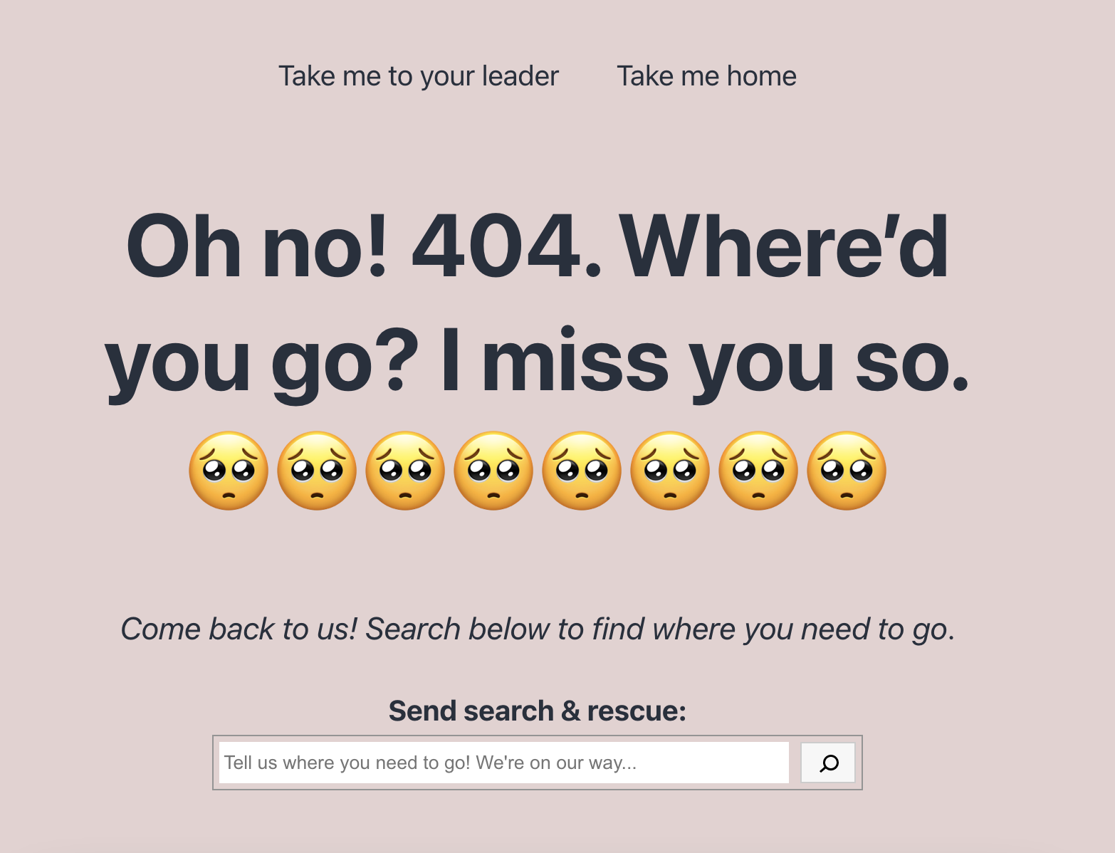
The following is a screenshot of the very fun, custom 404 page that @critterverse made solely using the FSE experience and her amazing design skills. While not all of us have the knack for design that she does, it’s exciting to see what’s possible without touching code:
High-Level Feedback
Here’s what a few folks had to say about the overall experience that’s important to keep in mind as you read the rest of this post:
I didn’t encounter anything that was broken, though several aspects of it could be significantly improved. Everything outlined in the testing flowFlowFlow is the path of screens and interactions taken to accomplish a task. It’s an experience vector. Flow is also a feeling. It’s being unselfconscious and in the zone. Flow is what happens when difficulties are removed and you are freed to pursue an activity without forming intentions. You just do it.
Flow is the actual user experience, in many ways. If you like, you can think of flow as a really comprehensive set of user stories. When you think about user flow, you’re thinking about exactly how a user will perform the tasks allowed by your product.Flow and Context
seems to work as it should, if users can ever find it. It is going to be a real challenge to make the interface spectacularly simple enough for ordinary users to feel comfortable knowing when and how to create their own template parts.
In my head, I know that we are inserting blocks to things other than the contents that goes into the blockBlockBlock is the abstract term used to describe units of markup that, composed together, form the content or layout of a webpage using the WordPress editor. The idea combines concepts of what in the past may have achieved with shortcodes, custom HTML, and embed discovery into a single consistent API and user experience. editor, but in reality, my instinct still tells me to look for something specific to do things, rather than inserting a block. Mainly I think because you need a time to get used to. But starting to feel that there are no visual feedbacks (e.g. different border colour, diffrent panel colour, different look on the sidebarSidebarA sidebar in WordPress is referred to a widget-ready area used by WordPress themes to display information that is not a part of the main content. It is not always a vertical column on the side. It can be a horizontal rectangle below or above the content area, footer, header, or any where in the theme. panel) within the editor to distinguish which are the content blocks, and which are FSE specific blocks (like template part block).
To sum it up, most of the difficulties I had during the test are the same ones I still experience when using GutenbergGutenbergThe Gutenberg project is the new Editor Interface for WordPress. The editor improves the process and experience of creating new content, making writing rich content much simpler. It uses ‘blocks’ to add richness rather than shortcodes, custom HTML etc. https://wordpress.org/gutenberg/ pretty much daily. First and foremost, getting often lost without any visual reference over layout structure, hierarchy, or block boundaries. These range from “it’s all white, where am I?” to “what block am I really editing now?”. Also, I still find it rather annoying that when I want to add a new block below an existing one I have to do a bit of treasure hunting to find the exact point where the magic [+] will appear, opening a new world of possibilities, or just the next block.
The things that were most confusing in early tests are becoming more comfortable. The thing that remains still a little confusing is the plus icons for adding elements. There seems to be a pattern to which types are used and where they are placed, but I have trouble seeing what that pattern is.
These last two comments underscore a high-level usability item that, if improved in either the block editor or site editor, would make a big difference across the collective experience. For now, I encourage those interested in confusion around the + button to follow or chime in on this relevant and comprehensive GitHub issue.
Repeated Feedback: Improving saving & enable the option to preview
These are two big themes that have been carried over from every single test that’s been done with the Outreach Program resulting in a feature on the High Level Feedback post. To better highlight how they’ve been repeated, they have been merged into this section with only new issues or enhancement requests shared below:
Once the design is saved, there is no confirmation but the button is no longer operable. The interface could communicate this better…Unfortunately, the preview looked nothing like the display on the frontend, but I assume that is still in progress. After trying multiple sources, I found that embeds didn’t work and some of the block styles were off.
It was a little confusing when it asked if I wanted to save individual parts of my work. I think at that point, I did a little thinking through the experience and landed on “oh this is like changing the slide vs slide template in Keynote”. It’s hard to know how many people will get to that conclusion.
Because this call for testing required one to remove and then create a new Template Part, this became a focal point for a variety of feedback items. For example, the current experience doesn’t make it clear how to set a name for a new Template Part after one is created causing some testers to create multiple template parts without realizing what was happening. Tied to this, the new Template Part name doesn’t propagate across the rest of the interface after being named making it a particularly confusing experience to know if a part has actually been created. The following issues capture this collective feedback into distinct areas:
Improve template part creation flow to nudge a user to set the name of a new Template Part and to make it easier to preview existing Template Parts.
Finally, there was general feedback around how it’s necessarily clear that one entering a true context shift as the current experience editing and creating Template Parts is almost too seamless. Making this context switch clear has been flagged during other calls for testing and is being explored in this previously opened issue.
The experience of editing a Template Part really does feel a bit like popping the hood, which is something a dramatic context shift could help emphasize even further. The concept of a context shift could eventually be applied to the experience of switching between editing regular content and a Template as well.
When adding and naming the Template part, I can’t tell if the part has been saved and has the new name as there is no visual sign that a part of the template is there at all. That can be very confusing. I ended up with four Parts of template blocks, all stacked up and pretty much overlapping.
One aspect of it that could be improved is that new Template Parts don’t save until you click “Update Design.” If you move away from the block and continue other parts of the design, it appears that it hasn’t saved and you may be tempted to create it again, as I was.
Thus far, the List View is proving to be a helpful navigation tool for making one’s way around the editor. It’s also proving to be a point of confusion mainly due to missing expected functionality, including the ability to drag & drop and remove items directly from the view. Thankfully, expanding the capabilities of the List view is being explored in this issue already including the ability to drag & drop.
The List View was confusing to me, there were Template Parts I thought hadn’t saved properly that suddenly appeared there, they look like duplicates and it didn’t seem possible to delete them.
Quick sidenote about the list view: it would be great if this view had the 3 dots menu for quick actions on items, and if it would allow you to reorder or drag blocks.
Thanks to this test calling for deeper usage of the Navigation Block, there was lots of great feedback gathered around both current pain points and feature requests to make it an even more robust block:
[Bug] Creating a draft page with “&” results in HTMLHTMLHTML is an acronym for Hyper Text Markup Language. It is a markup language that is used in the development of web pages and websites. Entities.
Some of what was brought up also relates to overall work around improving the Link UIUIUI is an acronym for User Interface - the layout of the page the user interacts with. Think ‘how are they doing that’ and less about what they are doing., which is currently in the process of going through a lovely design iteration.
Navigation Block – the two placeholder options don’t look like call to action buttons elsewhere in the UI. I understand they need to be in keeping with the Nav items style but it wasn’t clear they were options without actually reading the text. Could we improve this?
Now that there are starting to be many possible configurations of toggled sidebar states with the addition of Full Site Editing, I can imagine wanting to revisit some keyboard shortcuts to make the open/closing behavior of all the sidebars possible through similar, easy-to-remember shortcuts.
I lost track of the Settings sidebar a couple of times when I had been editing Global Styles because the advanced block controls that usually appear in the sidebar weren’t automatically shown when a block was selected.
The “Navigation Toggle” refers to the WordPress icon in the top left corner of the page, but as a new user I would expect that to take me back to the dashboard. The naming doesn’t seem clear and I had to look up what was meant by Navigation Toggle.
As with every call for testing, it’s not just for finding bugs! It’s also important to hear about features that people reach for and find are missing. This section is a “catch-all” to cover all additional features that were reported that didn’t nicely correspond with a particular block or categoryCategoryThe 'category' taxonomy lets you group posts / content together that share a common bond. Categories are pre-defined and broad ranging..
Allow the ability to resize embeds to create a more consistent WYSIWYGWhat You See Is What You GetWhat You See Is What You Get. Most commonly used in relation to editors, where changes made in edit mode reflect exactly as they will translate to the published page. experience.
Include block type on hover to make it easier to see at a glance while creating what blocks you are working with.
Add an option for fixed positionHeaderHeaderThe header of your site is typically the first thing people will experience. The masthead or header art located across the top of your page is part of the look and feel of your website. It can influence a visitor’s opinion about your content and you/ your organization’s brand. It may also look different on different screen sizes. and Footer Template Parts
While trying to build something for the test (but also when I currently use Gutenberg ) I often find myself hovering on the block icon several times, in order to double-check what kind of block I’m interacting with. In this case, the tooltip says “change block type or style”, which makes sense, but doesn’t help in immediately identifying a block type. Has there ever been an option for a visible label near blocks?
I would have expected to be able to save a Template Part independently of the Update Design button (top right). I’ve been conditioned by Gutenberg to see this as the main “update” / “save” button and I’d expect that to save my whole page (including changes to Template Parts). But I’d expect the Template Part to have it’s own “Save” UI.
Have you ever experienced a particularly delightful 404 page? Maybe it made you laugh or it was built in a way that made it super easy to find your way back to where you needed to be on the site. Currently, this is a part of one’s site that can only be altered with code and provided by the theme causing many of us to be unable to add some extra joy into the universe with helpful, fun 404 pages.
With Full Site Editing though, this is now within our grasps to make our own. This test explores doing exactly that with the option to build a simple 404 page through template editing or to really dive in to make something unique. If you choose to get super creative, please share a screenshot in your comment so we can all marvel at what you’ve made. For inspiration, here’s an example I made:
Testing Environment
While there’s more information below to ensure you get everything set up properly, here are the key aspects to have in place with your testing environment:
Use a test site. Do not use a production/live site. You can follow these instructions to set up a local installLocal InstallA local install of WordPress is a way to create a staging environment by installing a LAMP or LEMP stack on your local computer. or use a tool like this to set up a development site.
Use the TT1 Blocks Theme. If you followed the first call for testing, you’ll need to double-check to make sure you’re using this theme!
Use GutenbergGutenbergThe Gutenberg project is the new Editor Interface for WordPress. The editor improves the process and experience of creating new content, making writing rich content much simpler. It uses ‘blocks’ to add richness rather than shortcodes, custom HTML etc. https://wordpress.org/gutenberg/ 10.1.1 (latest version).
Testing FlowFlowFlow is the path of screens and interactions taken to accomplish a task. It’s an experience vector. Flow is also a feeling. It’s being unselfconscious and in the zone. Flow is what happens when difficulties are removed and you are freed to pursue an activity without forming intentions. You just do it.
Flow is the actual user experience, in many ways. If you like, you can think of flow as a really comprehensive set of user stories. When you think about user flow, you’re thinking about exactly how a user will perform the tasks allowed by your product.Flow and Context
Here’s a basic flow to follow when testing this specific feature. If anything doesn’t make sense, just comment below!
Important Note:
While this call for testing is focused on testing a specific feature, you’ll likely find other bugs in the process of testing with such a betaBetaA pre-release of software that is given out to a large group of users to trial under real conditions. Beta versions have gone through alpha testing in-house and are generally fairly close in look, feel and function to the final product; however, design changes often occur as part of the process. feature! Please know any bugs you find are welcome in your report for testing, even if they aren’t directly applicable to the tested feature.
Setup Instructions:
Have a test site using WordPress 5.7. It’s important this is not a production/live site.
Install the TT1 Blocks theme by going to Appearances > Themes > Add New. Once installed, activate the theme.
Go to the website’s admin.
Install and activate the Gutenberg pluginPluginA plugin is a piece of software containing a group of functions that can be added to a WordPress website. They can extend functionality or add new features to your WordPress websites. WordPress plugins are written in the PHP programming language and integrate seamlessly with WordPress. These can be free in the WordPress.org Plugin Directory https://wordpress.org/plugins/ or can be cost-based plugin from a third-party from Plugins > Add New. If you already have it installed, make sure you are using at least Gutenberg 10.1.1.
You should now see a navigation item titled “Site Editor (beta).” If you don’t see that in your sidebarSidebarA sidebar in WordPress is referred to a widget-ready area used by WordPress themes to display information that is not a part of the main content. It is not always a vertical column on the side. It can be a horizontal rectangle below or above the content area, footer, header, or any where in the theme., you aren’t correctly using the Site Editing experiment.
Testing Instructions:
Helpful Hint: As you go through this test, you might find the List View helpful while navigating between content.
Exploring the 404 template
Navigate to the “Site Editor (beta)” view. This will automatically open the site editor to the template powering your homepage.
Open the Navigation Toggle and head to Templates > 404. This will take you to your site’s 404 page template.
Using the List View, select the HeaderHeaderThe header of your site is typically the first thing people will experience. The masthead or header art located across the top of your page is part of the look and feel of your website. It can influence a visitor’s opinion about your content and you/ your organization’s brand. It may also look different on different screen sizes. Template Part and, using the three-dot toolbar menu, select “Remove BlockBlockBlock is the abstract term used to describe units of markup that, composed together, form the content or layout of a webpage using the WordPress editor. The idea combines concepts of what in the past may have achieved with shortcodes, custom HTML, and embed discovery into a single consistent API and user experience.” to delete this.
From there, select the default Header Block that says “Nothing Here” and, using the three-dot toolbar menu, use the “Insert Before” option to add a block above.
Using your preferred method to insert a block, insert a Template Part Block and select the “New Template Part” option.
Open the Block Settings for the new Template Part block and, under Advanced > “Title”, add in a custom title. For example, “404 Header”.
When you’re done making the changes you want, select “Update Design” and go through the saving flow to save all changes. This should cause the new Template Part to reflect the title you chose.
Adding navigation and getting creative
From there, make sure your focus is still within the new Template Part and add in a Navigation Block. You can choose whether to create a new menu or re-use a previous one.
Add a few links including a link to a page that doesn’t currently exist. To do this, just start typing a title that doesn’t currently exist on your site. For example, “Help”. You’ll then see an option to create a draft page. Do this for at least one menu item. Remember to have fun with this!
Outside of the Navigation Block, add any additional blocks you’d like to in this new Template Part. For example, you can use the Social Icons Block, Search Block, Site Title, and more. Try to add anything that would help orient someone who got lost on your site.
From there, edit the “Nothing Found” Header Block and Search Block to whatever you’d like. You can then add in anything you’d like including images, GIFs, etc.
When you’re done making the changes you want, select “Update Design” and go through the saving flow to save all changes.
View your 404 page on your site by going to yoursiteurl.com/404 (replace yoursiteurl.com with your test site URLURLA specific web address of a website or web page on the Internet, such as a website’s URL www.wordpress.org). Notice that any items you added to the Navigation Block that are page drafts appear but are broken links. You should be able to still view the drafts since you are logged in as an admin. Note: this has been logged as a bug.
Return to the Site Editor and open the Navigation Toggle > Dashboard to view your wp-admin dashboard. Note: there’s a current bug that makes it so you can’t view Page Drafts meaning in the future this will be easier.
Publish, review, and share
Head to Page > All Pages and publish any that need to be.
Once more, View your 404 page on your site by going to yoursiteurl.com/404 and confirm any prior draft Pages now show up properly with correct permalinks.
Share your experience in the comments below or in GitHub directly. You’re welcome to run through the experience multiple times to capture any additional feedback!
If you want to take this further, here are some extra items to explore:
Try adding in columns to your content! Columns are a powerful tool and it would be helpful to get feedback on the experience of using them in a real life scenario with site building.
Create a custom footer template part to replicate the process of creating a custom header template part.
Deeply customize the appearance of the page with custom colors, font sizes, and more. Here’s a quick video demonstrating some of what you can try.
Testing Video:
This video shows the testing flow after the initial testing setup is in place. Of note, this video purposefully does not go into depth in building out a 404 page in order to keep it concise. Don’t let this stop you from getting creative though when you’re testing!
What to notice:
Remember to share a screenshot of what you created if you’re up for it!
Did the experience crash at any point?
Did the saving experience work properly?
Did the saving experience make sense when making changes to the Template Part vs the general content?
What did you find particularly confusing or frustrating about the experience?
What did you especially enjoy or appreciate about the experience?
Did you find that what you created in the Site Editor matched what you saw when you viewed your 404 page?
Did it work using Keyboard only?
Did it work using a screen reader?
Leave Feedback by March 23rd, 2021
Please leave feedback in the comments of this post. If you’d prefer, you’re always welcome to create issues in this GitHub repo directly for Gutenberg and in this GitHub repo for TT1 Blocks. If you leave feedback in GitHubGitHubGitHub is a website that offers online implementation of git repositories that can can easily be shared, copied and modified by other developers. Public repositories are free to host, private repositories require a paid subscription. GitHub introduced the concept of the ‘pull request’ where code changes done in branches by contributors can be reviewed and discussed before being merged be the repository owner. https://github.com/, please do still comment below with the link. If you see that someone else has already reported a problem, please still note your experience with it below, as it’ll help give those working on this experience more well-rounded insight into what to improve.
This session of usability tests covered blockBlockBlock is the abstract term used to describe units of markup that, composed together, form the content or layout of a webpage using the WordPress editor. The idea combines concepts of what in the past may have achieved with shortcodes, custom HTML, and embed discovery into a single consistent API and user experience. patterns and how to move blocks around in the Editor.
Testing script
Imagine you are building a new website for your personal blog. You want to begin by creating your homepage. WordPress offers a new block editor that provides some great choices of block patterns that you can add for creative layouts. Let’s explore the block patterns to create your page.
Log in.
Create a new page.
Add a title to your page.
Keep in mind that the way to add various content to your page is by adding blocks or block patterns. Explore where you might go to add a block or pattern, and add the side-by-side image pattern to your page.
Make that pattern full width.
Below that, add a two-column layout pattern that also includes a Heading or larger text.
Edit the larger text to say something meaningful about your blog.
Now add either a Buttons block, or the side-by-side buttons pattern, whichever you prefer. Rename one button to “Learn more” and the other to “Contact us.”
Move the buttons above the previous block pattern.
Now add a Separator block above and below the Buttons block/pattern.
Publish your page.
How was this experience?
Videos
Video 1 – May 18
Can I grab this and move it? How do I grab this block?
Basically everything I make is in Elementor, so I haven’t really played around with the new WordPress blocks and the new editing capabilities. This was the first time and I actually really enjoyed it.
Video 2 – May 26
Oh, the arrows are the movers. That’s not very clear. I think that needs to be worked on a bit more.
Video 3 – June 2
Warning: some harsh language
Video 4 – June 19
It was intuitive to locate blocks and patterns.
Feedback
As with all the prior videos being shared, please leave some feedback! What are some patterns that pop out to you? What successes do these users have in navigating and creating a post? What challenges become evident in their flowFlowFlow is the path of screens and interactions taken to accomplish a task. It’s an experience vector. Flow is also a feeling. It’s being unselfconscious and in the zone. Flow is what happens when difficulties are removed and you are freed to pursue an activity without forming intentions. You just do it.
Flow is the actual user experience, in many ways. If you like, you can think of flow as a really comprehensive set of user stories. When you think about user flow, you’re thinking about exactly how a user will perform the tasks allowed by your product.Flow and Context
?
As a reminder, if you’re interested in helping with usability testing, there’s a number of things you can try:
You can write a test script that can be usability tested for GutenbergGutenbergThe Gutenberg project is the new Editor Interface for WordPress. The editor improves the process and experience of creating new content, making writing rich content much simpler. It uses ‘blocks’ to add richness rather than shortcodes, custom HTML etc. https://wordpress.org/gutenberg/.
Or simply watch the videos and leave some feedback below.
Thanks for watching and contributing anywhere you can.
GutenbergGutenbergThe Gutenberg project is the new Editor Interface for WordPress. The editor improves the process and experience of creating new content, making writing rich content much simpler. It uses ‘blocks’ to add richness rather than shortcodes, custom HTML etc. https://wordpress.org/gutenberg/ usability testing revolved around the Navigation blockBlockBlock is the abstract term used to describe units of markup that, composed together, form the content or layout of a webpage using the WordPress editor. The idea combines concepts of what in the past may have achieved with shortcodes, custom HTML, and embed discovery into a single consistent API and user experience. for the month of March. The Gutenberg team is looking to push this forward by creating a better UXUXUX is an acronym for User Experience - the way the user uses the UI. Think ‘what they are doing’ and less about how they do it. and including it as a proper block in the block library.
Testing script
Imagine you’re building a new website using WordPress. WordPress now offers a Navigation block within the new block editor. This is what you’ll focus on for this usability test. Let’s create a Navigation menuNavigation MenuA theme feature introduced with Version 3.0. WordPress includes an easy to use mechanism for giving various control options to get users to click from one place to another on a site. using this new block!
Log in.
Create a new post.
Add a title to your post.
Keep in mind that the way to add various content to your post is by adding blocks. Explore where you might go to add a block, and add the Navigation block to your post.
Click the “Create from all top-level pages” option in the block. We’re going to pre-fill this Navigation menu with the site’s top level pages.
First, delete the “Moby Dick” menu item.
Next, move the “About” menu item so that it comes just after “Home.”
Move “Blog” to the right of “Services.”
Next, we’re going to add sub-menu items under the “About” menu item.
The first sub-menu item should be “Mission.” Add a sub-menu item that links to the Mission page.
Now add a second sub-menu item and link it to the “Team” page.
Let’s add some color. Set a background color on this Navigation block and then change the color of the text in the menu items to something you like.
Preview your post.
How was this experience?
Videos
Video 1 – February 12 (I know this is Feb, but I missed a few that month)
I’m getting confused here. Here’s the link to the Team page. I think that’s a link.
[adding background color to Nav block] I’m just not seeing this.
NOTES:
The user tried to delete a nav item by clicking into the text and hitting the Delete key on the keyboard. This only deletes the text, but not the item.
Selecting the Navigation block parent proved too difficult. The user got frustrated which caused them not to see other UIUIUI is an acronym for User Interface - the layout of the page the user interacts with. Think ‘how are they doing that’ and less about what they are doing. parts creating a compounded affect.
Video 2 – March 10
I’m not quite sure how to change the color.
NOTES:
This user also tried deleting a nav item by highlighting the text and hitting the Delete key on the keyboard.
Video 3 – March 17
NOTES:
Finding the block’s background color proved difficult again, but he eventually found it.
Video 4 – March 24
I’m still trying to find the Navigation block.
Feedback
As with all the prior videos being shared, please leave some feedback! What are some patterns that pop out to you? What successes do these users have in navigating and creating a post? What challenges become evident in their flowFlowFlow is the path of screens and interactions taken to accomplish a task. It’s an experience vector. Flow is also a feeling. It’s being unselfconscious and in the zone. Flow is what happens when difficulties are removed and you are freed to pursue an activity without forming intentions. You just do it.
Flow is the actual user experience, in many ways. If you like, you can think of flow as a really comprehensive set of user stories. When you think about user flow, you’re thinking about exactly how a user will perform the tasks allowed by your product.Flow and Context
?
As a reminder, if you’re interested in helping with usability testing, there’s a number of things you can try:
I know this is a bit late, but I’ve got several usability tests to share from January 2020. I spent that month looking into the Columns blockBlockBlock is the abstract term used to describe units of markup that, composed together, form the content or layout of a webpage using the WordPress editor. The idea combines concepts of what in the past may have achieved with shortcodes, custom HTML, and embed discovery into a single consistent API and user experience. in GutenbergGutenbergThe Gutenberg project is the new Editor Interface for WordPress. The editor improves the process and experience of creating new content, making writing rich content much simpler. It uses ‘blocks’ to add richness rather than shortcodes, custom HTML etc. https://wordpress.org/gutenberg/. The Gutenberg Team has been making several changes to help the experience and these videos can help continue the improvements.
This particular test proved to be quite difficult and long due to the nature of the Columns block. Next time around I’ll be sure to limit the set of tasks.
Testing script
Imagine you’ve just been tasked with creating a webpage about pies. WordPress offers a Columns block in its new block-based editor. This is what you’ll focus on during this usability test. Let’s create a webpage about pies using the Columns block!
Log in.
Create a new post.
Add a title to your post.
Under the title add a Separator block. Once it is added, make sure you set it to “wide.”
Next, add a Columns block to the page, and choose the 3-column setting.
In the left column, add an Image block and set the image to be a pie.
In the middle column, add this text:
Key lime pie withdrawal
Not as easy as it sounds
Especially if you are totally addicted.
I can walk past pumpkin all day long
And not dig into it with a tablespoon.
If it has whipped cream, I might take a bite.
Who am I kidding?
Let’s put it where it lives.
If it has sugar, it is mine.
And get out of the way!
In the right column, add another Image block with another picture of a pie.
Set the right column’s width to 20%.
Set the left column’s width to 40%.
Did you notice anything change when you did that? Check the right column again and readjust the width to 20% if needed.
In this right column, change it so the image aligns to the bottom of the column.
Below this Columns block, add a Cover block.
Set the background image to be another picture of a pie.
Add a Columns block inside this Cover block, and choose the 2-column setting.
Make the left column width 70%.
In the right column, add the text “PIES” and change the font to be “Large.”
Below the Cover block, add another Columns block with 2 columns.
In the left column, add the text, “When Alice’s Aunt Polly, the Pie Queen of Ipswitch, passes away, she takes with her the secret to her world-famous pie-crust recipe. Or does she? In her will, Polly leaves the recipe to her extraordinarily fat, remarkably disagreeable cat, Lardo . . . and then leaves Lardo in the care of Alice.”
In the right column, add the text, “Suddenly, the whole town is wondering how you leave a recipe to a cat. Everyone wants to be the next big pie-contest winner, and it’s making them pie-crazy. It’s up to Alice and her friend Charlie to put the pieces together and discover the not-so-secret recipe for happiness: Friendship. Family. And the pleasure of doing something for the right reason.”
Preview your post, and then publish it.
Videos
Video 1 (Jan 8)
The change sign (block transform icon) made me think I was restarting something.
[looking at the multiple + icons everywhere] “It looks like I have multiple columns now. I don’t know what went wrong with this.”
The user struggled with adjusting the width of a single column. It was not clear how to do that.
It’s really hard to find how to adjust the width of this.
Video 2 (Jan 15)
[trying to select the single column block] How do you stop selecting the image?
To me it’s not clear. How do I select the column?
Video 3 (Jan 22)
I’ve never used this software before and I’m not sure how to set the column width.
Up to this point, everyone who has tried to add a Cover block below the Columns block has just added the block inside one of the Columns under the image. At this point things start falling apart because it’s just too many blocks inside a narrow space.
Video 4 (Jan 29)
I can’t find where I can do this. [setting column width]
The instructions were very hard to follow. It’s hard to know where to look and what to click on.
Feedback
As with all the prior videos being shared, please leave some feedback! What are some patterns that pop out to you? What successes do these users have in navigating and creating a post? What challenges become evident in their flowFlowFlow is the path of screens and interactions taken to accomplish a task. It’s an experience vector. Flow is also a feeling. It’s being unselfconscious and in the zone. Flow is what happens when difficulties are removed and you are freed to pursue an activity without forming intentions. You just do it.
Flow is the actual user experience, in many ways. If you like, you can think of flow as a really comprehensive set of user stories. When you think about user flow, you’re thinking about exactly how a user will perform the tasks allowed by your product.Flow and Context
?
As a reminder, if you’re interested in helping with usability testing, there’s a number of things you can try:
Hey there! 👋 I seemed to have missed November’s post, so I’m combining November and December on this one. I have 3 for November and 3 for December.
November focused on the last bit of side-by-side testing. I was trying to understand how users might go about adding elements in GutenbergGutenbergThe Gutenberg project is the new Editor Interface for WordPress. The editor improves the process and experience of creating new content, making writing rich content much simpler. It uses ‘blocks’ to add richness rather than shortcodes, custom HTML etc. https://wordpress.org/gutenberg/ side-by-side. And then inform them about a blockBlockBlock is the abstract term used to describe units of markup that, composed together, form the content or layout of a webpage using the WordPress editor. The idea combines concepts of what in the past may have achieved with shortcodes, custom HTML, and embed discovery into a single consistent API and user experience.-based way to do it and see how that affected their experience.
I also began testing around the List block. This is a natural block when writing up recipe posts, etc. I had an amazing group during WCUS this year help write up this particular script which is shared further below.
In December I wanted to focus on the Navigation block in the Gutenberg pluginPluginA plugin is a piece of software containing a group of functions that can be added to a WordPress website. They can extend functionality or add new features to your WordPress websites. WordPress plugins are written in the PHP programming language and integrate seamlessly with WordPress. These can be free in the WordPress.org Plugin Directory https://wordpress.org/plugins/ or can be cost-based plugin from a third-party.
Side-by-side script for November
Try out the new Block Editor in WordPress! There are a few tasks below. Please talk through them out loud so we might better understand how people think through these actions. Don’t worry, there are no right answers. Thank you.
Log in.
Create a new post.
In the post, add two images side-by-side. How was this experience?
If you haven’t already clicked the “+” icon in the top toolbar to add a block, try that now and add a Gallery block. Now add two images to the Gallery block. How was this experience?
With these various blocks in mind, try adding an image and text side-by-side in your post.
Did you find the Media+Text block or did you solve step 5 by some other way?
If you didn’t use the Media+Text block, try adding it now. Once you’ve added an image and text to this block, flip it so that the image is on the right of the text. How did you like this block?
Next, create some text that is side-by-side. How was this experience?
If you didn’t use the Columns block, please try adding that block to show text side-by-side. How did that go?
Now that you’ve become more experienced with blocks, how intuitive does this interface feel?
Pie recipe script for November
Imagine you’ve created a perfect pie recipe and want to share it with the world! You’ve gathered your notes and are ready to create this new post on your site.
Log in.
Create a new post.
Title the post: “Gutenberg Recipe”.
Add a paragraph describing the recipe: “This is a test recipe of a delicious pie. We love pies as they are tart and sweet at the same time.”
Add an Image block and select a photo of a pie. Make the image full-width.
Add a Columns block with two columns for the ingredients.
In the first column, add a Heading block and type “Crust”.
In the same column, add a bulleted list: • 1 ½ cup cookie crumbs • ¼ cup sugar
In the second column, add a Heading block and type “Curd”.
And in this column, add a bulleted list: • 1 (12 ounce) package of cranberries • 1/2 cup Sugar • 1 orange, zested
Below the Columns block, add a Heading block titled “Directions”.
Now add a List block and change it to a numbered list.
Add each of these to the numbered list:
Preheat oven to 350 degrees F.
Spray a 9-inch two-piece tart pan with cooking spray.
In a medium bowl, stir together cookie crumbs, sugar, stevia, salt, and butter.
Press mixture evenly in bottom and up sides of tart pan.
Bake until set, about 15 minutes.
In a medium saucepan, combine cranberries, sugar, stevia, and orange zest and juice.
Bring to a simmer over medium-high heat and cook until cranberries burst, about 8 minutes.
Preview your post and make any corrections to the layout that you’d like.
Publish your post!
Navigation block script for December
Imagine you’re building a new website using WordPress. WordPress now offers a Navigation block within the new block editor. This is what you’ll focus on for this usability test. Let’s create a Navigation menuNavigation MenuA theme feature introduced with Version 3.0. WordPress includes an easy to use mechanism for giving various control options to get users to click from one place to another on a site. using this new block!
Log in.
Create a new post.
Add a title to your post.
Keep in mind that the way to add various content to your post is by adding blocks. Explore where you might go to add a block, and add the Navigation block to your post.
Click the “Create empty” option in the block. We’re going to create a whole new Navigation menu.
Like all good navigations, make “Home” the first item in the menu and make sure it’s linked to the Home page.
Next, add another item labeled “About” and make sure it’s linked to the About page.
Add a submenu item under the About item. Label it “Team” and ensure it’s linked to the right page.
Next, add another top-level item labeled “Services”.
Then add two more items; one labeled “Blog” and the other labeled “Contact”.
Go back and delete the “Services” item from your Navigation block.
Now change the link for the “Contact” item by linking it to the “Happy Flowers” post.
Change the “Blog” item to say “Archive” instead, but keep it linked to the same page.
Preview your post.
How was this experience?
Videos
Video 1 – Side-by-side (Nov 6)
I’m not able to get them side-by-side.
Gallery block – So would we be able to add more than one picture? Cool. This was easy!
Video 2 – Pie recipe (Nov 20)
The only thing I would add to this I want to be able to do is to change the font and color.
Video 3 – Pie recipe (Nov 27)
This is a little bit complicated.
Okay, we’re getting somewhere finally!
Video 4 – Navigation block (Dec 4)
I’m not absolutely sure how to add a block. So it doesn’t seem to actually be done here (sidebarSidebarA sidebar in WordPress is referred to a widget-ready area used by WordPress themes to display information that is not a part of the main content. It is not always a vertical column on the side. It can be a horizontal rectangle below or above the content area, footer, header, or any where in the theme. block settings).
It did take a little while, but we did get there in the end.
In truthful a little confusing. It became clearer as I went on, but I’m unsure if I’ve done all the tasks as requested.
Video 5 – Navigation block (Dec 11)
About 9 minutes in and the user gives up. They can’t quite figure out how to add a Navigation block. About 8 minutes in they searched the Block Library but were unsuccessful because they didn’t look through every accordion, and they ended up searching for “empty” instead of “Navigation”.
Video 6 – Navigation block (Dec 18)
I expected to see a list of blocks. (referring to the Block tab in the sidebar)
Submenus are proving to be difficult in these usability tests. I know it’s a design problem we’re aiming to solve.
Feedback
As with all the prior videos being shared, please leave some feedback! What are some patterns that pop out to you? What successes do these users have in navigating and creating a post? What challenges become evident in their flowFlowFlow is the path of screens and interactions taken to accomplish a task. It’s an experience vector. Flow is also a feeling. It’s being unselfconscious and in the zone. Flow is what happens when difficulties are removed and you are freed to pursue an activity without forming intentions. You just do it.
Flow is the actual user experience, in many ways. If you like, you can think of flow as a really comprehensive set of user stories. When you think about user flow, you’re thinking about exactly how a user will perform the tasks allowed by your product.Flow and Context
?
As a reminder, if you’re interested in helping with usability testing, there’s a number of things you can try:
I had three usability tests for October. One tested the same “Flower shop” script from the month of September while the other two tested a “Side-by-side” script for October. The goal was to test how people placed various items side-by-side in the blockBlockBlock is the abstract term used to describe units of markup that, composed together, form the content or layout of a webpage using the WordPress editor. The idea combines concepts of what in the past may have achieved with shortcodes, custom HTML, and embed discovery into a single consistent API and user experience. editor.
Testing script
Try out the new Block Editor in WordPress! There are a few tasks below. Please talk through them out loud so we might better understand how people think through these actions. Don’t worry, there are no right answers. Thank you.
Log in.
Create a new post.
In the post, add two images side-by-side. How was this experience?
If you haven’t already clicked the “+” icon in the top toolbar to add a block, try that now and add a Gallery block. Now add two images to the Gallery block. How was this experience?
With these various blocks in mind, try adding an image and text side-by-side in your post.
Did you find the Media+Text block or did you solve step 5 by some other way?
If you didn’t use the Media+Text block, try adding it now. Once you’ve added an image and text to this block, flip it so that the image is on the right of the text. How did you like this block?
Next, create some text that is side-by-side. How was this experience?
If you didn’t use the Columns block, please try adding that block to show text side-by-side. How did that go?
Now that you’ve become more experienced with blocks, how intuitive does this interface feel?
Videos
Video 1 – October 2 (Used Sept’s Flower script)
Is there an option for ‘fit to screen’? Looking for a ‘fit’ option that just automatically detects the size you got and fits the text to full-screen.
“Is there a way to do this more simply?” Uses the arrows movers because drag and drop didn’t work when moving the blocks.
Maybe it would be better to make the column lines locked in place at first?
Video 2 – October 16
No audio.
Video 3 – October 23
I’m not finding anything with just text itself.
I just went to inline image and found that way was easier than the Media+Text block.
Feedback
As with all the prior videos being shared, please leave some feedback! What are some patterns that pop out to you? What successes do these users have in navigating and creating a post? What challenges become evident in their flowFlowFlow is the path of screens and interactions taken to accomplish a task. It’s an experience vector. Flow is also a feeling. It’s being unselfconscious and in the zone. Flow is what happens when difficulties are removed and you are freed to pursue an activity without forming intentions. You just do it.
Flow is the actual user experience, in many ways. If you like, you can think of flow as a really comprehensive set of user stories. When you think about user flow, you’re thinking about exactly how a user will perform the tasks allowed by your product.Flow and Context
?
As a reminder, if you’re interested in helping with usability testing, there’s a number of things you can try:
You can write a test script that can be usability tested for GutenbergGutenbergThe Gutenberg project is the new Editor Interface for WordPress. The editor improves the process and experience of creating new content, making writing rich content much simpler. It uses ‘blocks’ to add richness rather than shortcodes, custom HTML etc. https://wordpress.org/gutenberg/.
Or simply watch the videos and leave some feedback below.
Thanks for watching and contributing anywhere you can.


You must be logged in to post a comment.