WordPress 2.6.5 is immediately available and fixes one security problem and three bugs. We recommend everyone upgrade to this release.
The security issue is an XSS exploit discovered by Jeremias Reith that fortunately only affects IP-based virtual servers running on Apache 2.x. If you are interested only in the security fix, copy wp-includes/feed.php and wp-includes/version.php from the 2.6.5 release package.
2.6.5 contains three other small fixes in addition to the XSS fix. The first prevents accidentally saving post meta information to a revision. The second prevents XML-RPC from fetching incorrect post types. The third adds some user ID sanitization during bulk delete requests. For a list of changed files, consult the full changeset between 2.6.3 and 2.6.5.
Note that we are skipping version 2.6.4 and jumping from 2.6.3 to 2.6.5 to avoid confusion with a fake 2.6.4 release that made the rounds. There is not and never will be a version 2.6.4.
Get WordPress 2.6.5.
Like this:
Like Loading...
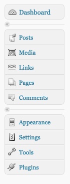
 The community has voted, and the votes have been tallied. The winner of Project Icon, with 35% of the votes, is Entry ID “BD,” otherwise known as Ben Dunkle. Congratulations, Ben! The runner-up was VS, otherwise known as Verena Segert, so we’ll be attaching that set to the alternate color palette that is selectable from the profile screen. As we prepare for RC1, Ben and Verena will be revising a couple of their icons so that both sets will use the same metaphors, creating the colored “on” states, and creating the larger size of each icon for use in the h2 screen headers. We are very grateful to have had the opportunity to select from so many great options, and would like to express again our appreciation for all the designers who participated in the contest. Thanks also to the more than 3700 people who completed the voting survey and took the time to weigh on on the individual icon sets.
| Q.18 Which one of the sets do you think we should use as a basis for the 2.7 icons? |
| Icon Set |
# of votes |
% of votes |
| BD |
1285 |
35% |
| VS |
1080 |
29% |
| GB2 |
424 |
11% |
| OSD |
376 |
10% |
| LS |
300 |
8% |
| GB1 |
235 |
6% |
The wide lead of BD and VS made it clear that voters had a clear preference for these sets.
| Q.20 If you could choose a runner-up, which would you choose? |
| Icon Set |
# of votes |
% of votes |
| VS |
916 |
27% |
| BD |
647 |
19% |
| LS |
522 |
16% |
| OSD |
488 |
14% |
| GB2 |
462 |
14% |
| GB1 |
331 |
10% |
Question 20 was not mandatory, so a few hundred people skipped it, but the responses we did get (3366 of them) reinforced the fact that the two most popular sets were also the most popular 2nd choices, which made the decision of the judges to go with the popular vote an easy one (take that, electoral college!).
A few of the individual icon metaphors also had a significant lead over the other choices.
Dashboard: 1333 voters (40%) chose a house as the best metaphor. We agree, so both Ben and Verena will be replacing their Dashboard icons.
Media: 2097 voters (65%) chose the combination camera + musical note icon, which was part of Ben’s set. We also really loved it, and Verena will amend her media icon to incorporate this idea.
Plugins: 1682 voters (53%) selected the outlet plug metaphor, which both Ben and Verena used in their sets.
Tools: 1581 voters (49%) liked the combination of two tools better than anything else, so Ben and Verena will try this approach.
So those are the results, and soon you’ll see the new icons coming to a 2.7 installation near you.
Need another look at the entries to remember which one you liked best? Here are some reminder images, as well as the identity of each set’s creator.
 BD was Ben Dunkle, a designer, professor and artist from upstate/western New York State. In case you’ve already forgotten, Ben’s icon set is the winner of Project Icon and will become the default icon set after a few minor changes. BD was Ben Dunkle, a designer, professor and artist from upstate/western New York State. In case you’ve already forgotten, Ben’s icon set is the winner of Project Icon and will become the default icon set after a few minor changes. |
 VS was Verena Segert, our runner-up, a designer from Germany who presented sets in both grayscale and blue. Her blue icons received more specific voter comments than the gray ones, so we’re planning the second color palette to be in shades of blue so that we can use the blue icon set. VS was Verena Segert, our runner-up, a designer from Germany who presented sets in both grayscale and blue. Her blue icons received more specific voter comments than the gray ones, so we’re planning the second color palette to be in shades of blue so that we can use the blue icon set. |
  GB was Guillaume Berry, a designer from France who submitted two sets in the same style in order to propose a couple of different metaphors. One of his sets came in third while the other came in last, but whether you only look at the higher scoring set or you combine their votes, Guillaume had the next highest percentage of votes, and many people liked the metaphors he used for various icons. In fact, given the enthusiasm of the community for Guillaume’s icons, we think a great plugin would be one that would allow the user to upload the icon set of their choice. Any volunteers? GB was Guillaume Berry, a designer from France who submitted two sets in the same style in order to propose a couple of different metaphors. One of his sets came in third while the other came in last, but whether you only look at the higher scoring set or you combine their votes, Guillaume had the next highest percentage of votes, and many people liked the metaphors he used for various icons. In fact, given the enthusiasm of the community for Guillaume’s icons, we think a great plugin would be one that would allow the user to upload the icon set of their choice. Any volunteers? |
 OSD was the Open Source Design class at Parson’s in New york City, taught by Mushon Zer-Aviv and consisting of students Alexandra Zsigmond, Ed Nacional, Karen Messing, Khurram Bajwa, Leonie Leibenfrost. Teacher and students worked together to determine their metaphors and visual style. OSD was the Open Source Design class at Parson’s in New york City, taught by Mushon Zer-Aviv and consisting of students Alexandra Zsigmond, Ed Nacional, Karen Messing, Khurram Bajwa, Leonie Leibenfrost. Teacher and students worked together to determine their metaphors and visual style. |
 LS was Luke Smith, a designer from Iowa who specializes in icons among his other design pursuits. LS was Luke Smith, a designer from Iowa who specializes in icons among his other design pursuits. |
If you need to hire an icon designer any time soon, we highly recommend our Project Icon contestants, who all delivered great work in a very short timeframe. It was great to work with all of them, even for such a short assignment.
So, to sum up:
- The winning icon sets by Ben Dunkle and Verena Segert will be incorporated into WordPress 2.7 RC1.
- Someone should write a plugin that would allow anyone to upload a custom icon set (I bet the other contestants could be convinced to release their icon sets for such a purpose).
- 2.7 is still trucking away, but we can always use help with patches, especially for IE6! (I know, that wasn’t in the main post, but it’s true, so hmph)
Thanks again to everyone who participated in this experiment, and we hope you enjoyed it as much as we did. And congratulations again to Ben and Verena!
Like this:
Like Loading...
WordPress 2.7 Beta 3 has been released for your testing pleasure. Here are some of the changes since Beta 2 (over 160 changes in total):
- Numerous style improvements and refinements.
- All admin notices now go under the page title.
- PHP Notice fixes.
- Dashboard widget options now properly save.
- Menu fixes.
- New design for Quick Edit.
- Canonical feed URL fixes.
- Walker fixes.
- An update for Hello Dolly.
- Plugin installer updates.
- Numerous font updates.
- Updated login logo.
- Switch position of “Save Draft” and “Preview” buttons in publish module.
- File upload support for MS Office 2007+ file formats.
- Media upload buttons won’t show if the user doesn’t have the upload capability.
- Canonical redirects only do yes-www or no-www redirection for domains.
- Shift-click checkbox range selection improvement.
- Add New User page now separate.
- Tag suggest only suggests tags (not other taxonomy terms).
- QuickPress shows “Submit for Review” if user cannot publish.
- Private posts/pages, and password-protected posts/pages are rolled into new “Visibility” section of publish module.
If you have already installed Beta 1 or Beta 2, you can update to Beta 3 via the Tools -> Update menu. If you have problems, or if this is your first time in the 2.7 beta ring, you can download and upgrade the old fashioned way.
Get 2.7 Beta 3.
Like this:
Like Loading...
Earlier in the beta period, we put out a call here on the development blog for designers in the WordPress community who might be interested in designing custom icons for the 2.7 admin interface. Over a dozen icon designers from around the world responded, so rather than choose just one, we decided to turn the icon design assignment into a contest so that more people could participate and the community could have a vote in what the new icons should look like.
Once we decided to go with a contest format instead of a single-designer gig, about half the original volunteers changed their minds. The remaining designers each submitted two icons (Posts, Links) in their proposed style. At this stage a couple of designers were thanked for their submissions but eliminated from the competition because their icons were considered too far afield from the WordPress visual style. The remaining designers were given feedback on the icons they had submitted and given about a week to complete the icon set for the menu as well as the list/excerpt icons that are shown on the Edit Posts screen. All but one of these designers finished a complete set, giving us five sets in total.
So now we need to choose a direction. For each of the icon sets, we’ll show you the set itself, the designer’s introduction, and some feedback from the lead developers. After you’ve reviewed all five, place your vote for the set you think has the visual style that is the most suitable for WordPress 2.7. This will be followed by additional votes on specific icons, so if you like the specific image used in one set but like the style of another, you can vote to change the metaphor for a given icon. You’ll also be able to leave general feedback throughout the voting process. When voting has concluded, we’ll review the comments and the votes, and will declare a winner.
Things to bear in mind when making your selections:
A week is not a long time to create 13 icons. The winning set will undergo a revision to be refined, and some icons may be substituted. We asked for all icons in grayscale for the contest. An “on” state and a larger size for screen headers will be designed by the winner. It seemed like too much work to have everyone do multiple states for so many icons.
Ready? Go and take the icon survey. (The survey has now been closed.) Voting will remain open for 48 hours from the time of this post to allow people from all time zones a chance to participate before we close the survey and make a decision (since we’d like to include the new icons in Beta 3).
A Note Regarding the 2.7 Release Date:
As we approach Beta 3, bug tickets continue to be added to Trac, the pain of making things look good in IE6 continues to be felt, and the need to improve accessibility looms. If you love WordPress, are a decent coder, and want to contribute like these icon designers contributed, please consider contributing a patch to help with one of these efforts. Jump right in on current Trac tickets, or pop into the #wordpress-dev IRC channel to ask what to do.
Like this:
Like Loading...
Welcome to the first post of the first blog on the wordpress.org domain dedicated solely to WordPress MU (WPMU).
Sure, this isn’t most likely going to see the light of day for some time, but it’s important to have it here, don’t you think?
Anyway, down to business…
The problem, as it stands is that:
- There isn’t enough centralized support material and communication for WPMU
This is pretty much down to:
- There’s a lot of duplication between WP and WPMU resources, with 98% of regular WP codex stuff applying to WPMU
- There aren’t as many WPMU users / devs… it’s just not as popular because fewer people need it
- And when they do need it, it’s usually for other people rather than themselves – to paraphrase Douglas Adams, I’ll spend days working out how to save myself a minute once a fortnight, but not much bother with stuff that’ll save other people weeks (OK, the last bit was me

- Let’s face it, we’re an offshoot, a kinda more complicated sibling
So, we’re not going to manage to get around this by mimicking what’s happened for WP – we’ve been doing that for a while, without any luck.
So, what I propose is this:
- WPMU (via this site) exchanges linkworthy respect and credit for knowledgeable people penning articles about aspects of WPMU here, as Contributors and Authors
- Those articles are, as they come in, organized a la faq.wordpress.com an dmaintained by their respective authors (with assistance from a set of editors – hopefully promoted contributors / authors)
- That is then integrated into the forums and the forums are integrated into this, creating two places where there’s a great deal of good WPMU knowledge
And that we ditch:
- The WPMU codex – it’s not used, no-one cares, it just give off a bad smell about WPMU an dcan be replaced by a good idex of materials here
- Trying to support WPMU outside of the forums and posts here – this gives us some good focus
How does that sound?
Like this:
Like Loading...
WordPress 2.7 Beta 2 is ready. Here is a quick rundown of changes since beta 1.
- The Upload button didn’t always show. Fixed.
- JS on the Dashboard broke for blogs with no comments, causing several UI elements to “freeze”. Fixed.
- Recent Drafts Dashboard module didn’t show correct times. Fixed.
- Various Autosave fixes.
- Redirect after deleting a page from the editor went back to the deleted page. Fixed.
- Fixed loading of translations for default TinyMCE plugins.
- Added avatars to the edit users list.
- Added some missing translations.
- Fixed some validation errors.
- Fixed some PHP warnings and notices.
- Handle inconsistent file permissions during auto upgrade
- Change Publish box layout to better accommodate internationalized text
- Fix quick editing of the last page in the Edit Pages list
- Fix Screen Options for IE
- Fixes for choose tag from tag cloud
- Rewrite rules fixes for certain hosts
- Don’t check for updates on every page load
- Easier post box dropping
- Preview fixes
- RTL fixes
- Fixed broken wp-mail
- Plugin update and install fixes
- First draft of contextual help tab
If you have already installed beta 1, you can update to beta 2 via the Tools -> Update menu. Beta 1 does have a bug in the automatic upgrade that breaks certain setups, so be prepared to download and install Beta 2 manually if you experience problems.
Get 2.7 Beta 2.
Like this:
Like Loading...
There have been a lot of posts and twitter announcements by people checking out the WordPress 2.7 Beta since it was announced yesterday. What’s your favorite thing about 2.7 so far? Or if you haven’t made the leap yet, to which feature are you most looking forward? Tell us in the poll below.
What is your favorite feature in WordPress 2.7?
( polls)
If you have a extra minute or two, we’ve also put together a survey that lists all the new features and allows you to rate them, as well as give additional feedback if you’re so inclined. If you want to participate, take the 2.7 Beta Favorite Features survey.
Like this:
Like Loading...
The first public beta of WordPress 2.7 is here at last. Join the thousands of people already testing 2.7 by downloading 2.7 Beta 1. As previously mentioned on this blog, 2.7 is bringing a new visual design. This design is almost completely implemented, but there are still a few areas that aren’t quite finished in Beta 1. There are also several glitches in certain browsers. Beta 1 provides the best experience in Firefox and Safari. Don’t worry, we are working on IE and Opera and will have those looking good in time for the final release.
Speaking of the final release, it will not be available on November 10th as originally scheduled. We are two weeks behind schedule at the moment. We need a little more time to finish the visual design, do a round of user testing against that finished design, and do a proper round of public beta testing. Our plan is to keep working as if Nov. 10 is still the release date. However, instead of releasing the final 2.7 on the 10th, we will make a release candidate available instead. The release candidate is intended to be a high-quality, almost-finished release that we are comfortable recommending for broad use. After Nov. 10, the focus will be on fixing high impact bugs turned up by those of you testing the release candidate. I suspect 2.7 will be ready for final release by the end of November. A specific date will be set as we progress through the public beta cycle and get a feel for how solid the release is.
Get WordPress 2.7 Beta 1.
Like this:
Like Loading...
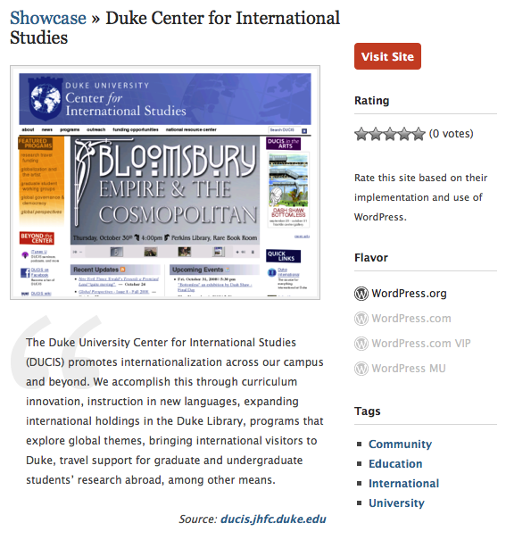
Today we launched the WordPress Showcase, a display of some of the best and brightest WordPress users, who are using it to do a whole lot more than blog.

Pick your flavor and check out the possibilities available through WordPress MU, WordPress.com, WordPress.com VIP and WordPress.org.
Site screenshots are constantly updated, so what you see is a realtime look at what’s going on with our hottest users.
Don’t see something there that should be? Suggest an addition! We’ll check it out and add it to the bunch if we think it makes the cut.
Like this:
Like Loading...
 The community has voted, and the votes have been tallied. The winner of Project Icon, with 35% of the votes, is Entry ID “BD,” otherwise known as Ben Dunkle. Congratulations, Ben! The runner-up was VS, otherwise known as Verena Segert, so we’ll be attaching that set to the alternate color palette that is selectable from the profile screen. As we prepare for RC1, Ben and Verena will be revising a couple of their icons so that both sets will use the same metaphors, creating the colored “on” states, and creating the larger size of each icon for use in the h2 screen headers. We are very grateful to have had the opportunity to select from so many great options, and would like to express again our appreciation for all the designers who participated in the contest. Thanks also to the more than 3700 people who completed the voting survey and took the time to weigh on on the individual icon sets.


Recent Comments