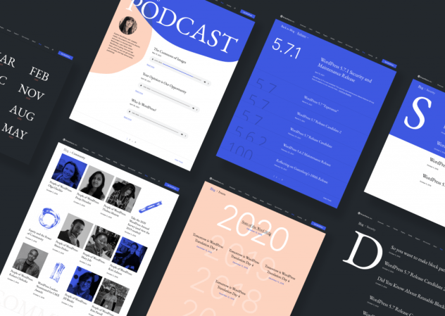
After many years of a tidy, white-space filled design on WordPress.org/news it’s time to bring new life to the way we present our content. So much has changed since this site was first created: the people who read it, the type and variety of what is published, even the way WordPress works has changed.
Which means it makes sense to change our theme.
Earlier this year, Matt requested a new design from Beatriz Fialho (who also created the State of the Word slides for 2020). The design keeps a clean, white-space friendly format while incorporating a more jazzy, playful feeling with a refreshed color palette.

More detail on this modern exploration have been posted on make.wordpress.org/design. I encourage you to stop by and read more about the thoughts behind the coming updates; and keep an eye out for the new look here and across WordPress.org!
Recent Comments