New issue
Have a question about this project? Sign up for a free GitHub account to open an issue and contact its maintainers and the community.
By clicking “Sign up for GitHub”, you agree to our terms of service and privacy statement. We’ll occasionally send you account related emails.
Already on GitHub? Sign in to your account
Chrome: Update the design of the ellipsis menu #3456
Conversation
ff5a8f7
to
1f1e64b
Compare
|
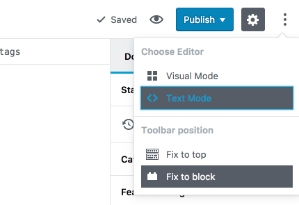
I think this is a huge improvement. It's not exactly what I had in mind in most recent designs, where I was imagining the items not having any icons, just a blank space, and the selected one had a checkmark: But that example above is not ideal either, because some of those plugins, like analyze readability, are also toggles. Which means that mockup has two patterns, 1 pattern which shows two options and a checkmark next to the chosen one in the group, and 1 pattern which shows a mix of direct links and "toggle links" where the toggle link simply gets a checkmark. One idea is to have a menu like this: Options 1 2 and 3 above are "toggles", and you could then end up with something like this: I also think not requiring an icon would make it easier to add items to the menu. But — I'm curious if mergint the two HTML/Visual mode switches into a single toggle is a good idea or not. I'm also not sure my ideas above should hold this PR from getting merged. Curious about your thoughts, @karmatosed |
Codecov Report
@@            Coverage Diff            @@
##           master    #3456     +/-   ##
=========================================
+ Coverage   33.83%   35.03%   +1.2%
=========================================
  Files         253      283     +30
  Lines        6741     8245   +1504
  Branches     1223     1633    +410
=========================================
+ Hits         2281     2889    +608
- Misses       3761     4420    +659
- Partials      699      936    +237
Continue to review full report at Codecov.
|
|
Happy to update the PR to use the no-icon and check-selected pattern if you think it's a better alternative to explore. |
|
I like first mock-up more. Second one has the same problem as block descriptions. Move keyboard shortcuts information to some dedicated and hidden "Help" icon/place. I do not know if you are aware Users will see it for years in the future. Make some orders and rules how you do all this. Will User beginner need it ? Yes, one week max, really max, time. |
|
While this PR is about the design and not the keyboard shorcuts, I tend to prefer the second design personally. And even the shortcuts, it's very different from the "On/Off" because we have too many keyboard shortcuts and we can easily forget them. It's also a widely used pattern to show shortcuts next to menu items (Window Menus for example in several Operating systems) |
|
You are not Windows. People will hook there own things. If you do not make filters other core developers will, when they take over Gutenberg from you. |
|
I actually think having no icons and then the checkmark is more scalable. The weight of the current visual is a little strong. I can see what the goal is, but I think we've gone too far in the heavier UI direction. The feeling of the interface is instantly less clean and fresh. However, it can be resolved and sometimes we just need to see these things, so thank you for showing it. Also worth noting there are issues with contrast on the selected. I like the idea with the toggles combining @jasmussen, at least to visually try. I do not think what we currently have is the best solution. Before merge I would like the visual strength eased up on. |
|
I like it. I think we should probably get this in. In a future iteration, perhaps when we get started on that plugin support, we can look at the concept outlined here, where instead of having two items in a group, one untoggling the other, we have a single item that's either checked or unchecked. |
830f3cf
to
d2cd07b
Compare
There was a problem hiding this comment.
Choose a reason for hiding this comment
The reason will be displayed to describe this comment to others. Learn more.
In this branch, when making a selection via keyboard, focus is moved elsewhere but the ellipsis menu stays open. This is unlike master where at least the menu is closed. I might expect that this would behave like a radio group, i.e. I can use arrow keys, and tab moves between groups. As implemented, tab moves between options within a group, and there is no behavior for arrow keys.
|
Feedback addressed here. It should be good to go |
|
Looks good, probably good to ship. I think we should look at how toggles work inside menus, and find some rules for it. I have looked at how Google Docs handles it, and they actually have two types of toggles inside menus, which should be confusing, but is actually very intuitive. The two toggles are:
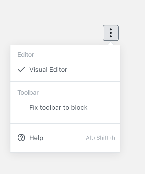
This branch currently does the latter. And again, Google Docs does both, yet manages to stay pretty intuitive. Google Docs checkbox behavior: Google Docs radio group behavior: The reason I'm asking is whether we should adopt both these patterns also. For example, like this: The editor type would use the radio behavior, and the toolbar setting would use the checkbox behavior. The alternative is to have both use the checkbox behavior, but that doesn't seem quite as intuitive to me: The reason I think it's important to clarify this (perhaps separately, let me know if you'd like me to ticket), is that we'd love to get some extensions into this menu: And in this case it'd be nice if the extensions could be either direct links (which can have icons), or checkbox toggles like spell-check or readability checks. Having two entries for every such extension (Enable spellchecking & Disable spellchecking items in a radio group behavior) would quickly make for an unwieldy menu. |
|
Thanks for the explanations @jasmussen I really like the second approach mixing both the "radio group" and the "checkbox" behavior for the Toolbar toggle. I updated this PR accordingly. |
|
|
|
See also #3566. For some history about why in WordPress the word "HTML" was changed to "Text", see https://core.trac.wordpress.org/ticket/20993 Seems to me the argumentations there are still valid, so "Text" is better than "HTML". However, see also https://core.trac.wordpress.org/ticket/38061 which proposes to use "Code editor" / "Visual editor". |
|
Renamed "HTML Editor" -> "Code Editor" |
|
I dig the new phrasing, "Code Editor". I also think it's good to merge early and test, so we can get a feel for it. Gutenberg is a perfect place to do that, because if for whatever unforeseen reason comes up that makes us have to revert, it's an easy change in this phase. |
|
+1 for code editor, that makes sense as a name. This looks good to ship for me :) Thanks for the awesome work. |


related to #3311 (comment)
I don't know if there's an issue for this.
This PR updates the design of the ellipsis menu to match the proposed design.