Using Blockbase for a theme experiment

A glitchy theme, built with Blockbase.

Last week I spent a little time putting Blockbase to the test. I had some explorations into warping text and images using CSS and SVG filters gathering dust, and I thought it would be fun to explore pulling those into a highly-opinionated block theme.

In the past when I’ve done a theme experiment like this, I’ve generally started with something like the emptytheme generator in the WordPress theme-experiments repository. This provides you with just the required files for building a block theme, so it’s a good minimal way to get started.

This time around, I used Blockbase. While it doesn’t yet include a quick generator script like emptytheme does, there is one in the works. In lieu of that, I just created a child theme like I normally would: by adding style.css, functions.php, and index.php files. I also copied over the child-theme.json file from the in-progress Quadrat theme, since I knew that would get me started.

My work in child-theme.json was very brief — I just changed a few variables and used Blockbase’s compiler script once. Then I copied and pasted over the block style effects from the plugin mentioned above.

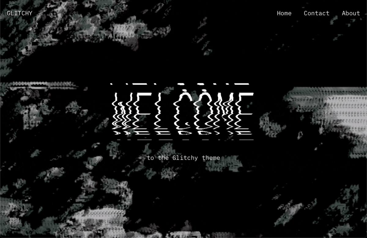
Once that was all in place, I jumped into custom templating. I created just two templates, plus a custom header that featured a video loop of me waving at the camera (but filtered into oblivion using the tools at photomosh.com). I used a “Warped and Stretched Photocopy” block style on the header’s text, and “Photocopy” style on the featured images. Combined together, this created a highly stylized look and feel, reminiscent of (for better or for worse) the old days of Flash animations:

This all worked pretty well in the editor too! Due to a combination of Gutenberg limitations and browser bugs, I ran into an issue getting my SVG filters loaded into the Site Editor’s iFrame, but aside from that, things looked just like the frontend:

The filters did work great in the post editor though, so I can show you how that’s supposed to work by loading the header there:

In the end, the filters bug is not really a fault of the theme, and something I’m sure I could resolve if I choose to devote some more time to this exploration.

The theme is obviously a little over-the-top, but that was really the point of the experiment! I’m amazed I was able to fold my earlier block styles work into such a distinctive, full-featured theme with minimal effort.

Overall, I found that the benefit to using Blockbase was peace of mind. Compared to starting fresh or using emptytheme, Blockbase ensured that I had a fully-functional block theme immediately. It already contained extra templates for pages like 404 and search, and it was full of little CSS fixes for things that full-site editing just doesn’t quite support yet.

This eliminated a lot of extra busywork, and allowed me to dive right in and focus on the theme-building aspect that’s most exciting for me: the theme’s design and creativity.

The code for the theme is over here in case anyone would like to poke around:

https://github.com/Automattic/themes/tree/try/glitchy-theme-experiment/glitchy

I look forward to seeing Blockbase spark the creation of many more themes!

Designing a Gutenberg-Powered Theme: Music

Kjell Reigstad walks through his experience designing a block-powered theme.

Last week, Allan Cole and I shared a new Gutenberg-powered theme called Music. In this follow up post, I’m going to take you through the design process for the theme. At its core, this felt a lot like a typical theme design process, but I did learn a lot about block-based design along the way. 

Blocks

When Allan and I decided to make this theme, we already had a homepage comp featuring a handful of blocks. That comp did a great job of setting the tone for the design aesthetic. To get things going, I decided to apply that aesthetic to the other default Gutenberg blocks. I worked through the Gutenberg Blocks Sketch document from my last post, updating styles as I went.


Working this way was great for a couple reasons. First, it helped me focus — I’d never designed a block-optimized theme before, and this kept my design explorations squarely on the blocks themselves. I thought,  “Gutenberg is all about blocks, right? I’ll design some blocks.”

Second, the Sketch file allowed me to see every single block style in one place. In effect, I was creating a sort of pattern library as I went. I thought this was pretty cool, and figured it’d come in handy later on when we began development.

As I got further through these block designs, I realized the need to see all of these individual blocks in context; I’d design a wide-width cover image block, but I had no idea how it’d look in use. So I began dragging blocks around and stacking them up to get a sense of how they’d feel together.

Testing-Ground.png

This helped a little bit, but still wasn’t enough. At this point, I realized something that should’ve been obvious: blocks are not a theme. They’re just part of a theme. By designing blocks first, I’d been avoiding the big picture. Users will never see blocks all by themselves — they’ll exist within full pages. I needed to design more pages. 

Pages

My initial homepage design comp introduced a rough idea of a header and an off-centered text column. I began by duplicating that initial page and clearing out all the blocks on it, then pulled together some sample content. Looking at the project through the lens of my imagined client (the band Superserious), I was able to think through examples of blocks and block combinations that might exist on a real site: the columns block to display album information, the table block to display tour dates. This felt much more effective than randomly placing blocks on a page.

Around this time, I hit my stride, design-wise. I’d lay out a page using my existing blocks and the sample content. Then I’d iterate and experiment with everything on that page. Once things looked right, I’d migrate any new block tweaks back to the global symbols and start fresh on the next page. After a little while, I ended up with a solid set of sample pages.


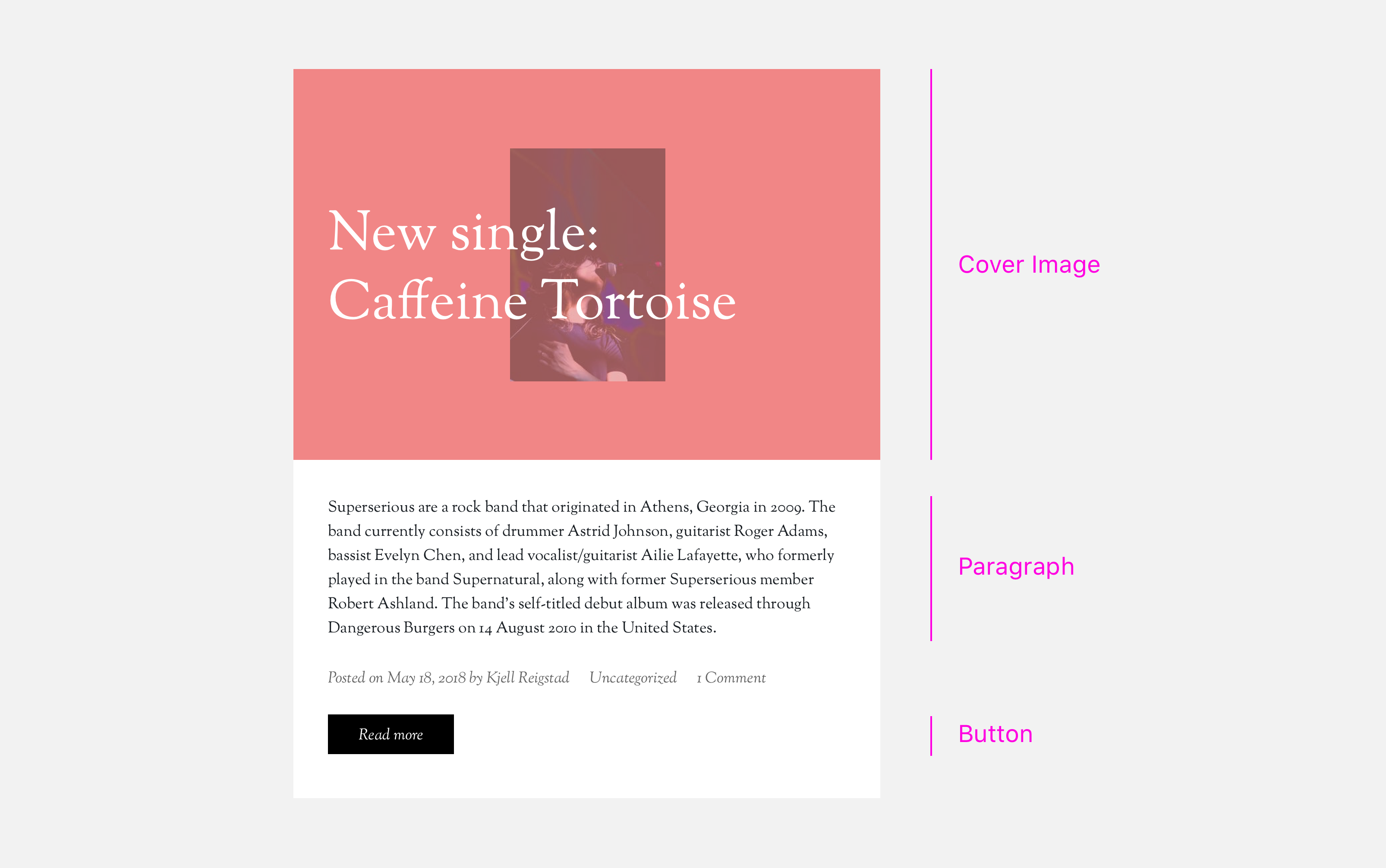
Backing up and thinking about page design helped me shift focus to other, more traditional components that needed to be designed too: archive pages, page footers, post headers, etc. Designing these wasn’t all that different than it would’ve been without Gutenberg. In a way, we’ve all been designing with blocks all along — we just hadn’t called them blocks. Take a look at this entry summary:
Entry-Summary.png

If I’d designed this theme pre-Gutenberg, I still would’ve designed each one of those pieces — they’re all fairly standard parts of a theme. But thanks to Gutenberg, each piece is part of a clear pattern library, to be reused throughout the design by me and by the user. That’s pretty cool.

I’d gone into this project thinking I’d spend most of my time styling individual blocks, but I ended up splitting my time pretty evenly between designing block variations and overall page elements. In that sense, this wasn’t as drastically different from a traditional theme design as I’d anticipated.

Prototypes

I’d been getting ongoing feedback from Allan throughout the process above, but once we were happy with the page designs above, we gathered  with the rest of the Theme team to get broader design feedback. To help with that process, I pulled all my comps together into a prototype. This took just a few minutes to do, and really helped others get a sense of how the theme will work in practice.

I created two separate prototypes with Invision: one for desktop and one for mobile. If my transition from block design to full-page design was about looking at the bigger picture, these prototypes stepped back still further: they showed us the context around that big picture. We were all able to see the designs on-device and test some basic interactions. 

The team’s feedback was (as usual) very helpful — we made some subtle revisions to text contrast, adjusted a number of margins, and kicked off a lot of iteration on the mobile menu treatment.

Development

Allan had been focused on the build from the beginning, and had the majority of the framework in place at this point. After our design feedback session, I jumped into the code too.  

From the development angle, we’d already determined a few things in the design that we couldn’t do, or that would take too much effort. For instance, in my initial design comp I’d had a series of backgrounds run down the page. Gutenberg doesn’t have a method for doing something like that today; despite my wishful design thinking, there’s no method for layering a background behind a group of blocks. We could’ve accomplished it through customizer settings, but we shelved the idea in favor of keeping things simple. We also abandoned a bunch of the play buttons I’d originally included, since those’ll require some custom blocks (more on that later). 

Once I jumped into the code, my main revelation was that there were way more block options than I’d originally anticipated. A number of blocks had options I’d never noticed before. I hadn’t realized that paragraph blocks could be set to full width, or that cover image blocks could be floated left or right.

In addition, I realized some design decisions I’d made were actually supposed to be user-editable: I’d overlooked the fact that users can edit the text alignment and image opacity for the cover image block. This required more design exploration, but it guided us towards a much more customizable theme — definitely a win in the end.

Beyond those updates, the majority of the design-oriented development work involved minor fixes and adjustments — polishing up the CSS to make sure it aligned with the intent of the original design. 

Next steps

Now that we’ve had our initial release, Allan and I plan to build a separate plugin with complementary music-centric blocks, like a tour dates block and a mashup of a cover image and an audio player. We’ll hope to showcase those at some point in the future.

In the meantime, keep an eye out for the next post in the series: Allan’s experience from a development perspective.
 

Music: A Gutenberg-Powered Theme

Announcing the Music theme: an exploration of how Gutenberg can transform theme design and development.

A couple months ago, I created a Sketch document to assist with the design of block-driven themes. I posted about that here on Themeshaper, and provided a couple short examples of how it could be used in a theme design workflow.

Since then, Allan Cole and I have been working to make one of those examples — a site for an imagined band named Superserious — into a working example of a Gutenberg-powered WordPress theme. We named the theme “Music.”

Allan and I set out to experiment, learn, and create a resource for the community. We’ve documented our experience designing and building this theme, and will be publishing our notes in a series of posts here on Themeshaper.

To kick things off, we’re releasing Music on GitHub today. We’d love for you to give it a spin, tinker with it, and explore how it works with Gutenberg. Here are a few things to look out for:


Design

Our design goal for the theme has been to show that it’s possible (and encouraged!) to make a Gutenberg theme that doesn’t necessarily look like Gutenberg. We wanted to create something bold and a little experimental; a theme with somewhat aggressive, non-standard styles.

Gutenberg gives users unprecedented control over their site design, opening the door for variety and experimentation. Our favorite example of this is our cover image blocks. They look great out of the gate, but users can adjust the image, alignment, and color to achieve a wide range of looks:

cover-images.png


Development

You’ll be happy to hear that the overall theme development process wasn’t all that different with Gutenberg. Common patterns like headers, footers, and loops work just as you’d expect in a Gutenberg-powered theme.

In many areas, Gutenberg makes things easier for both users and developers. For instance, full-width header images used to require a custom-built customizer or theme option solution, but now they’re essentially built in. This was important to keep in mind while building the theme, and was a very positive change for development.

Creating stylesheets for blocks was pretty straightforward. Expanding on the built-in stylesheets in _s,  we added a blocks.scss file to the SASS directory and placed all of our block-specific styles and overrides there. This kept everything nice and organized and is likely to appear in _s in the future.

Since Gutenberg is output by the_content(), we learned to take special care with any wrapper divs that might clip or obstruct the expected behavior of Gutenberg blocks. We’ll talk more about that in a follow up post.


Block Styles

We’re truly excited about the custom editor styles that ship with Music. These styles are a breakthrough: they give users a much clearer sense of what their visitors will see on the front end.

Best of all (for theme developers at least), the editor styles were a breeze to integrate! We built all of these in over the course of just a few hours.


Like most of the work we do, the Music theme is open source. You can find it on GitHub:

https://github.com/automattic/musictheme/

If you’d just like to see the front end, feel free to click around our demo site here:

https://musictheme.mystagingwebsite.com/

In many ways, designing and building this theme was similar to the way we’ve made themes in the past — but we did carve out a few new practices along the way. Allan and I will be sharing them with you in upcoming posts. In the meantime, we encourage you to download, install, and experiment with Music yourself!


Read part two of this series: Designing a Gutenberg-Powered Theme: Music

What We Look for in Themes for WordPress.com

What kinds of themes do we look for when we add to our collection on WordPress.com? We get this question a lot, both from existing and potential theme shops. And while some of the specifics evolve over time, the principles of what makes a good theme good remain the same. Whether it’s on WordPress.com or not.

When reviewing themes for WordPress.com, we never accept a theme based on design alone. We want to see the entire theme experience and for that you have to look at the user experience and code too. Why? You can have a beautiful design, but still make a bad theme. So we always look at three aspects, what we call the Three Amigos, named after a popular American comedy movie.

Design

We consider a lot of different design aspects. In general, we look for a strong grasp of design principles, especially methods that help establish harmony and unity:

  • Perspective: sense of distance between elements.
  • Similarity: repeating similar – but not identical – elements with strong visual connections.
  • Continuation: the sense of having a line or pattern extend throughout a design.
  • Repetition: elements being copied or mimicked numerous times.
  • Rhythm: achieved when recurring position, size, color, and use of a graphic element has a focal point interruption.
  • Altering the basic foundation of the design achieves unity and helps keep interest.

Code

We look for themes that follow the WordPress.org Theme Requirements and WordPress.com Theme Requirements.

User Experience

We run through setup to see how challenging it is to make the theme look like the theme demo. Complicated theme setups cause a large amount of user frustration, refunds and theme switches. We look at theme options to see if they’re intuitive to set up, simple, or complex. Any patterns that may confuse WordPress.com users are noted. User experience might just be the most important thing. You can’t use a theme if you can’t use it.

We’re always open to exceptions, if they can be justified by an innovative or creative theme that users will love.

And one last note – whether our marketplace is officially accepting new theme shops or not, we’re always looking for amazing, new themes. Make one, put it out there, and we’ll probably find it.

Happy theming!

Powering Your Design With WordPress on WordPress.tv

If you enjoyed the Powering Your Design With WordPress article in spring you can now see the presentation that inspired it on WordPress.tv courtesy of the fine folks at the Future of Web Design. Go Check it out!

And speaking of FOWD, it’ll be rolling back into London May 14th – 16th, 2012. I heard some great presentations, met some awesome people, and had a great time there in 2011. I’m sure 2012’s FOWD London will be even better.

Powering Your Design With WordPress

Can you use WordPress to power your web design work? Of course you can. But how? That was the subject of a talk I gave at the 2011 Future of Web Design conference this May in London. If you missed FOWD you missed a great time and some awesome presentations but you didn’t miss everything. The video is available on WordPress.tv and I’m going to share some of the ideas I brought up in my talk right here. Including a free custom theme for you to use in your own projects.

I’ll presume here that you’re already interested in WordPress if you’re reading this but in case you’re not, why WordPress? What’s the big deal? Well, right now, about 14% of the web is built on top of WordPress. That means, as web designers, it’s important that we get this whole theming thing right. Tipping point numbers like that mean more and more of your clients are going to be asking for WordPress. It’s probably starting to happen to you right now.

You’re already a web design expert. You should be a WordPress theme expert too.

Continue reading “Powering Your Design With WordPress”