Theme patterns for the Site Editor

Learn how to use Template Part and Query Loop patterns to provide users with more design options.

We’ve been bundling block patterns with all of our themes for quite a while now, but recent improvements to the Template Part and Query Loop blocks has opened up a whole new world for how patterns can be used.

Both blocks can now display a carousel of block patterns in their setup state, allowing users to choose between a menu of pre-designed versions of these blocks. These patterns can be bundled with your theme, so that users have a wide range of pre-designed header, query, and footer options available to choose from in the Site Editor:

The only difference between these and other patterns you’d build is that they include a special blockTypes property to let Gutenberg know which block to associate them with. Here’s a simplified example:

register_block_pattern(
	'theme/pattern-slug',
	array(
		'title'       => _x( 'Pattern Title' 'theme-slug' ),
		'blockTypes'  => array( 'core/template-part/header' ),
		'content'     => '<!-- Your Pattern Markup -->'
	)
);

The markup above specifies that this pattern should be surfaced for a Header template part block. The value there would core/template-part/footer or core/query if you were designing a pattern for those blocks instead. (This property also powers pattern transforms, but that’s a topic for another time).

Once you register a pattern that way, it will show up in the carousel for the specified block. It’s as simple as that!

There are already a few Query Loop patterns bundled with Core today that use this method, and the header patterns shown in the video above are actually from a Gutenberg PR I’m working on as well. I’ve prepared a quick code example using our in-progress Quadrat theme to show how they could be bundled — we definitely plan on including a handful of these sorts of patterns in our block themes moving forward.

https://github.com/Automattic/themes/pull/4104

When combined together, Header, Query Loop, and Footer patterns allow you to mix-and-match pre-designed sections to create your entire website. I’m truly excited to see not only how themes use this feature, but how the Pattern Directory might provide hundreds more options for these blocks. This feels groundbreaking for WordPress, and I can’t wait to see how it turns out.

Introducing Seedlet

A typography-led theme, built for the future of block-based theming.

This week the Automattic theme team launched a brand new theme called Seedlet. Seedlet is a simple, typography-driven foundation for folks to build their websites on. Its styles are opinionated, but generic enough that the theme can apply to a wide variety of different use cases.

This is a particularly exciting launch for us, because not only is Seedlet a lovely theme on the front end, but its backend was crafted with the future of theming in mind.

It ships with block patterns

As we’ve written before, block patterns are an incredible new tool for theme authors. We anticipate building these into every one of our themes going forward, giving users easy shortcuts to creating some of what they see in the theme demo.

Seedlet ships with a few patterns. Two of them leverage some creative use of gradient background presets, and the other makes your posts appear to snake down the page like a vine.

It’s built to be flexible

Behind the scenes, Seedlet has been built with a comprehensive system of CSS variables. If you’ve seen our Varia theme, you’ll be somewhat familiar with the system. Essentially, it’s a tiered system of variables inspired by modular CSS. In effect, everything from the site’s color palette to its spacing and structure is hooked into CSS variables.

Seedlet uses CSS variables as design tokens, instead of the SASS variables used in Varia. By relying on CSS variables for all of the core style attributes, we’re able to bridge the gap between the front end and the editor styles. If we change the value of Seedlet’s --global--color--background variable, the background of the site will update in both the front end and the editor immediately, with no compiling necessary.

CSS variables are also easily manipulated in the Customizer (as in Seedlet’s custom colors implementation), or in child themes. In the tests we’ve done, you can easily create a drastically different child theme by modifying only Seedlet’s CSS variables. Stay tuned for more to come on this, as we build out the first round of child themes based on Seedlet.

It’s ready for our block-based future

Seedlet’s extensive use of CSS variables also sets it up nicely to integrate with the block editor’s upcoming Global Styles functionality. CSS variables are what make Global Styles work, and Seedlet is full of them.

To demonstrate this transition, we put together a child theme that maps a number of Seedlet’s CSS variables to Global Styles values defined in experimental-theme.json. That, plus a few block templates, results in a fully functional, block-based version of Seedlet. You can explore this today by visiting Seedlet’s GitHub repository:

https://github.com/Automattic/themes/tree/master/seedlet-blocks

We plan to iterate on (and eventually launch!) this block-based version alongside the standard version of Seedlet.


We’re excited to see how Seedlet evolves as we continue moving towards block-based themes. In the meantime, give Seedlet a try, and feel free to contribute on GitHub if you’re so inclined.

Visit Seedlet on:


For more block-based exploration using Seedlet, check out this demo using Seedlet on the Gutenberg Times livestream:

Exploring Global Styles

Note: The code samples here are out of date. Please be sure to check out the block editor documentation for the latest on how to implement Global Styles.

Global Styles is an aspect of full site editing that will have a major impact on theme development. To further my understanding of this feature, I explored adding support for it to the block-based version of Twenty Twenty that Jeff Ong recently shared.

Some background: Global Styles aims to bring site-wide controls for things like colors, typography, and spacing into Gutenberg. The originating GitHub thread for the effort is a great primer on its goals and scope. From a technical perspective, Global Styles currently works by using CSS variables to define styles. A set of controls are being developed to allow users to edit those variables within the Gutenberg UI.

A lot of Global Styles work is still in flux, but early pieces are available for themes to experiment with. For example, while using the latest version of the Gutenberg Plugin, themes can define a base set of Global Style variables in an experimental-theme.json file. Here’s a simple example of what one might look like, courtesy of Andrés Manerio’s global styles demo theme:

{
    "color": {
        "background": "#fff",
        "primary": "#00f",
        "text": "#000"
    },
    "typography": {
        "font-scale": 1.2,
        "font-size": "16px",
        "font-weight": 400,
        "line-height": 1.5
    }
}

Each of these are automatically rendered out as CSS variables that the theme can hook into. On the front end, this equates to:

:root {
    --wp--color--background: #fff;
    --wp--color--primary: #00f;
    --wp--color--text: #000;
    --wp--typography--font-scale: 1.2;
    --wp--typography--font-size: 16px;
    --wp--typography--font-weight: 400;
    --wp--typography--line-height: 1.5;
}

Theme authors can pull those in like any other CSS variable. For example:

p {
    color: var(--wp--color--text);
    font-size: var(--wp--typography--font-size);
    line-height: var(--wp--typography--line-height);
}

To help wrap my head around this, I took Jeff Ong’s work on the Twenty Twenty Blocks theme, and adapted it to use CSS variables as defined in a brand new experimental-theme.json file. You can browse this here:

https://github.com/WordPress/theme-experiments/pull/26

This exercise was relatively straightforward. The concept really shines when thinking a little farther out though. Once I had those new variables in place, I tried them alongside an in-progress Gutenberg PR to add a Global Styles sidebar to the beta site editor. This provides a vision of how style editing might feel in the future:

This is still very early and very buggy, but the ability to modify these values globally in a single place is still very exciting. This is something my colleagues and I are looking forward to implementing into our themes when it’s ready.

In case anyone wants to dig in to the exploration, the full code and some instructions are available over in the WordPress/theme-experiments repository. Give it a test, and try adding an experimental-theme.json file to your block-based theme experiments as well.

For more information on Global Styles, follow the project board on GitHub, and consider joining the bi-weekly Block-based Themes meeting in the #theme-review channel of WordPress.org’s Slack.

Finally, if you’ve already given Global Styles a try, I’d love to hear about it! Please share your work in the theme-experiments repository, or drop a link into the comments.

Creating a Block-based Theme Using Block Templates

This post outlines the steps I took to create a block-based theme version of Twenty Twenty. Thanks to Kjell Reigstad for helping develop the theme and write this post.

There’s been a lot of conversation around how theme development changes as Full Site Editing using Gutenberg becomes a reality. Block templates are an experimental feature of Gutenberg (as of 7.2.0), and using them to create block-based themes is in exploratory stages of development. 

A block-based theme is a WordPress theme with templates entirely composed of blocks so that in addition to the post content of the different post types (pages, posts, …), the block editor can also be used to edit all areas of the site: headers, footers, sidebars, etc.

Gutenberg Handbook

Before diving in, I’ll reiterate that much of how this works is subject to change. This spec is in a very early stage. I hope by writing this, your interest is piqued to learn more and contribute your own experiment to the WordPress theme experiments repository.

Step 1: Create the theme project

In its simplest state, a block based-theme’s structure should look something like this:

theme
|__ block-templates
    |__ index.html
|__ block-template-parts
    |__ header.html
    |__ footer.html
|__ functions.php
|__ index.php
|__ style.css

This is refreshingly simpler than most WordPress theme boilerplates. Here’s a quick overview what each file and directory does:

  • block-templates/: page templates that are composed of blocks. These follow the same template hierarchy as traditional themes.
    • index.html: the primary / fallback template to generate a post or page. (Analogous to index.php in traditional theme templates.)
  • block-template-parts/: the common collections of blocks to be used in block templates.
    • header.html: The global header, expressed in Gutenberg-generated HTML.
    • footer.html: The global footer, expressed in Gutenberg-generated HTML.
  • functions.php: This contains the usual theme setup and any other reusable functions.
  • index.php: This is actually just an empty file. You can technically remove it, but it’s a good habit to include an index file in every directory.
  • style.css: Contains your theme’s styles as usual.

Recreating Twenty Twenty as a block-based theme required adding a few extra stylesheets. Overall, I chose to add no extra page templates to keep the demo as understandable as possible.

Step 2: Create the block templates + block template parts

There were just two that needed to be totally rebuilt as blocks: the header and footer. The process for turning these areas into block templates was something along the lines of:

  1. Attempt to create the template parts in the block editor
    • This can be done in a draft post or page. If you’ve enabled the Full Site Editing experiment in the Gutenberg plugin, you’ll see a new admin panel area Appearance/Template Parts — an area where in the future I could create, store, and edit the block template parts in my theme.
  2. Style them as closely as possible using the editor
  3. Add block style variations + additional theme CSS to address any gaps that the core editor
    • Most of these styles were already present somewhere in the Twenty Twenty theme CSS, so I just needed to make minor modifications to assign them to the new blocks.

Step 3: Save those block templates + template parts as distinct files

When Full Site Editing is enabled via the Gutenberg > Experiments panel, Gutenberg will expect that your theme provides block templates, overriding the normal templating behavior:

Once I had my template parts designed and displaying properly, I would switch over to the Code Editor view, copy the markup generated, and paste the code into its respective file within my theme directory’s block-template-parts folder.

Edit: there’s an easier way to do this without switching to the code editor. You can select all blocks (Meta+A), copy (Meta+C), and paste into your text editor.

Step 4: Add theme starter content

In order for the theme to be populated with pages and content, I borrowed the official TwentyTwenty theme starter content. This step wasn’t 100% necessary, but a nice addition to have some content when someone activates the theme on a fresh WordPress site.

Demo

Here is the result: a site running the block-based Twenty Twenty.

Home page of the Twenty Twenty block based theme demo site.

Potential Block Improvements

Converting the header and footer to blocks helped me identify some functionality that would be nice to add to core blocks. Some of these are already in the works.

  • Navigation block
    • Control over how the menu is laid out and collapses in different viewports (#16829)
  • Columns Block
    • The ability control the padding and margins (#10730, #16660)
    • Adjusting the size of one column, the remaining columns don’t resize equally (#19515)

How is this better than what we have now?

The structural block-based theme changes are generally not obvious on the front end. The process of switching between the Code editor, a template file, and previewing the site to achieve the intended design was tedious. However, this is just an interim step before we’re hopefully able to create and edit our theme (and your entire site) via Gutenberg.

WordPress admin screen showing a block template part being edited.

The end benefit will become most apparent when the user can edit every piece of the page individually using Gutenberg. Being able to compose, manage, and reuse parts of your theme all within one visual interface is an exciting idea and one that’s close to reality.

The other exciting aspect of this process was that it required very little PHP — just a few block style variation declarations and standard theme support registration. Everything else is CSS and HTML generated by the editor. To me this feels like a step in the right direction, lowering the barriers to entry for folks that are new to theme development and WordPress.


I invite you to try it out; your comments and feedback are more than welcome. The source code for this theme is available on GitHub:

https://github.com/WordPress/theme-experiments/tree/master/twentytwenty-blocks

In that repository, you’ll find a handful of other block-based theme experiments: converted versions of Twenty Nineteen, the Gutenberg Starter Theme, and a theme called Parisienne. Each contains instructions for installation and activation.

By the way, the theme-experiments repository is open for PRs! I’d love to see more people creating and testing themes that use this method: that’s the only way it’ll grow and improve.

Feel free to ask questions in the comments or in the repository, and thanks for reading!

Blocks, templates, and styles: architecture for a Gutenberg world

Exploring ideas about the evolution of layout and presentation in a post-Gutenberg world

What described below is an broad idea, some thoughts on one way the WordPress ecosystem might evolve in response to the new capabilities of Gutenberg. Huge thanks to Kjell Reigstad and David Kennedy for helping me think through these concepts!

Traditionally, themes have been the only authority when it came to the layout and presentation of a WordPress site. They provided the entire page structure, typography, the color scheme, the menu functionality, the responsive rules, and more. Themes generally had the full power to dictate if and how users could customize each of those elements. 

With the advent of Gutenberg, we’ve seen some of those responsibilities shift. Regardless of their theme, users can now add responsive column-based layouts to any page, assign custom colors to most of their content, and insert rich elements anywhere within a post or page. As a result, some of the responsibilities for the design of a site are blurred: The theme takes care of some aspects, while Gutenberg handles others. Much of that architecture is still to be defined as Gutenberg moves into Phase 2 and beyond. 

Gutenberg brings many opportunities to WordPress, but the biggest impact comes from the way it can enable a much clearer product architecture — one which enables modularity, consistency, and interoperability — and the positive impact that can have on the end user experience of WordPress. 
To that end, it can be helpful to think of layout and presentation not as the “Theme”, but as a set of interrelated pieces, each with their own set of responsibilities, working together to create a site.

Blocks

A block is a component that exists visually a page. It can be a “simple block”, like a paragraph or an embed; or it can be a “complex block”, which has a layout of multiple nested blocks, like a testimonials section. This distinction doesn’t necessarily matter to the user as there’s a unified insertion and discovery mechanism. Blocks can contain placeholder content that is neutral — in other words, they start as a “blank slate”, except for placeholder content that guides users as to how to add content to the block. 

A block can contain layout information, including media queries that define how the block behaves responsively in different viewports. A block could conceivably define styles that would override the ones provided by the template or the global styles, in order to create a unique presentation for a particular block.

Templates

While Gutenberg makes it easy to create a custom, complex page layout from scratch, the process of starting with a blank slate and designing a layout that looks good will likely still be daunting for many users. Giving users access to a collection of pre-built Gutenberg page templates would enable them to get started more quickly and simply tweak the template to their needs. 

A template would define a collection of blocks in a particular order and layout that make up an entire page. In addition, templates can contain “starter content” — editorial boilerplate text and media so that a user can simply tweak and replace rather than having to start from scratch. The concept of a template library would mean that there could be a core library of basic templates, in addition to non-core templates that can be developed by anyone and installed separately (similar to how blocks work). 

Styles

Styles would define the global aesthetics of the site, and would provide a central definition for typography, colors, spacing, icons, and more. Brent Jett has suggested some interesting ideas for how this might manifest on the user-facing side. Styles may also provide some global guidelines for layout, such as global settings for responsive behavior, etc. Layout that is specific to a page template or a block should be defined locally by that element, though.

Themes

Given all the new controls over layout that blocks and templates can provide, what does a theme mean in this new world? It seems that themes can become more lightweight. Perhaps a theme is simply a JSON wrapper that defines the components of that theme — identifying the blocks, templates, and styles that make up the theme. Rather than bundling all of the parts of the theme in a tightly coupled piece of software, the theme could simply be a high-level definition that identifies the modular dependencies (styles, templates, blocks) that need to be installed. When a theme is deactivated, a user could even have the option to keep the templates and blocks in their library for future use. This could allow for greater flexibility but also greater standardization, creating a consistent and modular framework for shaping how sites get built in the future.

We all know that themes will evolve, and this is just one early idea. As we move forward together, WordPress will surely benefit from the sharing of ideas and explorations around the future of themes. If you have a vision yourself, please share it! Feel free to use the comments below, your own blog, Twitter (use the tag #gutenideas), or wherever you can get the word out. 

Designing a Gutenberg-Powered Theme: Music

Kjell Reigstad walks through his experience designing a block-powered theme.

Last week, Allan Cole and I shared a new Gutenberg-powered theme called Music. In this follow up post, I’m going to take you through the design process for the theme. At its core, this felt a lot like a typical theme design process, but I did learn a lot about block-based design along the way. 

Blocks

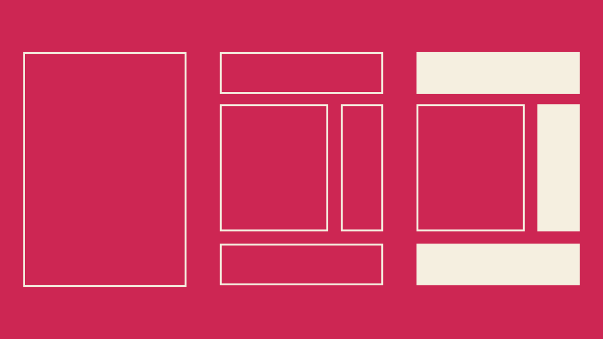
When Allan and I decided to make this theme, we already had a homepage comp featuring a handful of blocks. That comp did a great job of setting the tone for the design aesthetic. To get things going, I decided to apply that aesthetic to the other default Gutenberg blocks. I worked through the Gutenberg Blocks Sketch document from my last post, updating styles as I went.


Working this way was great for a couple reasons. First, it helped me focus — I’d never designed a block-optimized theme before, and this kept my design explorations squarely on the blocks themselves. I thought,  “Gutenberg is all about blocks, right? I’ll design some blocks.”

Second, the Sketch file allowed me to see every single block style in one place. In effect, I was creating a sort of pattern library as I went. I thought this was pretty cool, and figured it’d come in handy later on when we began development.

As I got further through these block designs, I realized the need to see all of these individual blocks in context; I’d design a wide-width cover image block, but I had no idea how it’d look in use. So I began dragging blocks around and stacking them up to get a sense of how they’d feel together.

Testing-Ground.png

This helped a little bit, but still wasn’t enough. At this point, I realized something that should’ve been obvious: blocks are not a theme. They’re just part of a theme. By designing blocks first, I’d been avoiding the big picture. Users will never see blocks all by themselves — they’ll exist within full pages. I needed to design more pages. 

Pages

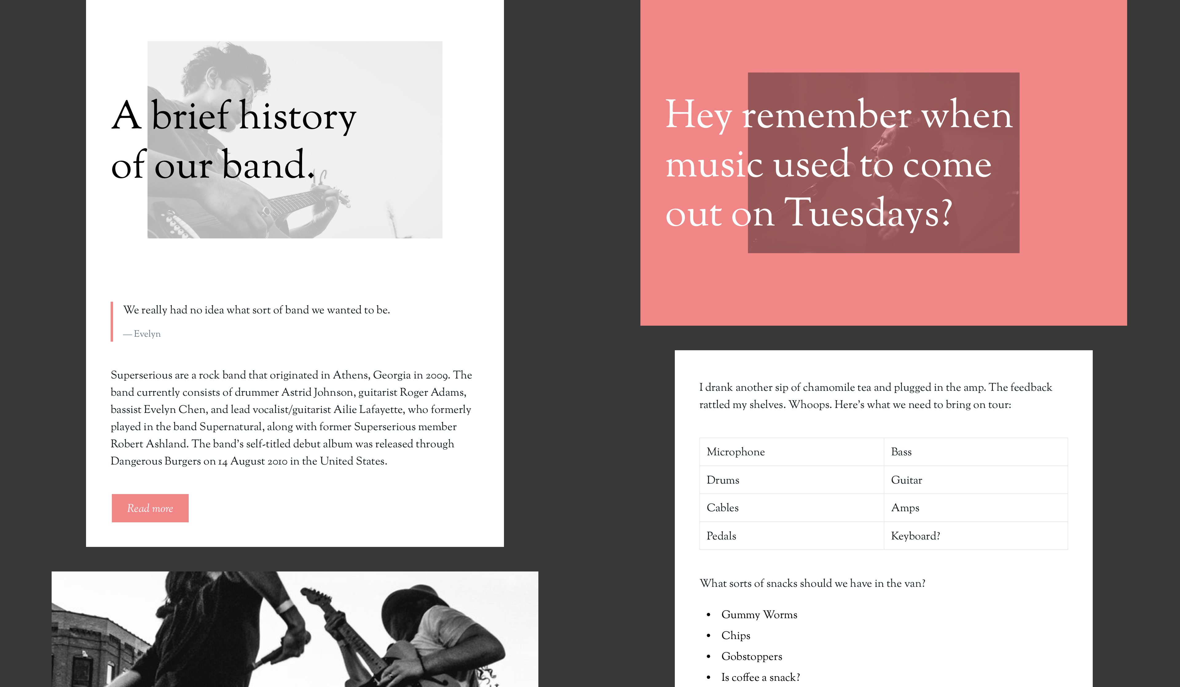
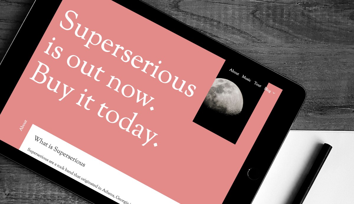
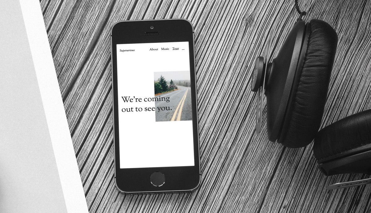
My initial homepage design comp introduced a rough idea of a header and an off-centered text column. I began by duplicating that initial page and clearing out all the blocks on it, then pulled together some sample content. Looking at the project through the lens of my imagined client (the band Superserious), I was able to think through examples of blocks and block combinations that might exist on a real site: the columns block to display album information, the table block to display tour dates. This felt much more effective than randomly placing blocks on a page.

Around this time, I hit my stride, design-wise. I’d lay out a page using my existing blocks and the sample content. Then I’d iterate and experiment with everything on that page. Once things looked right, I’d migrate any new block tweaks back to the global symbols and start fresh on the next page. After a little while, I ended up with a solid set of sample pages.


Backing up and thinking about page design helped me shift focus to other, more traditional components that needed to be designed too: archive pages, page footers, post headers, etc. Designing these wasn’t all that different than it would’ve been without Gutenberg. In a way, we’ve all been designing with blocks all along — we just hadn’t called them blocks. Take a look at this entry summary:

Entry-Summary.png

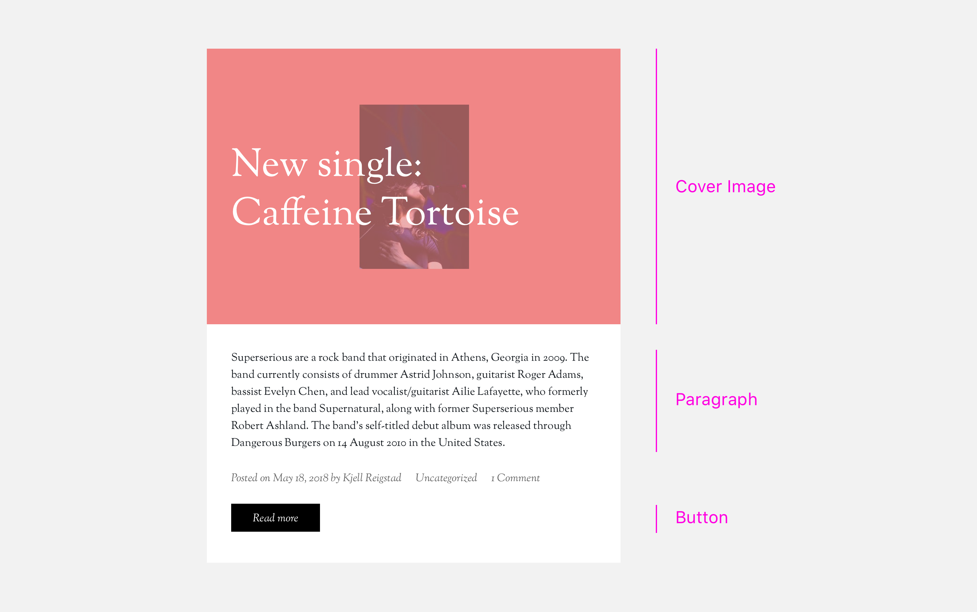
If I’d designed this theme pre-Gutenberg, I still would’ve designed each one of those pieces — they’re all fairly standard parts of a theme. But thanks to Gutenberg, each piece is part of a clear pattern library, to be reused throughout the design by me and by the user. That’s pretty cool.

I’d gone into this project thinking I’d spend most of my time styling individual blocks, but I ended up splitting my time pretty evenly between designing block variations and overall page elements. In that sense, this wasn’t as drastically different from a traditional theme design as I’d anticipated.

Prototypes

I’d been getting ongoing feedback from Allan throughout the process above, but once we were happy with the page designs above, we gathered  with the rest of the Theme team to get broader design feedback. To help with that process, I pulled all my comps together into a prototype. This took just a few minutes to do, and really helped others get a sense of how the theme will work in practice.

I created two separate prototypes with Invision: one for desktop and one for mobile. If my transition from block design to full-page design was about looking at the bigger picture, these prototypes stepped back still further: they showed us the context around that big picture. We were all able to see the designs on-device and test some basic interactions. 

The team’s feedback was (as usual) very helpful — we made some subtle revisions to text contrast, adjusted a number of margins, and kicked off a lot of iteration on the mobile menu treatment.

Development

Allan had been focused on the build from the beginning, and had the majority of the framework in place at this point. After our design feedback session, I jumped into the code too.  

From the development angle, we’d already determined a few things in the design that we couldn’t do, or that would take too much effort. For instance, in my initial design comp I’d had a series of backgrounds run down the page. Gutenberg doesn’t have a method for doing something like that today; despite my wishful design thinking, there’s no method for layering a background behind a group of blocks. We could’ve accomplished it through customizer settings, but we shelved the idea in favor of keeping things simple. We also abandoned a bunch of the play buttons I’d originally included, since those’ll require some custom blocks (more on that later). 

Once I jumped into the code, my main revelation was that there were way more block options than I’d originally anticipated. A number of blocks had options I’d never noticed before. I hadn’t realized that paragraph blocks could be set to full width, or that cover image blocks could be floated left or right.

In addition, I realized some design decisions I’d made were actually supposed to be user-editable: I’d overlooked the fact that users can edit the text alignment and image opacity for the cover image block. This required more design exploration, but it guided us towards a much more customizable theme — definitely a win in the end.

Beyond those updates, the majority of the design-oriented development work involved minor fixes and adjustments — polishing up the CSS to make sure it aligned with the intent of the original design. 

Next steps

Now that we’ve had our initial release, Allan and I plan to build a separate plugin with complementary music-centric blocks, like a tour dates block and a mashup of a cover image and an audio player. We’ll hope to showcase those at some point in the future.

In the meantime, keep an eye out for the next post in the series: Allan’s experience from a development perspective.


Music: A Gutenberg-Powered Theme

Announcing the Music theme: an exploration of how Gutenberg can transform theme design and development.

A couple months ago, I created a Sketch document to assist with the design of block-driven themes. I posted about that here on Themeshaper, and provided a couple short examples of how it could be used in a theme design workflow.

Since then, Allan Cole and I have been working to make one of those examples — a site for an imagined band named Superserious — into a working example of a Gutenberg-powered WordPress theme. We named the theme “Music.”

Allan and I set out to experiment, learn, and create a resource for the community. We’ve documented our experience designing and building this theme, and will be publishing our notes in a series of posts here on Themeshaper.

To kick things off, we’re releasing Music on GitHub today. We’d love for you to give it a spin, tinker with it, and explore how it works with Gutenberg. Here are a few things to look out for:


Design

Our design goal for the theme has been to show that it’s possible (and encouraged!) to make a Gutenberg theme that doesn’t necessarily look like Gutenberg. We wanted to create something bold and a little experimental; a theme with somewhat aggressive, non-standard styles.

Gutenberg gives users unprecedented control over their site design, opening the door for variety and experimentation. Our favorite example of this is our cover image blocks. They look great out of the gate, but users can adjust the image, alignment, and color to achieve a wide range of looks:

cover-images.png


Development

You’ll be happy to hear that the overall theme development process wasn’t all that different with Gutenberg. Common patterns like headers, footers, and loops work just as you’d expect in a Gutenberg-powered theme.

In many areas, Gutenberg makes things easier for both users and developers. For instance, full-width header images used to require a custom-built customizer or theme option solution, but now they’re essentially built in. This was important to keep in mind while building the theme, and was a very positive change for development.

Creating stylesheets for blocks was pretty straightforward. Expanding on the built-in stylesheets in _s,  we added a blocks.scss file to the SASS directory and placed all of our block-specific styles and overrides there. This kept everything nice and organized and is likely to appear in _s in the future.

Since Gutenberg is output by the_content(), we learned to take special care with any wrapper divs that might clip or obstruct the expected behavior of Gutenberg blocks. We’ll talk more about that in a follow up post.


Block Styles

We’re truly excited about the custom editor styles that ship with Music. These styles are a breakthrough: they give users a much clearer sense of what their visitors will see on the front end.

Best of all (for theme developers at least), the editor styles were a breeze to integrate! We built all of these in over the course of just a few hours.


Like most of the work we do, the Music theme is open source. You can find it on GitHub:

https://github.com/automattic/musictheme/

If you’d just like to see the front end, feel free to click around our demo site here:

https://musictheme.mystagingwebsite.com/

In many ways, designing and building this theme was similar to the way we’ve made themes in the past — but we did carve out a few new practices along the way. Allan and I will be sharing them with you in upcoming posts. In the meantime, we encourage you to download, install, and experiment with Music yourself!


Read part two of this series: Designing a Gutenberg-Powered Theme: Music

The Promise of Gutenberg: Themes as More Design, Less Baggage

Gutenberg promises the vision you have takes shape in the editor, instead of something you can’t see. Why’s that so powerful?

It happened again.

I sat with a potential WordPress themer, who wanted to know how to get started the right way with theme development. He’s a user experience professional by day, looking to up his coding skills.

He pointed to the WordPress editor, and said something like, “I understand HTML and CSS, but I’m not sure how to make something beyond putting it in there.”

We’ve all been there. Having that vision of what you want your site to look like, and not knowing how to get there. Gutenberg promises the vision you have takes shape in the editor, instead of some PHP file or a special plugin that isn’t truly native to WordPress. That’s powerful! It shifts much of the customization control from the themer to the person using the theme.

Today, if you’re trying to get into WordPress development, you might start by tweaking an existing theme. Then making a child theme. Then diving into a custom theme. My user-experience professional friend did just that. He’s already customized a theme and made a child theme. But the whole world of specialized WordPress theme knowledge can intimidate even professional web workers. Imagine how it feels to new users of WordPress who have never built a website before?

But with Gutenberg, people – professionals and beginners alike – can begin building what they want. Now, Gutenberg will no doubt need its own specialized knowledge. But at its heart, it will transform what a theme means to WordPress. They can become more about pure design, powered by the simplicity of CSS.

You might be saying, “But you can already use CSS now to change a theme’s design.” That’s true, but much of a theme’s structure gets determined by and locked away in template files. Hard to change unless you start learning how to “theme.” But with much of that structure and markup becoming blocks that can be added to a theme, it becomes easier for people who aren’t themers to see different possibilities.

Say goodbye to lots of custom widgets and theme options. Oh, and to limiting page templates. The future of WordPress themes can become more about empowering users to work on their vision instead of always having to learn how to “theme.” It starts in the editor and not with the theme.

Photo by Dmitri Popov.

Themes are Mission Control

When we think of space flight, we often think of the thing that gets us there: the shuttle, module or rockets that take us out of this world.

However, in the early days of space flight programs at NASA, one man realized how important control from the ground would be to quickly evolving missions. Christopher Kraft pioneered the creation of Mission Control, the place where dozens of engineers, scientists and staff on the ground assist the astronauts in carrying out their mission from thousands of miles away.

About the Flight Director, the person in charge of Mission Control, Kraft said:

[T]he guy on the ground ultimately controls the mission. There’s no question about that in my mind or in the astronauts’ minds. They are going to do what he says.

The notion of Mission Control makes a good metaphor for a WordPress theme. Themes sit at the center of the WordPress experience. They run the show. WordPress is the ship and rockets that get us there. Without a theme, the mission won’t be successful. Sure, at its core, WordPress is publishing software, but many more people interact with the front end of a site than its back end.

So how do we start thinking of themes as an experience, rather than part of the experience?

Design how the pieces fit together. Most themers see the parts of a theme experience as separate. I did too, until recently. When I say separate, I mean as different parts of one flow. We often create the theme and the documentation with little thought as to how customers get from the theme to the help text when they need it. We also don’t spend time on onboarding or setup with customers. All that matters though, and it can help get a customer to success and make them feel like a success. We need to pay more attention to how those parts connect for a better experience.

Be consistent. Themes in WordPress have this great strength because they can do nearly anything. Their biggest weakness? They can do nearly anything. This means how a theme behaves can vary widely from one to the next. We’ve tried to address this in projects like Underscores and the TUX (Themes User Experience) list, but you can never do enough. I’d like to see themes only vary greatly from the norm if it accomplishes an important design goal for the customer.

Mind the internals. Recently, we had our support team at WordPress.com share why themes frustrate our customers. So much of the frustrations boil down to what a customer might not have control over in a typical theme. Things like how an image is cropped or how WordPress Core handles some default data. Experimenting with how these types of things work for your customers can mean they’re happier in the end.

If you make these items a bigger part of your theme design process, you’ll have more control over your theme’s experience. And your customer’s missions will have a greater chance of success.

Photo courtesy of NASA.

Balancing Options vs. Overload

On WordPress.com, one thing we’ve been focusing on is making themes that just work. It’s a bit of a balancing act; it’s very tempting to allow customers to control every aspect of their theme, because it seems like the simplest way to give them what they want.

That idea may sound great to customers, but having panels of options in the Customizer and an armload of documentation to figure them out is daunting. You can change things, but you’re also faced with making dozens of small, similar decisions about various aspects of your site, and deciphering the purpose of various controls.

It is true that in WordPress themes, some options are necessary. When designing and building a theme, it’s important to distinguish what options fit the actual intent of the design, and what options are being added for the sake of adding them.

You can often figure out which is which by tracking common pain points.

One way to do this is through support requests. On WordPress.com, we have a dedicated, talented team of Happiness Engineers who interact with customers every day. As Gary Murray wrote in a recent post, support teams are an important link between our work and our customers, and an invaluable wealth of information.

For themes, the support requests often involve how to set up a theme or use different options (which is why making themes that just work from the get-go is important). But other requests have to do with customizing a theme in specific ways. Some are unique to a customer’s specific goals; others come up again and again from different customers, either in the same theme or across several different themes.

In the Ixion theme, we recently added an option to control the opacity of the overlay used on front page photos, after several customers asked about changing or removing it.

Ixion with its two new options.

One purpose of the dark overlay is to ensure the text on top is legible against the photo. But if you’re starting with a photo that’s already pretty dark, the overlay isn’t needed and can make it hard to distinguish details in the photo. We were able to add this option while maintaining the original appearance, so customers who weren’t troubled by the opacity didn’t know the change happened.

Another feature that came from frequent customer requests was Content Options. A brainchild of Thomas Guillot, Content Options are a way for customers to make small visual changes on their site, like hiding the date, author name, or featured images. Rather than adding the options to individual themes, it’s a feature available in Jetpack and WordPress.com that themes can support. That way, the options are available in several themes and implemented exactly the same way.

Both additions were guided by the goal of keeping things simple, balanced with following actual customer requests.

When looking at adding options to a theme, there are a few things that can help to keep things simpler:

First, aim to make a theme that just works on activation. If the design’s not possible without multiple options, rethink it. If options are necessary to get the theme to work well with different kinds of content, find a way to make the theme more forgiving instead. Make the theme do as much work as it can by itself.

In a similar vein, make the theme make the decision. You could allow customers to switch a sidebar position, or make the header sticky, but unless it’s a very common request it’s best left out. Chances are, one option looks best and makes the most sense for the theme you’re building — use that one.

Use existing WordPress functionality rather than custom options. I don’t mean stretch the options beyond their original intent, just don’t reinvent the wheel. For example, look to use the custom header image or featured images in the theme before adding another image upload option to the Customizer.

When adding options, rethink your approach to customization. Alright, you’ve discovered your customers can’t live without being able to change their header’s layout. Rather than having separate controls to move each individual item — logo, header image, menu, social links, site title — is there another way to approach this? Aim for simpler, more opinionated controls to limit the decisions customers have to make. Basically, make your options smart.

Last but never least, user test, talk to your customers, and work directly with them when you can. They’ll help guide you to that point where your themes can help them feel empowered, but not overwhelmed.

Photo by Patryk Grądys on Unsplash.

The Next Chapter for Themes

Every few months I read a post about how the WordPress theme business has shrunk. The authors always reach a similar conclusion. Sales have dwindled. Competition has increased. Putting food on the table, finding a niche and standing out is near impossible.

It may not be so impossible though. With a new editing interface on the horizon, the theme landscape will change in a big way. That editing interface, and eventually better site customization, means we (those who create themes) will all have a chance to redefine what a theme is and means to people who use WordPress. It will be new, fertile ground to discover – the next chapter for themes. We just can’t make the same mistakes we’ve made before.

A long time ago, especially in Internet years, you could sell a collection of well-designed WordPress themes and make a living. These became known in the WordPress space as premium themes. What made them “premium” was loosely defined. They often sported a unique look or carried interesting features. As a consumer, premium themes always seemed more special to me. They took risks. That runs against what we say on the Theme Team at WordPress.com, where we do nothing but create WordPress themes: The only difference between a free theme and a premium one is the price.

As more and more theme shops sprang up, the feature race began. Many themes became as complex as WordPress itself. Designers and developers had less time to experiment because we spent more time glancing over our shoulders. What’s the next trend? What’s this other theme shop doing?

To correct for the complexity, the larger theme ecosystem became obsessed with standards. Like making sure a theme did things the WordPress way or always met “best practices.” The web industry as a whole also continues to obsess over and rely on build tools and frameworks, sometimes to a fault. They should solve technical hurdles for us. But do they? Sometimes they do at the expense of our customers. Make no mistake, I’m not arguing against best practices or tools. We do the same thing. However, the status quo, even if it means well, can blind you to what’s important.

What’s important, you ask? Our customers. Doing the invisible things that make their experience its best. Focusing on accessibility, performance and security. Making sure the the small screens look just as good as the large screens. Gutenberg, the project name for the new editing interface, will make one theme become many. A customer using a theme will be able to bend it many different ways – turning the focal point of the theme from its capabilities to its design.

Customers want their sites to look just right. They don’t want to learn a theme. So when the new age of themes begins, promise me you’ll focus on what they want. You won’t get distracted by the many different ways to extend this new editor or become mired in all the ways to prevent the abuse of customizing it.

This matters. Your customers need you. And you’ll stand out and put more food on your table.

Photo courtesy of Hermann.

Behind the Design of the Forefront theme

If you’ve read my previous articles you’ll recognize the title of this post. For those of you who are new, these are my thoughts behind the themes I’ve designed. This time, I’d like to talk about Forefront — a responsive Business theme.

Continue reading “Behind the Design of the Forefront theme”