With WordPress 5.8 launching on July 20th, it seems like a great time to round up some resources to help theme authors prepare for the future. By now, you’ve probably heard about block themes and the upcoming future of full site editing. Perhaps you have even begun to explore creating a block theme or adapting your current theme to some of the new features, like template editing mode. Whether you’re just starting out or already deep in the block theme world, the following resources should help you be aware of what’s to come and how to get involved in shaping the future.If you’re looking for a quick snapshot, it’s recommended to review the following for 5.8:
Since block themes are currently evolving along with the features to support them, it’s helpful to start by figuring out what will help you stay up to date with the latest happenings, as that makes sense for you. Here are a few options:
Since this is an area that folks across the WordPress community are diving into, there are some fantastic ways to keep in touch with what others are experimenting with, how they are solving problems, how they are getting started, and more. Especially during a time where we can’t meet up and look over someone’s shoulder at a WordCamp, hopefully these resources help bridge that divide even a tiny bit.
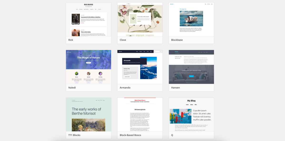
Check out the Theme Experiments Repo to see what others are building/doing to get started. You can even quickly create a blank theme to get started using resources within that repo.
While these are the resources we found most useful, we’d love to hear from you too. What resources have been helpful for you to explore block themes and the various pathways leading up to full site editing? Share in the comments so we can all learn together.
Mel Choyce discusses and highlights GPL-compatible fonts.
Pairing type can be hard, especially when you’re limited to using only free, open source fonts in your themes. What that means can be confusing, and there aren’t a ton of high quality sources for you to obtain compatible fonts.
I want to talk to you about font licensing, where to find high quality, expressive free fonts, and show off some examples for font combinations you can use in your own theme designs.
Open source fonts are usually released under the SIL Open Font License, or OFL for short.
Finding the perfect typefaces for your theme can be challenging. Limiting yourself to the smaller bucket of available OFL fonts? Now that’s stressful. Open source fonts sometimes have a few downfalls to look out for:
The font might not include multiple weights and italics or obliques.
The kerning on the font might be spaced unevenly.
The fonts themselves might not be high quality.
However, constraint breeds creativity. We can still design professional, visually appealing themes using plenty of available license-compatible fonts.
Where to find free fonts
There are many places to find OFL fonts, ranging from directories, to curated collections, to individual type foundries. Here are a few sources I recommend.
Directories
Google Fonts
With almost a thousand available fonts, Google Fonts is one of the largest directories of open source fonts on the web.
Google Fonts’ filtering tools allow you to view fonts that contain a minimum number of available styles, which can often be a proxy for quality. I’ll usually search font fonts with at least four available styles (usually regular, italic, bold, and bold italic), though searching for six+ generally nets more versatile options. They’ve also recently introduced a toggle to limit results to variable fonts.
Google Fonts also gives you the option of downloading and bundling the font files in your theme, or linking to the files on their CDN.
Font Squirrel
Font Squirrel is another long-established directory of open source fonts. It provides more granular filtering options than Google Fonts. This is a great resource if you’re looking for a typeface with a very specific feel.
Font Squirrel also offers a web font generator service where you can upload your own font files, and convert them to all the different formats you’ll need to embed the fonts into your theme.
Collections
Beautiful Web Type
Beautiful Web Type showcases a curated collection of high-quality open source typefaces. Instead of a list of fonts, this website actually demos them in action, allowing you to get a good sense of how each typeface looks and feels in context.
Open Foundry
Open Foundry is similar, focused on showcasing the best and newest high quality open source fonts.
You can type in your own text directly into the font listings to preview how it will look, and adjust the font size, line-height, and letter spacing of the text. You can also dive deeper into each typeface and see a type specimen.
Type Foundries
Velvetyne
Velvetyne is a collection of type designers who create and distribute open source fonts. Their philosophy and ethos resonate strongly with WordPress’ own.
Looking for a striking, experimental, or overall fun typeface to use in your next project? Velvetyne’s got your back.
Collletttivo
Collletttivo is another collection of individual type designers who release open source fonts under the same foundry. Their fonts feel punchy, and eye-catching, and many push the envelope of modern typography.
League of Movable Type
The League of Movable Type is the oldest open source font foundry, opening its virtual doors in 2009. This group was my introduction to web type. They offer a diverse array of high-quality typefaces ranging across many different styles.
Pairings
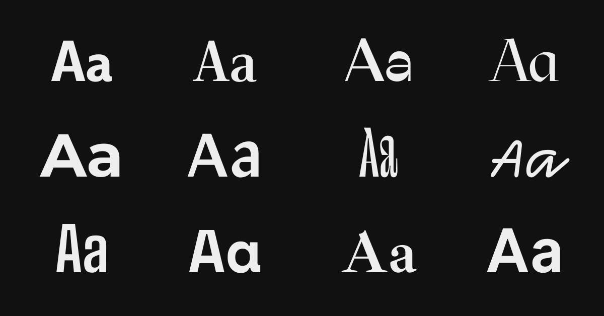
If you’re looking for somewhere to start, here are seven hand-picked open source font pairings you can use in your next theme design. I’ve shown each in a potential context so you can get a feel for how the pairings could work in action.
Luiss Serif & Luiss Sans
Luiss Serif and Luiss Sans by Antonio Pace showcase the beauty of font families. Designed with similar characteristics and proportions, these sans and serif typefaces match beautifully.
While versatile, I think using this pairing in a theme meant for longform text will help it shine brightest.
Ribes & Subjectivity
This font combination will infuse your theme with funky, retro vibes.
Ribes by Luigi Gorlero takes inspiration from the ’50s funk and jazz aesthetic. I love how the horizontal slant of the counters make the typeface look like it’s squinting at you.
Subjectivity is a display geometric typeface by Alex Slobzheninov. Its funky qualities play well off of Ribes. Generally, display faces are not suited for longform text, and that’s also the case here.
Use this combo in your next landing, splash, or marketing page theme design.
Mazius & Montserrat
Mazius is a gorgeous calligraphic serif by Alberto Casagrande, featuring not one, but two italic styles (the second of which is shown in this demo).
Montserrat by Julieta Ulanovsky has been around for a while, but was redrawn and expanded in 2017 with new weights.
Mazius works great for large headings, while Montserrat is versatile enough to take up the slack for smaller headlines and all body content. This pairing works well for any theme needing a just touch of elegance.
Facultad & DM Sans
Facultad is a sans serif typeface designed by Andrés Torres for the Faculty of the Arts at the University of Cuenca. Its calligraphic construction, wide counters, and generous x-height make Facultad a great choice for any modern academic news or magazine theme.
With its even, round shapes, DM Sans by Colophon pairs well with Facultad because of its differences. Its geometric qualities draw more attention to Facultad’s interesting calligraphic details.
Together, the pairing feels warm and inviting, while also strikingly smart.
Le Murmure & Compagnon
Sometimes you need to let some personality shine through. This pairing is bold and unconventional, but with two typefaces from Velvetyne, it might work for your next personal portfolio theme.
Le Murmure by Jérémy Landes was designed for the French design agency Murmure. This condensed titling font reminds me of the interesting angles achieved when you squeeze a handful of pipe cleaners. Only, you know, cooler.
Compagnon is a family with five different styles, inspired by old typewriter specimens. It’s super funky and fun to play with. If you use it, you’ll want to make sure your theme supports editor styles; this is a font that needs to be live-previewed.
Big Shoulders Text & Space Mono
Big Shoulders Text is a condensed sans-serif typeface by Patric King, created for the City of Chicago’s Brand Standards and inspired by “Chicago’s multiple histories in railway transport, journalism, advertising, and public political action.”
Space Mono was designed by Colophon for Google Fonts. It was designed for headline and display type, but I think it can be safely used for body copy if your size is large enough and your text sparse enough. So: okay for things like restaurant menus, bad for longform.
Combined, these typefaces remind me of old offset printed menus and the newer hipster styles that harken back to them.
Ibarra Real Nova & Inter
Ibarra Real Nova is an elegant serif typeface, designed by José María Ribagorda and Octavio Pardo based on 18th century Spanish type.
Conversely, Inter by Rasmus Andersson is a highly readable modern font created specifically for screens.
In this pairing, Ibarra Real Nova sets the overall elegant and classical tone, with Inter as a supporting actor. Use in any theme with a flair for the dramatic.
I hope these provide some inspiration to all you themers out there. If you use any of these font pairings in your next theme, let me know! I’d love to check them out 😁
What kinds of themes do we look for when we add to our collection on WordPress.com? We get this question a lot, both from existing and potential theme shops. And while some of the specifics evolve over time, the principles of what makes a good theme good remain the same. Whether it’s on WordPress.com or not.
When reviewing themes for WordPress.com, we never accept a theme based on design alone. We want to see the entire theme experience and for that you have to look at the user experience and code too. Why? You can have a beautiful design, but still make a bad theme. So we always look at three aspects, what we call the Three Amigos, named after a popular American comedy movie.
Design
We consider a lot of different design aspects. In general, we look for a strong grasp of design principles, especially methods that help establish harmony and unity:
Perspective: sense of distance between elements.
Similarity: repeating similar – but not identical – elements with strong visual connections.
Continuation: the sense of having a line or pattern extend throughout a design.
Repetition: elements being copied or mimicked numerous times.
Rhythm: achieved when recurring position, size, color, and use of a graphic element has a focal point interruption.
Altering the basic foundation of the design achieves unity and helps keep interest.
We run through setup to see how challenging it is to make the theme look like the theme demo. Complicated theme setups cause a large amount of user frustration, refunds and theme switches. We look at theme options to see if they’re intuitive to set up, simple, or complex. Any patterns that may confuse WordPress.com users are noted. User experience might just be the most important thing. You can’t use a theme if you can’t use it.
We’re always open to exceptions, if they can be justified by an innovative or creative theme that users will love.
And one last note – whether our marketplace is officially accepting new theme shops or not, we’re always looking for amazing, new themes. Make one, put it out there, and we’ll probably find it.
This year, we’ve focused heavily on improving people’s experience using themes on WordPress.com. We’ve dug into defining the most common and tricky issues for people using themes through research, user testing, and iteration.
We still have a long way to go toward substantially improving people’s WordPress theme experience. To that end, we’re introducing a new set of requirements for all themes on WordPress.com to follow, geared toward making themes easier for people to set up and use. We call it the TUX List.
It features best practices like this:
Keep widget names descriptive of their location, ie. Sidebar, Footer, etc. Reason: Users can more easily find them and know what area they refer to.
Widget IDs should take the format of sidebar-1, sidebar-2, etc.
Reason: Consistency across themes means that a user can switch themes and not have to reassign their widgets to the theme’s widget locations. It also allows for easier readability in code.
We wanted to share it with the community, since incorporating these best practices into your themes on WordPress.org and elsewhere means anyone using them will have an easier time getting to what they really want to do: publish their site. Nothing on the list should restrict your creativity when it comes to designs.
Give it a read and let us know if you have any questions or ideas on how to make it better. Making themes easier is a job for everyone. Happy theming!
Making a theme is really exciting. It’s a great way to practice your coding skills. It could be a good way to bring in some extra pocket change. Best yet, seeing someone use something you’ve built is incredibly rewarding.
I’ve watched the quality of theme design get better and better in the WordPress.org directory in the last few years, but I still see a lot of themes that look the same. Free themes still lag behind premium themes in terms of design quality. You can help change all that. You don’t need a design background to make good design decisions: a developer conscious of design can still make a good-looking theme.
Here are a few general tips and tricks you can apply to your themes to give them a solid design base, regardless of your background.
Pick a Direction
When planning out your new theme, have a specific user or use case in mind. That use case shouldn’t be “a theme for everyone.” Your use case can still be pretty broad — “a modern theme for small businesses” is still targeted enough for your ideal user to solve a specific goal by using your theme. Alternately, you can get super specific, giving yourself a prompt like “a food blogging theme targeting smartphone photographers.” Each theme idea has a different set of constraints, and by embracing and sticking to these constraints, you can make better themes.
Once you have a direction in mind, think through that scenario and what your target users would need. The more you imagine how people are going to use your theme, the stronger your concept becomes.
For a modern business theme, think about what a great business website needs. If the company has a physical location, site visitors need an easy way to find an address or directions. People visiting the site need a way to contact the business, via phone, email, or contact form. The theme needs strong page templates, but probably not a unique blog template. It probably needs a navigation bar that can support up to a dozen or more pages at various levels. Typography should probably be strong and serious. A business might also need to display their products, so you could consider adding support for popular e-commerce plugins.
On the other hand, an amateur food blogger, especially if they don’t have a nice camera, needs a theme that focuses more on super strong typography. Photos should be present, but de-emphasized in case they aren’t top-quality. The theme’s users need a way to easily display recipes. Maybe this means building a plugin that pairs with the theme for extra feature support, or maybe it means really nice post styling. A variety of page templates probably aren’t extremely important, but well-styled category archive templates are. Type can have a little more personality, but still has to be readable.
In both situations, you want to have a strong responsive design so site visitors can browse on their phones or tablets. After all, 50% of web traffic comes from mobile devices.
Look at other themes and websites that fit within your use case. Find five really great ones and figure out what makes them great. Take these insights and apply them to your theme.
Visual Design
Typography
Typography is probably the most important part of the vast majority of themes. What’s a site without text? Type needs to be clear, readable, and context-appropriate. There’s a couple rules of thumb you can use to make sure your theme’s typography looks good.
The hardest part of theme typography is picking the right fonts. The “popular” sorting option on Google Fonts is a surprisingly okay place to start looking for a font to use. Try to pick fonts that have multiple weights. Depending on the font, a light or semibold weight might be more appropriate than just regular or bold. At the very least, avoid using fonts that don’t come with bold or italic. There is (finally)! a “number of styles” filter in Google Fonts that you can also browse through. Don’t trust Google’s recommended font pairings — they’re actually pretty poor.
If you want to combine a serif and a sans-serif and you’re unsure which typefaces to pick, go for a font family. These are built to have similar features and will naturally pair well. Some families on Google Fonts include Merriweather Sans and Serif, PT Sans and Serif, and Noto Sans and Serif.
When in doubt, use font combinations from sites you like.
Once you’ve chosen your font(s), you need to style your text to be readable. This means using appropriate font sizing. Don’t make someone squint! Use at least 14px or higher for your body text. If 14px looks too small, don’t be afraid to go up to 16px, or even 18px.
One of the biggest issues I see concerning type on themes is an overall lack of line height, which is the space between each line of text. As a general rule of thumb, my headers are always between 1.2-1.4 the size of my font, and my body text is almost always between 1.4-1.6 the size of your font. And the awesome thing about line-height is you can even just use line-height: 1.4 instead of having to calculate the actual pixel value.
As a general rule, paragraphs shouldn’t be more than 50- 75 characters long. This helps keep them nice and readable.
Finally, limit the number of font styles. I mentioned earlier that you should look for fonts that have multiple font weights. While you should seek these out, don’t combine too many different font weights and sizes, since they negatively impact your content’s hierarchy and flow.
Color
There is a lot of psychology around color. You don’t need to be an expert in color, but learn a little bit before you pick them for your theme. Colors also have different meanings in different cultures, so keep your audience in mind when picking your palette. For a good introduction to color theory, watch Aaron Jorbin’s presentation on WordPress.tv.
Color also affects whether or not your users will be able to view your theme. Keep in mind contrast when designing your themes — contrast that’s too high or too low makes it hard for people, especially people with visual impairments, to read your text and navigate through the site. Keep in mind people with low vision or color blindness.
Don’t use too many bright or bold colors. They’re great for emphasis and drawing attention to specific parts of the page, but too many strong colors can make your theme hard to look at, or can make it difficult for people to find the most important content on the page.
Soften your blacks. Pure black doesn’t really exist in the world around us, and pure black on the web ends up looking harsh and unnatural. Add hints of color to your black by going up and right in most color pickers, or go for a dark grey.
If you’re struggling with color, here’s some things you can do:
Stick to dark text on a light background with one or two accent colors. You can’t go wrong with dark grey text on white.
Let everything breathe. Use ample white space between separate elements in your theme.
Finding the right balance of whitespace is hard. When in doubt, l o o s e n t h i n g s u p a l i t t l e. (Just not your lowercase text — only add letter spacing to uppercase text.)
Details
Don’t go crazy with the details. Less is more.
For example, consider if the drop-shadow you’re using adds a necessary sense of depth to your theme, or if it’s purely decorative. If it’s necessary, tone it down a little. In general, don’t use drop-shadows darker than 25% opacity. The same can be said for gradients; try to keep gradients subtle.
Use animation sparingly. I mean really sparingly. Inappropriate animation is jarring and detracts from your theme. Motion should only be used to show change, not for decoration.
UX Design
There is nothing worse than finding a theme that looks awesome and does what you need, only to install and activate it and find a thousand options you need to hand-configure to make it look like the demo.
Many of WordPress’s core philosophies revolve around simplicity and ease of use:
Great software should work with little configuration and setup.
Design for the majority.
Decisions, not options.
Clean, lean, and mean.
Striving for simplicity.
You should take these core philosophies to heart when creating your themes. Cut the number of options down to what’s absolutely necessary. For example, instead of letting people control every single color in your theme, let them choose two or three and generate a color scheme based on those colors. Make smart defaults and informed assumptions. If you include options that can be previewed, put them in the Customizer. Stop using gigantic theme options and settings pages. They are almost universally a bad experience for users.
Lastly — user test! If you’re creating a premium theme, you owe it to your users to make your theme as easy to set up and use as possible. UserTesting.com is relatively cheap and easy. Running as few as 3 user tests will catch the majority of your theme’s issues.
Free theme? No budget? Ask around for some beta testers. Don’t want to? Then at the very least, set up your theme on a couple different demo sites. Try it on one totally new, empty site, and then try setting it up on a site that already has content. Record your screen as you set it up. If you did well and remembered where everything was — awesome! You can now use that video as documentation. Did you struggle? Figure out where the process broke down, and fix it.
Love the idea of user testing? Read Rocket Surgery Made Easy by Steve Krug. It’s short, concise, and explains everything you need to know to run a good user test.
You don’t need to be a designer to make a good theme — you just need to be conscious of your design decisions. Now go forth and theme!
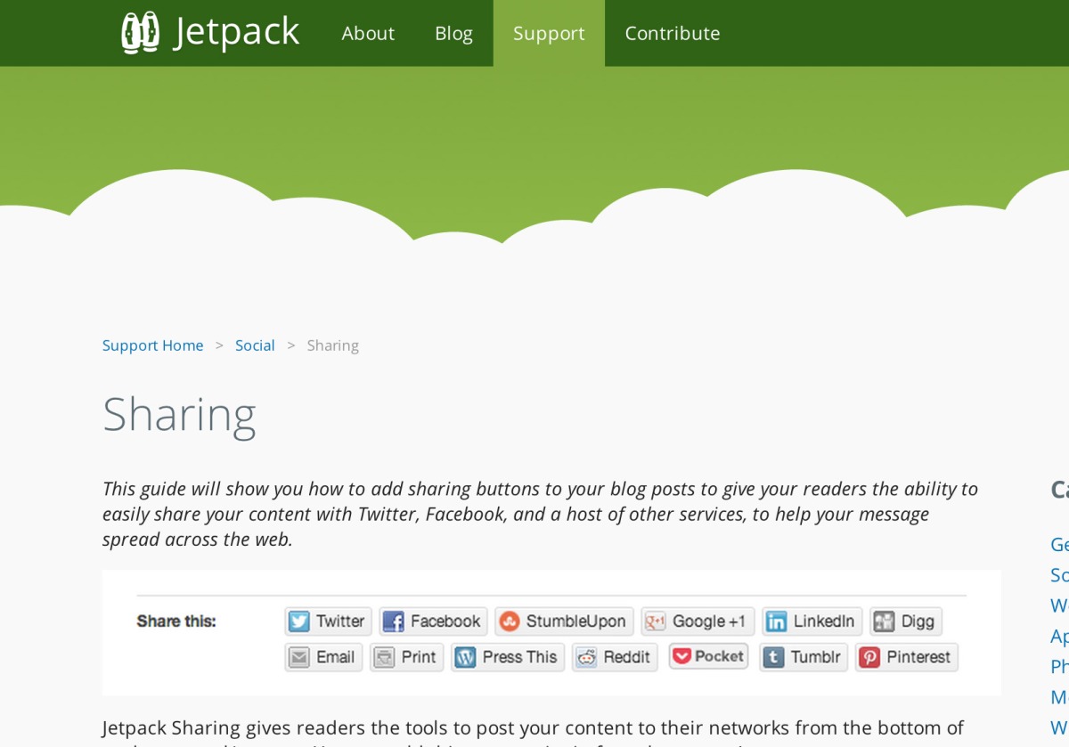
One of my favorite feature in Jetpack is sharing, but if you are a theme designer/developer like me, it can be really frustrating trying to customize it.
By adding a simple filter to functions.php or inc/jetpack.php if your theme is based on _s, you can actually avoid the Sharedaddy stylesheet from being enqueued.
Now you can add you own custom CSS without worrying about multiple levels like .site-main .entry-content > .sharedaddy .sd-title, or having to use !important to overwrite the Sharedaddy stylesheet.
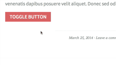
If you want to go a bit further, you can use some jQuery/Javascript. For example, if you want to create a link that, when you click on it, toggles the sharing buttons:
Nathan Ford wrote a great article about how you can use the attribute selector to define styles for a multitude of classes that share a common element. Initially I thought this was great (I actually still think this is a great idea), and used it in _s and Twenty Thirteen to simplify the clearfix selector and some others. We used [class*="site"] and [class*="content"], to grab all classes that contained those two words, essentially addressing our entire page structure with two selectors. Awesome, right?
Well, it turns out there are a few issues with this approach. After a while we received a report that Modernizr uses a generatedcontent class on the html element, screwing with the rest of the site because the styles for the [class*="content"] selector were applied. We also received reports from WordPress.com, where users specified tags, categories, or post titles that contained one of our two words. Since WordPress adds all categories and tags as classes in post_class(), this, again, broke the site’s layout.
I still think this a valid approach in projects where you can control the class namespace. Since you can’t really do that in WordPress, it’s not a good approach for theme developers.
Review is a key part of Theme Wrangling, so we spend a lot of time looking “under the hood” at themes. Here are some of most common theme development errors that come up in the review process, and some tips on how to avoid them.
Have you ever looked at a WordPress theme and thought, “Man, I wish I could do that!” Well, here’s a little secret: You totally can.
Yes, you can make a theme, and you don’t need to be a theme expert to do so. You just need three things:
An idea,
a healthy dose of curiosity,
and time.
An Idea
Until five years ago, I’d never touched a WordPress theme. I didn’t have a lot of experience, I’d never experimented with dynamic programming languages, and I’d never had to design for a vast and varied audience.
But what I did have were ideas – how about a theme for babies? Or a theme with changing seasons? Or a theme with animated fish? I didn’t know how to make these themes happen – I just knew I wanted to make them.
Without an idea, there is no theme! So before you do anything, figure out what you want to build. Have a goal to strive for, write up some notes, sketch it out.
It doesn’t have to be mind-blowing, or revolutionary, or the Next Big Thing, as long as you’re excited about it. You’re probably not going to make history with your first theme, but why let that deter you from making something really cool?
A Healthy Dose of Curiosity
If you like to learn, you’ve already taken a huge step toward becoming a themer. WordPress changes often, so theming techniques change often, too. You don’t have to venture far for learning material – you’re looking at a wealth of theme-makin’ goodness right here at ThemeShaper!
But I encourage you not to get mired in the technical details. You know how you may use Photoshop, but you probably don’t use one-tenth of its capabilities? Theming is like that. You don’t need to know how to do it all – you just need to figure out one piece at a time.
Think of your theme as a puzzle, and break it into smaller components – a fixed sidebar, an animated drop-down menu, a customizable header that changes colors – together they’re an intimidating obstacle, but if you tackle each piece individually, you’re likely to find it’s not as difficult as you think.
Also keep in mind, you don’t necessarily need to start from scratch (unless you want to!) Maybe you’re less interested in coding a theme, but you want to illustrate one – you can always build a child theme, or use a starter theme, so you don’t have to dive as deeply into the code.
Here are some of our favorite ThemeShaper resources to get you started:
And finally, tutorials have their place, but don’t be afraid to play around! Some of the best learning experiences and discoveries are hands on. Remember: There are very few things you could do to your WordPress theme that a quick Ctrl+Z can’t fix.
Time
We’ve come to the part I can’t help with. You have the idea, you have the tools, now you just have to make it happen. Easier said than done, but as they say, Rome wasn’t built in a day. Some of the best themes take weeks, months, or possibly even years, to come to fruition.
But beware: Theming is addictive. If you spend enough time with it, you may find yourself staying up late into the night to squash a CSS float bug, or research scripts for a post slider, or find just the right shade of blue for that navigation menu. Don’t say I didn’t warn you!
I hope this inspires you to give theming a chance if you haven’t already – it’s a great opportunity to try something new and make something cool!
Our very own Lance Willett spoke recently at WordCamp Phoenix about the art of finding the perfect theme:
Feel free to get started by checking out our latest four themes that were added to the WordPress.org theme repository: Forever, Vertigo, Reddle, and Quintus!
Whenever I write a post to publish on a WordPress powered website, I start by crafting a title. While I do this 99.9% of the time, there are definitely situations where no title is needed for a post.