The .gov means it's official. Federal government websites often end in .gov or .mil. Before sharing sensitive information,
make sure you're on a federal government site.
The site is secure. The
https:// ensures that you are connecting to the official website and that any
information you provide is encrypted and transmitted securely.
BLS was established in 1884, and some of our programs date back nearly that far. We have more than a century of statistics on prices, employment, wages, productivity, and more. But even in those early days, we realized that pages full of numbers can be a little dull. We frequently use pictures to tell the stories behind those numbers and help readers see the important points more quickly. Let’s look at over a century of BLS price statistics, in five charts.
The first chart, which looks hand drawn, was originally presented as part of the Department of Labor’s exhibit at the Century of Progress International Exposition in Chicago in 1933, also known as the Chicago World’s Fair.
The chart below depicts changes in the cost of living from 1913 to 1932, based on the BLS Consumer Price Index. Here we see market baskets (with legs) rising during World War I, then declining and holding steady during the roaring 1920s, and declining as the nation entered the Great Depression.
The next chart, again looking hand drawn – this time perhaps with a ruler – compares wholesale prices (what we now call the Producer Price Index) in the years leading up to the United States entering World War I and World War II. It comes from the first of two BLS bulletins on Wartime Prices. The increase in the wholesale price for all commodities was nearly twice as great in the earlier period, reflecting large differences in the price change for such commodities as fuel and chemicals.
Now, let’s move forward about 20 years. BLS published a chart book in 1963 focusing on price changes over the prior decade. The chart book presented both consumer and wholesale prices for the nation, along with consumer price trends in the 12 largest U.S. cities. The chart shown here, perhaps produced on an early computer, tracks the change in prices for all consumer items, and separately for various categories. Prices for durable commodities, such as appliances and furniture, declined in the early part of the period and later rebounded, resulting in virtually no price change over the decade. In contrast, the price of services, such as shelter, transportation, and medical care, rose steadily throughout the period.
With advances in computer software, BLS expanded the use of charts to allow readers to visualize data trends. Such charts became prominent in the BLS flagship publication, the Monthly Labor Review. In an article from 1987, data from the BLS International Price Program track price changes for selected imports.
BLS ushered in the age of interactive charts in recent years, making chart packages available with most news releases. In the chart below, readers can track a decade of consumer price changes for all items, and then click on selected categories to compare trends. Want to compare price changes for food at home with food away from home? It’s just a couple of clicks away.
Our charts today are a lot more sophisticated than the hand-drawn charts of the early twentieth century. They may not have amusing cartoon characters like the CPI market basket with legs, but they have interactive features that let you dig into more details about the data or choose the data you want to see. We also have several publications that focus on the visual display of data. Check out The Economics Daily and Spotlight on Statistics!
BLS is one of several U.S. statistical agencies that follow consistent policies and share best practices. These agencies also frequently work with their statistical counterparts around the world to develop standards, share information, troubleshoot issues, and improve the quality of available data. At BLS, our Division of International Technical Cooperation coordinates these activities. The division helps to strengthen statistical development by organizing seminars, consultations, and meetings for international visitors with BLS staff. The division also provides BLS input on global statistical initiatives. Without missing a beat, most of these activities moved to virtual platforms during the COVID-19 pandemic. Despite some time-zone challenges, which often lead to early morning or late-night video meetings, BLS continues to play an active role on the world stage.
Today I’m highlighting some recent international engagements, which have included our colleagues from Australia, Canada, France, Greece, Italy, Mexico, South Korea, and the United Kingdom. These events are often mutually beneficial, as they provide opportunities for BLS staff to learn more about the experiences of our international counterparts.
BLS staff met with a former Australian Bureau of Statistics official who was working with the U.K. Statistics Authority and the U.K. Office for National Statistics to research best practices in implementing international statistical standards. They discussed the international comparability of domestic industry and product classifications, data quality and publishing, and the independence of statistical organizations.
Staff from the Australian Bureau of Statistics are planning to revise their household expenditure survey. They turned to BLS experts, who shared their insights and experiences in improving our Consumer Expenditure Surveys.
Staff from the Statistical Division at the United Nations asked BLS to comment on issues surrounding the classification of business functions; household income, consumption, and wealth; and unpaid household service work. Input from staff in multiple offices will inform the BLS response to this request.
BLS staff, our counterparts in Canada and Mexico, and colleagues from across Europe and Asia discussed data ethics in a meeting organized by the Centre for Applied Data Ethics at the U.K. Statistics Authority. Country representatives summarized how their organizations assess ethical considerations when producing official statistics. The U.K. Statistics Authority identified the following ethical considerations as being especially important:
And that’s just some of what we did this summer! BLS has a longstanding reputation for providing expert training and guidance and participating in international statistical forums. We also provide BLS data to the International Labour Organization and the Organisation for Economic Cooperation and Development, among others. These organizations often feature BLS statistics in their databases. Since its inception, BLS has provided technical assistance to our international counterparts, starting with our first Commissioner, Carroll Wright, who directed BLS staff to advise foreign governments establishing statistical agencies. Commissioner Wright was also a member of several international statistical associations, a tradition that continues today. Currently, BLS staff participate in many international expert groups, including the Voorburg Group on Service Statistics, the Wiesbaden Group on Business Registers, and the International Conference of Labor Statisticians. These groups provide BLS staff with opportunities to discuss topics of common interest, to propose and learn about innovative solutions to data measurement issues, and to influence discussions about important economic concepts.
BLS began providing technical assistance in earnest in the late 1940s as part of the U.S. government’s European Economic Recovery Program. BLS staff planned and conducted productivity studies and helped European governments establish their own economic statistics. Similar efforts continue today for our colleagues around the world, many of whom have participated in our international training programs. While we have temporarily halted in-person training programs because of the pandemic, our staff plan to provide more training modules virtually in response to the popularity of these programs. Over the last 10 years, BLS has provided training or other technical assistance to over 1,700 seminar participants and other visitors from 95 countries. More recently, the International Monetary Fund has asked BLS to provide training on Producer Price Indexes and Import and Export Price Indexes to our colleagues abroad.
I am incredibly grateful to all the subject matter experts throughout BLS who provide invaluable assistance with these activities and help maintain our excellent reputation in the international statistical community. We look forward to your continued support as BLS strengthens important international relationships, virtually for now, and hopefully in person soon.
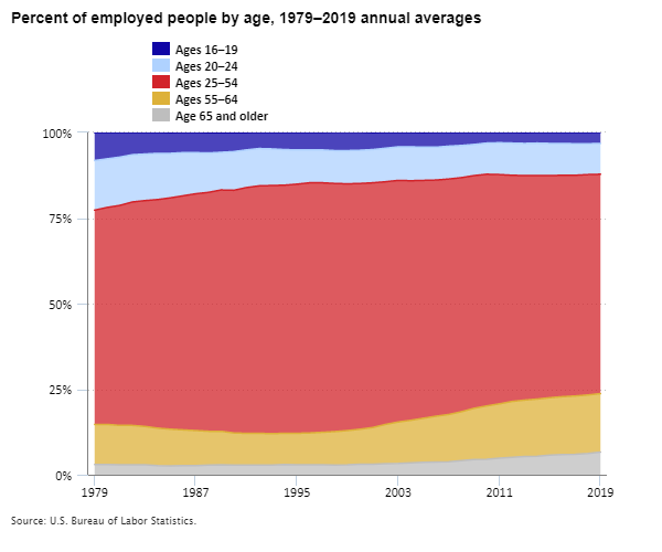
Forty years ago, teenagers ages 16 to 19 made up 8 percent of all U.S. workers. By 2019, that share fell to just 3 percent. With fewer teenagers working, the face of American labor looks much different today than it did when the Bee Gees ruled the American pop charts.
Happy Labor Day! The U.S. workforce has been changing over many generations. It’s been changing with respect to the work people do. For example, an increasing share of workers is engaged in service or technology work, while a decreasing share is engaged in factory or farm work. My focus today, however, is on the people who do the work.
Here at BLS, we spend a great deal of time and effort measuring and reporting on employment. How many jobs are there this month? What kind of jobs? But as Labor Day approaches, I’d like to shift the focus away from employment and jobs and toward labor itself. Who are the people holding down the jobs that we count? What is the face of American labor? And how has labor’s profile changed—and yes, it has changed—over a generation or more?
So today I’m not going to say much about what jobs workers hold or what their jobs pay. Instead, I’ll focus on more personal characteristics of the people who hold the jobs—characteristics that are not a function of workers’ jobs, but that are intrinsic to the workers themselves. Is America’s employed population getting older or younger? Are African Americans, Hispanics and Latinos, Asians, and other groups making up an increasing share of employment? And so forth. Call it the “composition” of America’s employed population. To examine this, I’ll be using data from the Current Population Survey, or CPS, which is a large, monthly survey of many thousands of U.S. households.
BLS collects data directly from lots of employers, such as businesses and state and local governments. This data collection is behind our monthly news release about how many jobs were added or lost in the U.S. economy. It gives us a vital, current, and accurate picture of work in America—but not of workers.
To learn more about workers, rather than about just their jobs, we can’t ask their employers. We have to ask workers themselves. BLS partners with the U.S. Census Bureau each month to survey some 60,000 U.S. households about their work and other topics. We can learn at least three important things by surveying workers that we can’t learn by surveying employers. First, we can learn about things like self-employment, multiple jobholding, and “alternative” work arrangements, like so-called “gig” work. Second, we can learn about people who are not currently employed. In fact, BLS uses these data each month to measure how many are “unemployed,” roughly meaning they are actively looking for a job and available to start. Third, and most relevant here, we can learn about people’s personal characteristics—things like their age, race, and marital status, which their employers might not know or might find hard to detail in a BLS survey.
Let’s look at data from the CPS to explore how the personal characteristics of America’s employed population have shifted. I’ll share some of my own favorite nuggets of information, which I think you’ll find interesting. I’ll mostly compare 1979 with 2019—a 40-year span that roughly coincides with two peaks in U.S. employment and economic activity. The comparisons would look similar if we looked at 2020 or today, but I think the long-term trends are better understood “peak to peak” than in comparison to the more recent but very unusual COVID-19 economy. Along the way I’ll link to some BLS resources that go deeper into these topics. Let’s dive in!
Where have the teenagers gone? In 1979, 8 percent of U.S. workers were ages 16 to 19. By 2019, just 3 percent were. Over the same 40-year period, the share that were ages 16 to 24 fell from 23 percent to 12 percent. Two things happened. First, the age composition of the entire population shifted. In 1979, the tail end of the large, post-World War II “baby boom” generation was about 16 years old. The generation that came after this group was smaller, so its share of the workforce was smaller too. Second, young people’s “participation rate”—the share that were working or seeking work—declined. In fact, that rate peaked at 58 percent in 1979, then fell to 34 percent by 2011. This huge change coincided with increases in school enrollment and educational attainment. This example illustrates how two forces combine to reshape the face of American labor: the shifting composition of the working age population, and shifts in participation rates of different groups.
The American workforce has aged. Between 1979 and 2019, the fraction of the employed population that is 65 years old or older grew from 3 percent to 7 percent. The share that is 55 or older grew from 15 percent to 24 percent. Forces behind this trend include the aging of baby boomers (they are mostly 60 or older today), medical and other advances that have extended lives and health, and less physically strenuous jobs. The participation rate story is a little more complicated: As a group, today’s older women always were more likely to work for pay than their mothers or grandmothers were. Participation among older men, in contrast, first ebbed and then rebounded across these 40 years.
Editor’s note: Data for this chart are available in the table below.
There are more working women. By 1979, women’s share of the employed population, at 42 percent, had already been growing for some time; it was up from just 28 percent in 1948. It kept growing for about 20 more years, before leveling off at around 47 percent by 2000 and remaining there through 2019.
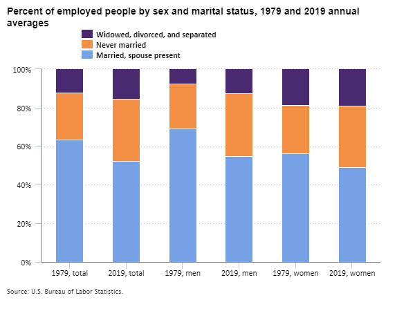
What’s love got to do with it? Between 1979 and 2019, the trend in marital status was more pronounced than the trend in gender. The fraction of all workers who were unmarried grew from 36 percent to 48 percent. This trend was sharper among men (31 percent to 45 percent) than women (44 percent to 51 percent).
Editor’s note: Data for this chart are available in the table below.
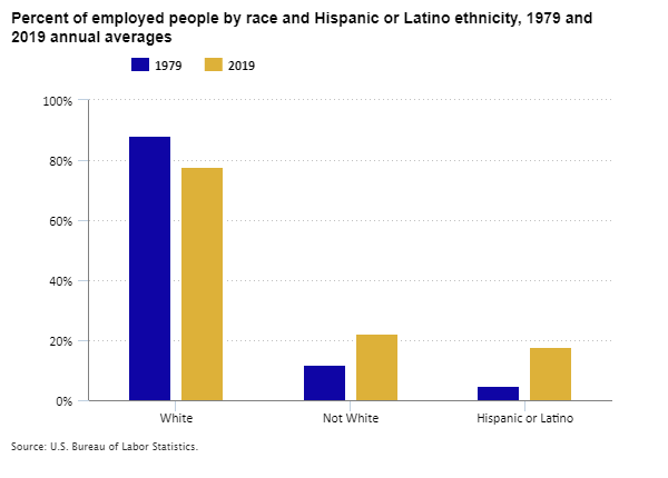
Racial and ethnic diversity is changing too. The U.S. population has long been very diverse, shaped by colonization, slavery and emancipation, and migration. Over the last 40 years, workforce diversity has been shaped mostly by immigration and by differences in fertility among racial and ethnic groups. Between 1979 and 2019 the non-White fraction of all U.S. workers grew from 12 percent to 22 percent. The fraction who are Hispanic or Latino (who may be of any race) grew from 5 percent to 18 percent. A note of caution: the survey questions about race and ethnicity changed over the years, and this might skew the measurements a little, but not enough to change the story that non-Whites and Hispanics and Latinos represent a growing share of employed people. The latest survey questions provide lots of detail about diversity today.
Editor’s note: Data for this chart are available in the table below.
The more you survey, the more you know. Changes in the CPS and other surveys affect more than just our measures of labor diversity. Of course, we can’t measure everything all the time. Big household surveys can be expensive for taxpayers and burdensome for the thousands of households who answer the long questionnaires. Over time, we may change how we think about who we are and what we do, so survey questions must change as well. New survey questions can inform us better about where we are today, but they can make it harder to compare conditions over time. For example, beginning in 1992, the CPS questions about educational attainment were changed to emphasize degrees earned rather than years of school completed. We know that the fraction of U.S. workers age 25 or older who had a bachelor’s degree or higher grew from 27 percent in 1992 to 42 percent in 2019, but we don’t know for sure what percentage of the workforce was this educated in 1979.
The CPS has its roots in a tough time for American labor. The Great Depression of the 1930s brought mass unemployment to the United States. Back then, there was no sure way to measure the problem or track progress toward recovery. By the end of the 1930s, the U.S. launched the monthly household survey that today we call the CPS. The survey has gone through many changes, but it has measured unemployment each month since then. For economists like me, the history of the CPS is almost as interesting as the history of American labor. If you happen to be an economist or statistician yourself, BLS and the U.S. Census Bureau can tell you all you need to know about this great source of information. But not today – it’s Labor Day! Save the technical stuff for after the celebration.
Percent of employed people by age, 1979–2019 annual averages
Year
Ages 16–19
Ages 20–24
Ages 25–54
Ages 55–64
Age 65 and older
1979
8.2%
14.5%
62.6%
11.7%
3.0%
1980
7.8
14.2
63.4
11.7
3.0
1981
7.2
14.1
64.3
11.5
2.9
1982
6.6
13.8
65.3
11.5
2.9
1983
6.3
13.6
66.0
11.2
2.9
1984
6.1
13.5
66.8
10.9
2.7
1985
6.0
13.0
67.6
10.7
2.6
1986
5.9
12.6
68.4
10.4
2.7
1987
5.9
12.0
69.2
10.2
2.7
1988
5.9
11.5
69.8
9.9
2.8
1989
5.8
11.0
70.5
9.8
2.9
1990
5.5
11.3
70.9
9.4
2.8
1991
5.0
11.0
71.8
9.3
2.8
1992
4.8
10.9
72.3
9.3
2.8
1993
4.8
10.7
72.5
9.2
2.8
1994
5.0
10.4
72.5
9.1
3.0
1995
5.1
10.0
72.8
9.2
2.9
1996
5.1
9.6
73.1
9.3
2.9
1997
5.1
9.6
72.9
9.5
2.9
1998
5.4
9.6
72.5
9.8
2.8
1999
5.4
9.7
72.1
10.0
2.9
2000
5.3
9.7
71.8
10.2
3.1
2001
4.9
9.7
71.5
10.7
3.1
2002
4.6
9.8
70.9
11.5
3.2
2003
4.3
9.8
70.6
12.1
3.3
2004
4.2
9.9
70.0
12.4
3.5
2005
4.2
9.7
69.5
12.9
3.6
2006
4.3
9.6
69.0
13.4
3.7
2007
4.0
9.6
68.8
13.8
3.8
2008
3.8
9.4
68.4
14.3
4.1
2009
3.5
9.1
68.0
15.0
4.4
2010
3.1
9.1
67.7
15.6
4.5
2011
3.1
9.3
67.0
15.9
4.8
2012
3.1
9.4
66.1
16.3
5.1
2013
3.1
9.4
65.6
16.5
5.3
2014
3.1
9.5
65.3
16.7
5.4
2015
3.2
9.4
64.9
16.8
5.7
2016
3.3
9.3
64.7
16.9
5.9
2017
3.3
9.2
64.5
17.0
6.0
2018
3.3
9.0
64.4
17.1
6.2
2019
3.3
9.0
64.1
17.1
6.6
2020
3.2
8.5
64.5
17.2
6.6
Percent of employed people by sex and marital status, 1979 and 2019 annual averages
Marital status
1979, total
2019, total
1979, men
2019, men
1979, women
2019, women
Married, spouse present
63.6%
52.3%
69.0%
55.0%
56.1%
49.1%
Never married
24.1
32.3
23.3
32.6
25.2
31.9
Widowed, divorced, and separated
12.3
15.5
7.7
12.3
18.7
19.0
Percent of employed people by race and Hispanic or Latino ethnicity, 1979 and 2019 annual averages
Whether I’m working from my home “office” or I travel into my “real” office, I notice a lot of construction activity. In my neighborhood, the number of work trucks seems to multiply every day, with homeowners getting new roofs, updated decks, expanded kitchens, and even large additions. Away from the neighborhood, I pass cranes high above me that are the makings of new residences, new office buildings, new schools, and more. Given all this construction, I thought I’d take a look at what BLS data have to say about construction prices.
I am going to focus on the Producer Price Index (PPI) for “intermediate demand.” You might already be familiar with the PPI, which was first published in 1902. The PPI measures the average change over time in the selling prices domestic producers receive for their output. The headline number reports on “final demand.” That is the average change in selling prices received by producers for products sold for personal consumption, capital investment, government, and export. But what about goods and services sold to businesses for further production, such as those used in construction projects? That’s where the “intermediate demand” index comes in.
Within the intermediate demand categories, the PPI provides price changes for both services and goods. Goods used for construction include “materials” and “components.” Materials are partially processed products that will be further processed into completed products. Softwood lumber and plywood are examples of materials.
Components are complete commodities purchased for assembly with other commodities. Sinks, windows, and doors are “components.” There are other inputs to construction as well, such as energy, transportation, and trade services, which fall into other PPI intermediate demand categories. But today the main focus is on materials and components we see every day at construction sites.
Your local roofing contractor and the mega-construction company building that new hospital are affected by the change in price for these intermediate demand goods. Those price changes probably are passed on to the final customer. So let’s look at what’s been happening to some of those intermediate demand prices.
Overall, the price of materials and components for construction registered a 1-month increase of 0.6 percent in July 2021 and a 20-percent increase from a year earlier. Here’s a chart showing a little longer history, separately for materials and components. The prices of both changed little during 2019 but surged upward later. Between the two, materials prices grew earlier, and by a larger amount, but fell back a bit in July 2021.
Editor’s note: Data for this chart are available in the table below.
The PPI measures price changes for many products. I chose a few, based on some local construction projects I’ve seen lately. For example, the neighbor down the street is putting a two-story addition onto the back of her house. A project like that probably requires a lot of wood products—and that might make it expensive. In the last 19 months, the prices received by producers of plywood more than doubled.
Along the nearby highway, there’s a large warehouse under construction, perhaps related to the increase in online shopping and home delivery. The owner may have seen price increases for many of the construction materials, including an 83-percent increase in the price of iron and steel in the past 19 months. The second chart shows that large price increases in wood and metal products dwarfed those observed for most other materials and components for construction.
It’s time for a new roof at my house—and I see companies producing the asphalt products used on roofs charged 12 percent higher prices in July 2021 than 19 months earlier. From my window, I can see one neighbor is replacing an aging heating and air conditioning unit, while another is installing a new patio. Their contractors are experiencing a variety of price changes. In the past 19 months, producer prices rose 11 percent for heating equipment and 7 percent for concrete products. Finally, with a lot of people spending the last year or more working and schooling from home, it may be time to spruce up that interior. Some of the materials your contractor may need include cabinets, windows, doors, and other “millwork,” whose prices over the last 19 months are up 25 percent; paint products, up 10 percent; lighting fixtures, up 6 percent; and sinks and other plumbing fixtures, up 4 percent.
Unusually large and fast price increases sometimes turn out to be temporary. Fuel prices often are volatile like this. Recently, consruction materials prices might have been as well. In July 2021, producer prices for softwood lumber fell 29 percent.
Editor’s note: Data for this chart are available in the table below.
BLS measures changes in producer prices for items like these each month. The PPI moves differently for final demand and intermediate demand because the mix of goods and services consumed by these users differs. Likewise, even within the construction sector, the mix of inputs used for production varies. For example, construction of single-family homes might require more lumber, while construction of warehouses might require more steel.
We just looked at the producer price indexes that examine “intermediate demand” for detailed materials and components used in construction overall. Additional breakdowns of price changes for products used in construction and other industries are available from a different set of producer price indexes, known as the “inputs to industry” indexes. These two sets of indexes rely on somewhat different data and methods to track different producers’ use of inputs, so their estimates of overall producer price changes sometimes differ slightly. Together they offer a fuller picture. The inputs-to-industry indexes offer a more detailed breakdown of price changes for inputs consumed by specific construction industries.
Consider the overall producer prices paid for goods (excluding food and energy) used as inputs to different types of construction. The third chart shows that these prices rose most for construction of new single-family homes. This might partly reflect more intensive use of softwood lumber in construction of new single family homes than in some other types of construction.
Editor’s note: Data for this chart are available in the table below.
The price changes examined here just scratch the surface of the detail available from the PPI each month. As you think about your next homeowner project or pass by another large construction site, you now know where you can find that latest information on selling prices for intermediate demand. These data let you know how much contractors’ input prices change for the materials they need for the projects in your homes and neighborhoods.
Percent change since December 2018 in producer prices for materials and components for construction
Month
Materials
Components
Dec 2018
0.0%
0.0%
Jan 2019
0.2
0.6
Feb 2019
0.6
0.7
Mar 2019
0.5
0.7
Apr 2019
0.8
0.9
May 2019
0.9
0.7
Jun 2019
0.6
0.6
Jul 2019
0.7
1.3
Aug 2019
0.6
0.7
Sep 2019
0.6
0.6
Oct 2019
0.4
0.5
Nov 2019
0.5
0.4
Dec 2019
0.4
0.5
Jan 2020
1.3
0.7
Feb 2020
1.9
0.7
Mar 2020
2.5
1.3
Apr 2020
1.3
1.2
May 2020
1.4
1.1
Jun 2020
2.3
1.1
Jul 2020
3.6
1.2
Aug 2020
6.3
1.5
Sep 2020
9.7
2.0
Oct 2020
8.8
2.3
Nov 2020
7.2
2.7
Dec 2020
8.4
3.3
Jan 2021
12.4
4.2
Feb 2021
14.4
6.0
Mar 2021
17.0
8.6
Apr 2021
18.7
10.9
May 2021
24.7
14.0
Jun 2021
27.7
18.3
Jul 2021
25.6
21.1
Percent changes in producer prices for selected materials and components for construction
Material or component
December 2019 to December 2020
January 2021 to July 2021
Plywood
30.7%
107.2%
Iron and steel
11.3
72.1
Softwood lumber
54.3
23.9
Hardwood lumber
9.2
35.5
Nonferrous metals
13.0
19.6
Fabricated structural metal products
2.0
27.1
Millwork
8.4
16.5
Asphalt felts and coatings
2.1
9.6
Heating equipment
0.6
10.4
Paints and allied products
1.6
8.3
Hardware
1.4
8.1
Concrete products
2.2
4.9
Lighting fixtures
1.2
4.6
Major household appliances
3.9
1.8
Plumbing fixtures and fittings
1.9
2.4
Floor coverings
0.4
2.6
Percent change since December 2018 in producer prices for goods (excluding food and energy) used as inputs to selected types of construction
We first reported in December 2019 on the expert panel convened by the National Academy of Sciences, Committee on National Statistics (CNSTAT), to study the U.S. Consumer Price Index (CPI). At the time, we were looking forward to the upcoming baseball season—and we didn’t know yet how different the 2020 season would be. Since then, CNSTAT assembled a panel of experts to tackle some of the biggest issues facing the CPI. The panel is chaired by Daniel Sichel, professor of economics at Wellesley College. Panel members include members of academia and experts at government agencies. Visit the CNSTAT website to review the panel members’ biographies and see the breadth of accomplishments and experiences on this team.
While the future of the baseball season that spring was uncertain, the CNSTAT panel on Improving Cost-of-Living Indexes and Consumer Inflation Statistics in the Digital Age forged ahead. The panel held a public meeting virtually on May 27, 2020, and invited BLS staff and luminaries from across the statistical community to clarify the study’s scope. The discussion centered on how we can harness new sources of data to improve CPI methods and produce accurate, timely, and relevant measures of consumer price change.
The baseball season finally got underway over the summer of 2020, and the CNSTAT panel continued its work. They held closed sessions to discuss the issues and to plan the gathering of information. The panel envisioned a series of public workshops designed to gather information from top experts in the field. Unlike the fate of the 2020 Major League All-Star Game, this gathering of experts would go on—as a series of virtual sessions rather than the typical one- or two-day event.
With the Washington Nationals out of playoff contention, everyone focused on the first workshop session held October 2, 2020. At this session, the panel discussed the challenges of measuring price change for different population groups. The CNSTAT panel added this topic to their scope of work in the May meeting. The panel heard from presenters in academia who use highly granular data and uncover measurement issues when combining information across households. The panel also heard from the United Kingdom’s Office for National Statistics and BLS about each agency’s efforts to improve price measurement for different population groups. Staff from the Bureau of Economic Analysis (BEA) also discussed potential uses for these indexes.
The next two workshop sessions (October 7, 2020 and October 30, 2020) centered on new data sources as an alternative to data from traditional surveys. The panel brought together experts from the Office for National Statistics, Statistics Canada, Statistics Belgium, and the Australian Bureau of Statistics. A benefit of a virtual meeting was the ability to convene people from so many countries without the cost of travel—although it was a challenge to coordinate a meeting over so many time zones. It is both reassuring and enlightening to hear that other countries face similar challenges and opportunities regarding new data sources. To give another perspective, the panel also convened experts from academia and the private sector to review research conducted outside of the statistical agencies. The panel heard about automated data collection efforts and methods to address quality change using new sources of data.
The final sessions (December 15, 2020 and March 31, 2021) tackled housing and medical care, arguably the most difficult areas to measure in the CPI market basket. Measuring the change in the cost of shelter for homeowners is a longstanding challenge. Since the late 1970s, BLS has used an approach called owner’s equivalent rent, which aims to isolate homeowners’ consumption of shelter services from their capital investment in a home. This method has been as hotly debated as baseball’s addition of the designated hitter around the same time. Presenters from BLS, BEA, Statistics Canada, and academia discussed potential improvements to owner’s equivalent rent and alternatives such as a user cost approach (how much it costs a homeowner to own their home).
Measuring price change for medical care services and health insurance is another longstanding challenge. While the panel’s scope is limited to health insurance, any changes to the BLS approach affect the larger scope of measuring price change for medical care services. The panel invited experts in health economics from government, academia, and nonprofits to discuss critical questions about quality change—such as medical care outcomes, utilization rates, and risk premiums.
With the All-Star public sessions now complete, the panel is weighing the information it has gathered. The panel originally planned to deliver its final report around the start of the 2021 baseball season, but the broader scope pushed back their timeline. We now expect the final report to coincide roughly with the beginning of the 2021 World Series. A truly global series of meetings produced a wealth of information for the panel to sift through. As they deliberate, we will enjoy the baseball season and report back on their recommendations in the fall.