Confusion around the [ + ] button #26404
Comments
|
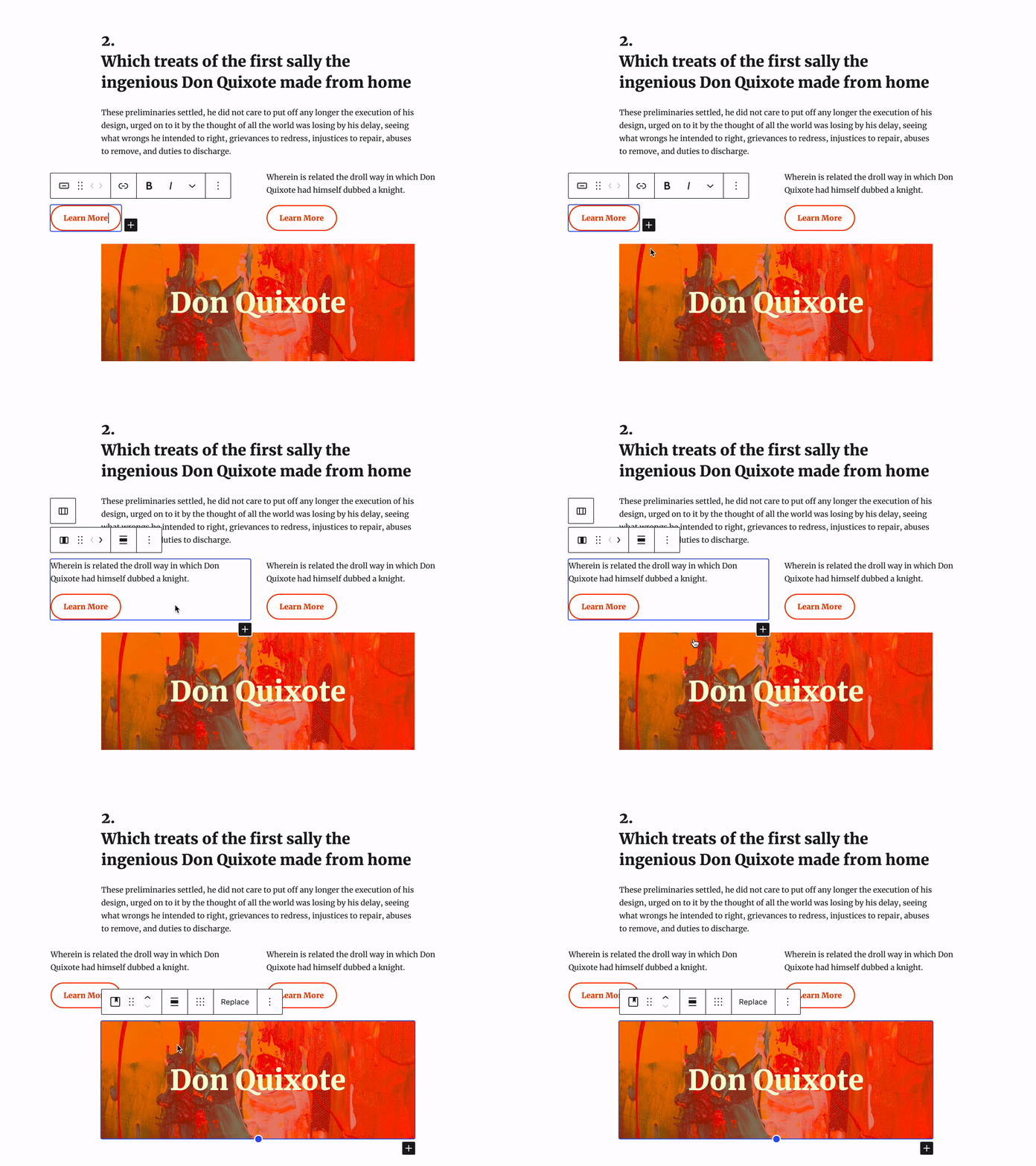
I have a few explorations. Here's the first one in GIF format: In the above GIF I have a Columns block, with one column containing an Image and the other column containing two Paragraphs. Add buttons are only displayed based on the currently selected block. As I select the Columns block, the default canvas add button disappears. When I hover over the left column's add button the Column is outlined and a linear guide is shown to indicator where a block would be added. These add buttons are positioned to a fixed point on the container (bottom-right), and don't affect the layout of the document. |
|
Awesome ticket, Shaun. This is something I know has frustrated both @mtias and @ellatrix for a long time — specifically the layout interruption. Whatever we can do to make the appender not take up visual space in, for example, a vertically centered Cover block, would be great. As for your first exploration, my instinct also goes towards some absolute positioning as the primary/only solution, and showing on hover also makes sense. The primary problem there is, what if I want to click at the bottom right of a paragraph to start typing there? I wonder if there's a refinement that puts the button on the edge of the block boundary, and even makes it smaller. Notably in cases like Social Links, or Navigation, putting the plus as an overlay is tricky as there's barely any space to begin with — we might even want to limit this from showing up in such small contexts. |
|
Another exploration focuses on drag-and-drop as a useful method of adding blocks into specific locations. Here's a quick GIF to show dragging a block from the library, and how hovering can help guide you into the placement of the block: In the GIF I drag a Paragraph block over the bottom area of a Column block. As I hold the hover for a split second, a blue line appears to help signify where this new Paragraph block would be place. As I continue to move my pointer towards the center of the document a new guide appears letting me know that I'm about to place a Paragraph block between the Columns and existing Paragraph block. I think this drag-and-drop interaction would make the in-between and container add buttons unnecessary. |
I'd love to see this drag and drop interaction become a reality. This was highly requested in the Widget Screen as well. |
Thinking about this a little, I wonder if for container-type blocks like Buttons, Navigation, Columns, and Column if it would make sense to surface the add button into the block's toolbar: |
|
There's a very old issue for drag and drop from the inserter (#1511). Would you mind adding that gif as reference there? |
|
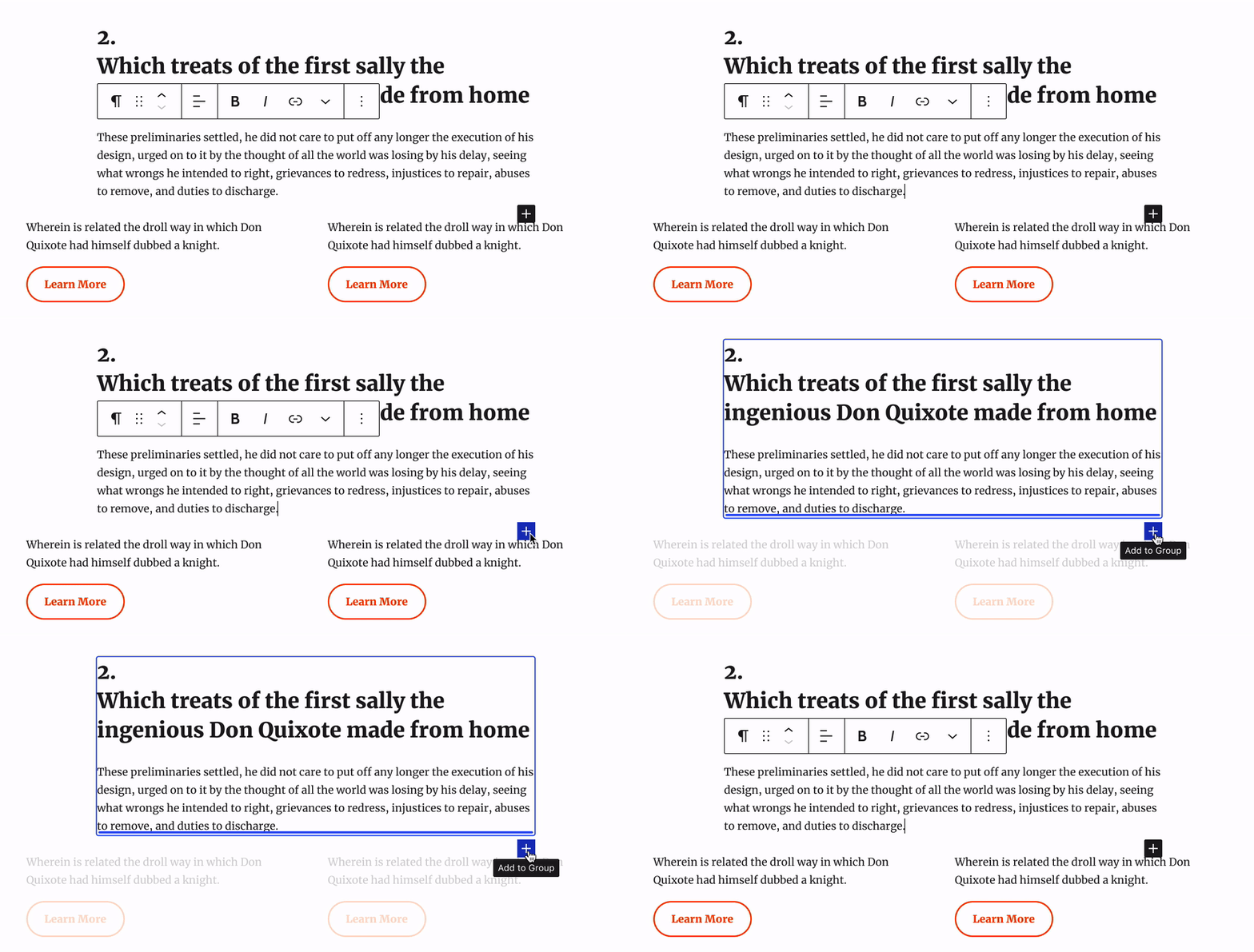
Looking at the (what I've nicknamed) Fixed Floaties option, where container-type blocks show a fixed-positioned add button. Only one add button is shown at a time, and since it's fixed to doesn't affect the layout of the document. When hovered for a few seconds this button would highlight the container block: Here's a look at how the hovered highlight could work for different types of containers: |
|
While there's something about the visuals of the bottom right aligned button I don't totally love, your approach does seem to hold an opportunity to solve some of our current headaches. There appears to be an inconsistency in how the button appears in Group/Cover compared to Buttons. In Buttons, it's inside the container, next to the only allowed child block. In Group/Cover the button is outside the container, always at the end. Is there a system that tackles both at the same time? |
|
In the Cover context, how would you distinguish between adding within and adding outside? |
Drag and drop.
Insertering from toolbarI like the idea of @shaunandrews #26404 (comment) to use insertes from the toolbar. To be honest: For me the only reliable source in Gutenberg to add blocks at the correct place are the options "Add block before" and "Add block after". I don't want to overcrowd the toolbar, but would like to add the following proposal, coming from @mapk's idea to show more options in select mode (being explored in #25275) and building on (in this context a bit tiny) icons I created in #25274:
This could be handled with those options in the toolbar. And: I would love to see an inserter instead of a new paragraph (for inner blocks with only one allowed block of course this single block should be inserted). |
|
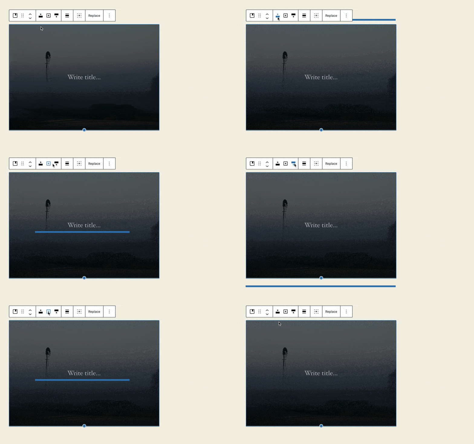
Had another idea: If using the toolbar for inserters, we could enhance usability by showing the inserter-line while hovering/focusing: |
Part of the idea is that the + button only appear on the canvas when you select a container block, like Group, Column, or Cover. I've created a small prototype to get a sense for how this container add button could work: https://shaunandrews.github.io/static-prototypes/canvas-add-buttons/ Otherwise, the only + button is the one in the top toolbar. With the existing method of using the block toolbar's More Menu (...) to add blocks before/after, and the proposals for incorporating drag-and-drop, we can remove the default + buttons in empty Paragraphs and at the bottom of the document. -- @mariohamann — I have similar explorations, but abandoned the idea of adding more icons to the toolbar as it doesn't feel like a primary action related to the block. Having these options in the More Menu (...) seems like the better solution. I could see adding another option to the More Menu to "Add inside," if the block supports it. |
|
I've mentioned this to you before, just adding it here just to note on record :D Having the + on the bottom right of the container makes it quite uncomfortable to target with my cursor when using a Trackpad. I don't know if its just working against my muscle memory of interacting with the toolbar, or some kind of awkward contrast in that most blocks tend to be top-left heavy. This one is especially troublesome: TLDR: I +1 the idea of exploring this action being closer – but not necessarily inside the Toolbar. Perhaps something like: Quite possibly too radical, but sharing if for no other reason than to rule it out (or inspire something better)... If we made the button a bit bigger (matching the toolbar) we might be able to communicate where the block will be added on the button itself, and perhaps even utilise a pattern like the parent-block-selector to enable folks to choose the position their block will be added... |
|
Some of these mockups remind me a lot of what I'm proposing in #13571. |
|
To make sure it doesn't get lost, I wanted to recap some of the feedback from this recent WP Tavern post:
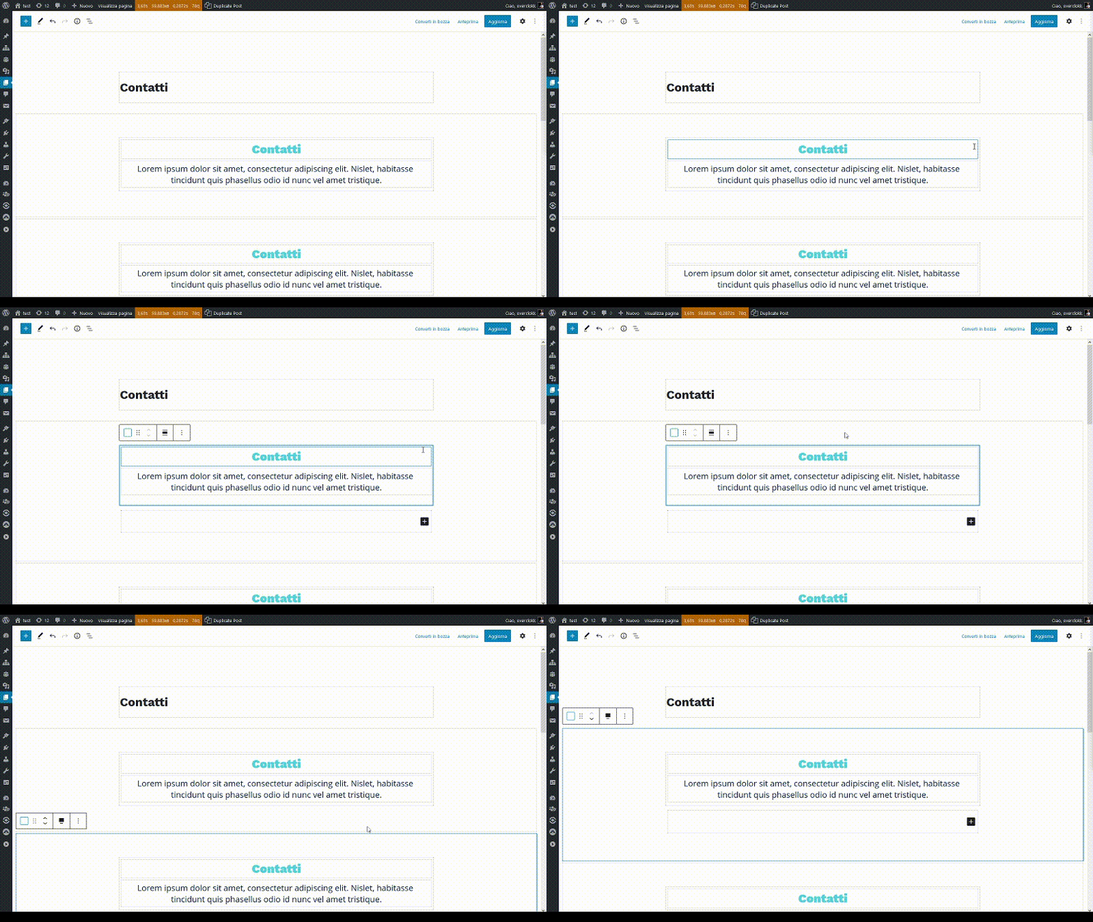
In my testing the last few weeks, this experience has grown worse particularly when using Full Site Editing. Here's just a quick video where you can see the block outlines and add buttons causing a lot of visual activity to do simple tasks: add.button.mov |
|
@overclokk There are several issues which try to improve outlines e. g. #25133 #23892 #22383 You are very, very welcome to add your feedback over there. 👍🏻 |








This add button appears in many places while interacting with blocks in the editor.
The intention of these buttons is to allow the user to quickly add a block in a specific location. However, these buttons can also cause problems...
The Problem with Add Buttons
The floating add buttons have often been brought up as a source of confusion and frustration. These little [ + ] buttons can seem to appear at random times, in random places, which can make it difficult to add a block in a specific place. In general, adding new blocks is often seen as a “pain point” for both new and experienced WordPress users.
Here's the problems with add buttons that I've seen in my own use, and when watching others...
Multiple Add Buttons
Add buttons are often unaware of each other's presence, which leads to multiple [ + ] buttons scattered around your document. Its easy to get 3 add buttons, all aligned differently, and all that add blocks in different places.
In the GIF above I have a Columns block with 3 columns, each containing a Paragraph and a Buttons block. Below the Columns block I have a few Paragraph blocks. When I select the Buttons block I suddenly see three different [ + ] buttons.
With all the various alignments and display logic, it quickly becomes overwhelming and leads to confusion around where each of these buttons would add a block.
Layout Interference
Often times you'll notice your blocks will shuffle around the screen as you interact with container-type blocks. This shuffling is caused by the addition of the add buttons when working within a container-type block. The add buttons behave like a normal
div, usingdisplay: block, and by definition affect the layout of the document. As the add buttons are displayed and hidden, they cause blocks to move around as the layout of the document is updated.In the GIF above I have a Columns block, with the right Column containing a Heading, Paragraph, and Navigation block. As I select one of these inner blocks, the Column block displays its add button. The addition of this button affects the layout, causing the normally vertically-centered blocks to move around. This is incredibly weird, as the block you just selected no longer appears under your pointer — it’s a cruel game of Keep Away.
Interaction and Interface Interference
The floating in-between add button can often interfere with other UI elements and content in the editor. One common example of this is the drag handle for resizing the Spacer block:
Similar, editor UI can sometimes interfere with the add buttons. For example, a block's toolbar can display on top of the in-between add button hiding it entirely from view.
The Mystery of the Randomly Appearing Paragraph
The strangest experience when dealing with add buttons is the mysteriously added default Paragraph block that often appears.
In the GIF above I have two Columns, with a Paragraph on the left and an Image on the right. When I select the Image, the Column block displays its add button below the Image. In this scenario I was trying to select the Column block, so I clicked on the empty whitespace below the Image.
However, this doesn’t select the Column block — it actually added an empty default Paragraph block. This is because I unknowingly clicked on the Column's add button. This is confusing, because it’s not obvious that this add button is actually much bigger than its visual appearance. If we look at the code behind the scenes, we can see the actual size of this deceptive add button:
Once you click on the add button, you’ve actually placed a default Paragraph block. If you’re like me, you don’t expect this behavior. I often will try to undo my mistake by clicking somewhere else — but them I’m stuck with the “Start writing or type / to choose a block” placeholder text which affects my layout.
--
Summary of User Problems
The text was updated successfully, but these errors were encountered: