Introducing Twenty Sixteen
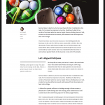
WordPress 4.4 will see a brand new default theme; that’s right, today is time to meet Twenty Sixteen! The process of selecting the Twenty Sixteen theme was a long one, taking several months. Lots of themes were considered, eventually settling on the one you see below. It’s a perfect fit!

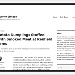
Twenty Sixteen features a new, never-released design that has some really unique touches on a traditional blog layout. It adapts well to different devices and is a joy to use.
Twenty Sixteen is a modernised approach of an ever-popular layout — a horizontal masthead and an optional right sidebar that works well with both blogs and websites. It has custom color options that allow you to make your own Twenty Sixteen. The theme was designed on a harmonious fluid grid with a mobile first approach. This means it looks great on any device.
– @iamtakashi
Let’s take a look at more!


We have the pleasure of welcoming back Takashi Irie as the designer of Twenty Sixteen. This year, the core team developing our new default theme will be myself and @iamtakashi — and you! We hope you can join us in getting Twenty Sixteen out to the world. Along with us, @iandstewart and @samuelsidler will be making sure the ship stays on course and giving us their wisdom as we charter the default theme seas.
How can you get involved?
There will be weekly meetings every Monday and Friday 16:00 UTC in #core-themes for half an hour. These weekly meetings will start once the theme has initially landed in core. If you are interested in contributing, subscribe to this blog (if you haven’t already), and leave your name in the comments. Once we’re ready, we will give everyone a ping and we’ll let you know on this blog too.
Want to know more about default themes?
There are some great links where you can find out more about past default themes.
- Why Default Themes Change Each Year
- Takashi Irie on Twenty Fifteen
- Takashi Irie on Twenty Fourteen
- Joen on Twenty Thirteen
The road to releasing a new default theme is long, but we’re already well on our way! The next step is to commit the initial code to core. From there, we will begin testing and patching. We hope you join in the adventure of releasing Twenty Sixteen.
Nikhil Vimal 2:54 pm on August 25, 2015 Permalink | Log in to Reply
I would be interested in helping!
Frankie Jarrett 2:57 pm on August 25, 2015 Permalink | Log in to Reply
Pretty
Drew Jaynes 3:05 pm on August 25, 2015 Permalink | Log in to Reply
Congrats all around!
Ciprian 3:11 pm on August 25, 2015 Permalink | Log in to Reply
I still think it looks a bit outdated. The default themes should be more modern, more 2016ish.
Mattias Tengblad 3:38 pm on August 25, 2015 Permalink | Log in to Reply
+1
Paal Joachim Romdahl 4:55 pm on August 25, 2015 Permalink | Log in to Reply
Agreed.
Arnan de Gans 6:21 pm on August 25, 2015 Permalink | Log in to Reply
Yep, this looks like a 1998 html page
WTech 6:29 pm on August 25, 2015 Permalink | Log in to Reply
+2 (imho 2014 is better)
Matt Mullenweg 11:52 pm on August 25, 2015 Permalink | Log in to Reply
For the folks who think it looks old, definitely share some links to themes you think are more modern, it could be a good inspiration for twenty-seventeen (which is just around the corner).
waltson 5:37 am on August 26, 2015 Permalink | Log in to Reply
Hi Matt .Really thanks for giving a chance to interact with you .I like wordpress, and i am working on it from few months .I like the 2016 theme. But please see the below points
(1)Could you please add some more functions that assist in working with forms.
(2)Captcha support by default
(3)Could you please add some more permalink structure tags like %taxonomy%,%sub-taxonomy%,%sub-category% and way to arrange them
(4) great pain is trying to make WP work with Angular.js or similar for building web apps.
The most important ting is that please give some importance to https://wordpress.org/ideas/view/latest , because we only have this place to express our ideas . It would be very happy if we get correct reply and concentration from the wordpress team .
I am looking forward to your reply.
Thank you .
Paal Joachim Romdahl 8:12 am on August 26, 2015 Permalink | Log in to Reply
Hi Waltson. A better place to post what you wrote would be in the “WordPress 4.4: What’s on your wishlist?” thread further down this page.
Sam wc 9:08 am on August 26, 2015 Permalink
But Paal , these are some good ideas .Why we waiting for implement this in WordPress 4.4 . If these ideas make sense and it is important it can be implemented int he very next WordPress update.
Aparna123 9:25 am on August 26, 2015 Permalink
Waltson is right
Sam wc 3:04 pm on August 27, 2015 Permalink
WordPress team not looking at Frame work such as laravel,Yii,cakephp etc.Please make it very powerful such as this frame work. Because we love wordpress never wan’t to down when compare with these frameworks .
Aparna123 9:23 am on August 26, 2015 Permalink | Log in to Reply
Good things Waltson.Generally there is lack of form handling and validating function in WordPress.Captcha is also important .
Adrian Pop 1:08 pm on August 26, 2015 Permalink | Log in to Reply
I also think is kind of an oldish design – forget about sidebars! I really like Satellite (https://wordpress.org/themes/satellite/) and Ryu (https://wordpress.org/themes/ryu/) is one of my all-time favorite – Thaks Mr. Takashi
Sam wc 3:03 pm on August 27, 2015 Permalink | Log in to Reply
WordPress team not looking at Framework such as laravel,Yii,cakephp etc.Please make it very powerful such as this frame work. Because we love wordpress never wan’t to down when compare with these frameworks .
transl8or 5:11 pm on August 27, 2015 Permalink | Log in to Reply
I don’t think it looks old.
It’s very very classical, kinda puristic und could be quite elegant with good pictures.
—
Nevertheless I have two concerns about this theme:
So I hope the customizer options will support a checkbox or simular to switch the frame on or off.
Or maybe even have it only left & right vs. top & bottom.
Or just choose the frame color individually so that it will be the same as the background color.
I’m often very unhappy with lot’s of menus within WordPress Themes because they seldom look kinda “design consitent” for the whole site nor for bigger websites with lots of pages (not blogs, with mainly posts and infinite scroll).
The later comes mostly with horizontal menu.
— —
As a suggestion for this theme, I could imagine a “sidebar integrated” menu, like you can see it in the Ascetic theme see here:
http://demo.alienwp.com/ascetica/
Could be a challenge with a full-width page, or pages with full-width header-image though.
Or a menu like the Materialist Theme uses, see here:
https://wordpress.org/themes/materialist/
But on the upper right side.
I like simplicity of the menu in the Libre Theme and the Theme in general;
but it still has the issue of going “white over white, or even over content” when you create a site with a menu that has loads of items and levels.
— — —
Talking about the Materialist Theme brings me to the next topic.
A more modern design approach for Twenty Seventeen?!?
How about Material Design, Semi Flat Design, more colorful options and/or a “lighter, thinner, more playful & transparent look” for the menu/navigation, input-form elements and fonts.
Oh, and I’d like to see an option in the Customizer for the primary menu to either be a “fixed navigation bar” or not more often.
Examples:
http://www.nuabikes.com/
http://www.brindisatapaskitchens.com/
http://revelator.com/
http://www.wonderfullywild.co.uk/
https://niice.co/
http://branding.cards/
http://simplehonestwork.com/
http://evandorlot.com/portfolio/naaataa-fashion-branding/
Google Resources on “Material Design”:
https://www.google.com/design/spec/material-design/introduction.html
sonofara 2:46 am on August 28, 2015 Permalink | Log in to Reply
20Sixteen is clean, responsive and is definitely a perfect startup template which can be transformed into an eye catching website.
hapke 12:51 pm on September 21, 2015 Permalink | Log in to Reply
++
wimfeijen 8:49 pm on October 29, 2015 Permalink | Log in to Reply
Hi Matt,
To me 2016 looks stylish, elegant and indeed a bit old-fashioned.
Our customers especially like Big Point. For example see: http://ttcmobile.com/ . In our designs we like to look at websites like uber.com , airbnb.com and always apple.com . Meaning big pictures, clear menu, big header text explaining what the site is about and clear call to action button.
Good luck in creating another awesome theme!
chrishoward 5:50 am on August 26, 2015 Permalink | Log in to Reply
Yes. Reminds me of 2012.
I think the main prob is the sidebar. That sort of stuff is all in footers in modern designs.
chrishoward 5:51 am on August 26, 2015 Permalink | Log in to Reply
I meant, reminds me of TwentyTwelve theme
stuk 3:22 pm on August 26, 2015 Permalink | Log in to Reply
+1
Lara Littlefield 3:16 pm on August 25, 2015 Permalink | Log in to Reply
I’m so excited to have photos displayed in such a unique way like this in a default WordPress theme. 2016 is beautiful!!
Helen Hou-Sandi 3:18 pm on August 25, 2015 Permalink | Log in to Reply
Woohoo! I’ve still got that musician bias – like Twenty Fifteen, this looks like it can serve as a really solid base for portfolio sites, especially with some creative thinking around colors and content.
web2033 3:23 pm on August 25, 2015 Permalink | Log in to Reply
Happy new 2016 ^_^
Mel Choyce 3:24 pm on August 25, 2015 Permalink | Log in to Reply
<3
Matthew 3:26 pm on August 25, 2015 Permalink | Log in to Reply
awesome stuff
Philip Arthur Moore 3:27 pm on August 25, 2015 Permalink | Log in to Reply
Happy to help do some theme breaking. Can’t wait to see this land. Takashi’s designs…are they ever not amazing? Another hit; cannot wait to see this on millions of sites. Great work gang.
Ihor Vorotnov 3:35 pm on August 25, 2015 Permalink | Log in to Reply
One more blog theme with a font that looks ok only with latin characters? Looks nice, but… Come on guys, there’s life outside US. There are other languages out there. WordPress is not only for blogs anymore.
Ajay 3:40 pm on August 25, 2015 Permalink | Log in to Reply
This is definitely looking very clean. Twenty Fifteen was OK look wise, but this definitely looks like a worthy base for any new site.
Nick Halsey 3:48 pm on August 25, 2015 Permalink | Log in to Reply
I’m honestly not a fan based on the screenshots, but that’s okay – even a default theme shouldn’t try to satisfy everyone. Something feels off with it for me.
Based on the way the colors seem to work, again based on the screenshots, we should probably explore making the text colors auto-generate to light or dark based on the selected background color, for simplicity and to minimize contrast issues. The Fourteen Colors plugin for Twenty Fourteen does something similar.
Chrisdc1 3:51 pm on August 25, 2015 Permalink | Log in to Reply
Looks good, I’d be interested in helping as well,
Ahmad Awais 4:02 pm on August 25, 2015 Permalink | Log in to Reply
I’d love to contribute.
Sakin Shrestha 4:03 pm on August 25, 2015 Permalink | Log in to Reply
Looks really nice and clean. Would love to contribute… Thanks
Donna Fontenot 4:18 pm on August 25, 2015 Permalink | Log in to Reply
This is exactly what WordPress does NOT need. Another boring, snoozefest old-school blog layout. Wake me when WP joins the rest of the world in 2015 and beyond. (BTW, I tried really hard to come up with a nice way to say that, and I just couldn’t, so here is the comment in all its straight-forwardness.)
MRWweb 4:25 pm on August 25, 2015 Permalink | Log in to Reply
Let’s get some alt text in that image gallery! #a11y
There are some really nice touches in the screenshots. I like the pull quote a lot (though wonder how it will be applied with the editor).
At some point, I’d love to hear the core team be a little clearer on how the new theme is selected and why there have been two blog themes in a row. (It also might not be too late to add an interesting static front page option to Twenty Sixteen to make it more versatile!) I tend to follow this stuff and had no clue this process was happening. I certainly understand the need for fewer cooks in the kitchen, but at least letting some more people suggest ideas for priorities might be nice. Maybe even a poll or two.
I’ve heard for years now many people clamoring for a “new Twenty Twelve” and still hope to see another “CMS” theme as a default soon. (It’s remained quite popular: https://docs.google.com/spreadsheets/d/1UV4UGFCdTdNhK8v7l9s6J0uI5Y-QMRocSET63NO3CVc/edit?usp=sharing)
Nick Halsey 7:11 pm on August 25, 2015 Permalink | Log in to Reply
You’re not missing anything – there is a complete lack of transparency in the default theme process prior to the “announcement” posts. Even frequent contributors have heard absolutely nothing about it prior to today.
My biggest complaint is that we have now had the same designer do the last three default themes. Takashi’s work is amazing, but it’s definitely time to give someone else an opportunity to fill this role as has been done in the past. Since the extremely outside-the-box Twenty Thirteen, we’ve gone back to progressively less and less compelling designs with each default theme.
MRWweb 8:59 pm on August 25, 2015 Permalink | Log in to Reply
> Takashi’s work is amazing, but it’s definitely time to give someone else an opportunity to fill this role as has been done in the past.
I agree. Even if Twenty Fifteen—which I like quite a bit—were by the objectively best designer in the world (that is not a thing, but for the sake of argument…) the core team should be doing more to promote and diversify the designers who show what WordPress can do and be. The idea that there aren’t other designs who can do this—and wouldn’t drop all sorts of other commitments if given the chance!—just doesn’t make sense.
I hate being negative in what is an otherwise worthwhile celebratory post and call-to-action, but I really hope this can stop being so untransparent and homogenous.
Ian Dunn 2:05 am on August 26, 2015 Permalink | Log in to Reply
+1
John Saddington 9:29 pm on August 30, 2015 Permalink | Log in to Reply
+1. I think it just makes sense to give someone else a go. Why not?
wimfeijen 8:55 pm on October 29, 2015 Permalink | Log in to Reply
+1 Nicely put! TwentySeventeen should be the new Twenty Twelve!
Felix Arntz 4:26 pm on August 25, 2015 Permalink | Log in to Reply
Plain and simple – and great. Looking forward to replace Twenty Fifteen on my blog
Emil Uzelac 4:30 pm on August 25, 2015 Permalink | Log in to Reply
So Fresh, So Clean!
Nilambar Sharma 4:31 pm on August 25, 2015 Permalink | Log in to Reply
Simple and nice. I am willing to contribute…
voldemortensen 4:48 pm on August 25, 2015 Permalink | Log in to Reply
Is there a way to get involved with this *before* it lands in core? I am a frequent core contributor and I have Slack open all day. I’ve heard nothing about this until literally a few minutes ago.
Matt Mullenweg 11:51 pm on August 25, 2015 Permalink | Log in to Reply
Is there anything in core yet? I didn’t see it on the timeline.
Shapeshifter 3 5:12 pm on August 25, 2015 Permalink | Log in to Reply
“The theme was designed on a harmonious fluid grid with a mobile first approach. This means it looks great on any device.”
– @iamtakashi
I like the concept !
Is there any way to download the current alpha version of this, so I can upload it to my own website to preview it with my own personal content?
I’m interested to know what the current Theme Customizer currently offers in Content (width) and Layout options.
Orangedrop 5:16 pm on August 25, 2015 Permalink | Log in to Reply
For once purely based on screens I don’t know if I’m down this ! That said you can’t please everybody all of the time I would love to get my grubby mitts on it and break it a few times so please count me in ! Thanks guys and as always keep up the awesome work.
Brent Jett 5:39 pm on August 25, 2015 Permalink | Log in to Reply
I’d like to know more about how this theme will be implemented in terms of customizer fields, editor styles, custom widgets/shortcodes etc… I’m a big believer in designing themes for the WP user as much as the reader. Where are these discussions currently being had? Is this project on github somewhere?
dannybrown 5:54 pm on August 25, 2015 Permalink | Log in to Reply
Yawn. Sorry, but this design (as far as looks goes) is so 2012.
dshanske 6:15 pm on August 25, 2015 Permalink | Log in to Reply
I would be interested in ensuring that the theme is microformats compliant.
Gaurav Tiwari 6:20 pm on August 25, 2015 Permalink | Log in to Reply
Make it look like commercial themes. If WP is no longer blogging focused CMS why should the default themes be?
LittleBigThings 6:36 pm on August 25, 2015 Permalink | Log in to Reply
Cool and clean, a bit Twenty Twelve-like. Hope to see some unique features in the Customizer. I would love to follow it up and help out testing.
Tomas Mackevicius 6:41 pm on August 25, 2015 Permalink | Log in to Reply
Looks great! Can we see live demo?
Karthikeyan KC 6:44 pm on August 25, 2015 Permalink | Log in to Reply
To be honest, twentyfourteen looks better than twentysixteen. Anyways, it’s good for the default one.
Tomas Mackevicius 6:52 pm on August 25, 2015 Permalink | Log in to Reply
But 2014 was not built on _s, I hope 2016 is.
WebMan Design | Oliver Juhas 7:07 pm on August 25, 2015 Permalink | Log in to Reply
Looks great, very clean! I’d like to contribute too
SanjayaBhai 7:10 pm on August 25, 2015 Permalink | Log in to Reply
Twenty sixteen.. Hope it will be great…. But please make this themes more modern/Beautiful … It’s seems classic .
Alex Mills (Viper007Bond) 7:25 pm on August 25, 2015 Permalink | Log in to Reply
It’s been a long time since I’ve run a default theme but I’ll be switching for this one!
George Stephanis 7:28 pm on August 25, 2015 Permalink | Log in to Reply
I’m pulling for twentyseventeen to be Kubrick redone responsively.
Ryan Hellyer 9:42 am on August 26, 2015 Permalink | Log in to Reply
I’ve been toying with forking Kubrick like that for many years now, but never gotten around to it.
Drew Jaynes 8:41 pm on August 26, 2015 Permalink | Log in to Reply
FWIW, I already did it. I created a child theme for Twenty Twelve called Nubrick, that created a responsive version of Kubrick. The header used CSS gradients and everything else was matched to a tee with some obvious improvements. Might have it laying around here somewhere, have to look.
Tarik Cayir 7:59 pm on August 25, 2015 Permalink | Log in to Reply
That’s sweet and incredible!
Morten Rand-Hendriksen 8:14 pm on August 25, 2015 Permalink | Log in to Reply
Sign me up. I’ve done a lot of work with pull-images of the kind proposed here and know some of the pitfalls. I’ll contribute what I can and where it helps.
Valeriu Tihai 12:14 am on August 26, 2015 Permalink | Log in to Reply
Happy to help
WP Sites - Brad Dalton 1:37 am on August 26, 2015 Permalink | Log in to Reply
How about a widgetized page template which can be used as the front page. Widgets in columns are popular and so are full width sections. The genesis sample child theme is hugely popular because you can easily add custom functionality unlike any of the default themes.
Matt (Thomas) Miklic 2:03 am on August 26, 2015 Permalink | Log in to Reply
This is a beautiful theme and I can’t wait to use it myself.
Aaron Brazell 2:13 am on August 26, 2015 Permalink | Log in to Reply
I like the image offset a lot and I want a one-column option, so glad to see that in there. Agree with previous commenters saying it looks a bit dated, but I also don’t think that’s twntysixteen per se… I think the “blog layout”, which is a guiding principal, is a bit dated. I’d love to see twentyseventeen place less emphasis on text content, top down, left-right, sidebar, header and more of a focus on rich media. Photographs, videos, etc… with natural integrations (no external APIs) with social content (and not just FB and Twitter)… it’s such a rich internet, but the blog approach to the project might be influencing the frontend a bit much and not keeping up.
nick6352683 2:38 am on August 26, 2015 Permalink | Log in to Reply
Anything, and I mean anything would be better than 2013, 2014, and 2015. I prefer 2012 over those, and 2016 seems more or less in line with 2012. The whole discussion is pretty much mute for me, as I always opt to use “premium” type themes, with tons of bells and whistles, but I’m very biased as I develop my own themes, with extra functions and shortcodes.
webdevmattcrom 3:33 am on August 26, 2015 Permalink | Log in to Reply
Definitely interested in contributing, sign me up!
I love that this does feel like it’s heading back toward a cleaner Twenty Twelve feeling. I like that the sidebar is on the right by default, but especially considering RTL it would be nice to have a Customizer option to put the sidebar on either side. In that vein, since the Customizer is getting more and more prominence it would be great to see this theme really flaunt some great aspects of the Customizer as a strong example of “Decisions not Options” while still providing flexibility in look and feel.
Looking forward to seeing this come to life.
Amit Kvint 6:32 am on August 26, 2015 Permalink | Log in to Reply
Definitely interested in contributing, sign me up too!
Brian Krogsgard 7:12 am on August 26, 2015 Permalink | Log in to Reply
Is Ian Stewart the default theme lead?
There is obviously a lot of decision making going on in regard to default theme design that nobody really knows about, and it is really confusing. It is so different than the rest of WordPress development.
So, how would someone go about getting involved earlier in the process (at the design level!), short of going to Matt Mullenweg? I might add that going to Matt on how to get involved (though he appears the primary gatekeeper on default theme design) is likely quite intimidating for most folks.
A lot of talented designers would probably like to get involved in this process but don’t know it’s possible or how to start. Some information and light on the process itself would be most welcome, I’m sure.
Philip Arthur Moore 8:55 am on August 26, 2015 Permalink | Log in to Reply
The fact that there are so many passionate responses here is pretty cool.
History time:
Default themes won’t be for everyone, and ultimately I share Brian’s thoughts above. I think it’d be GREAT for 10000% transparency around the default theme making, designing, and proposal stages before posts like this are made. (Honestly it makes no difference to me personally but the community seems to benefit quite well from feeling like we have a chance to contribute to such a public and front-facing piece of WordPress.)
But that aside, however the theme came to be, I think the first drafts shared are quite nice and absolutely cannot wait to help break things once it lands into Core. I’ve no doubt that there are some pretty serious design and development challenges that will come out of these drafts, and it’s going to be exciting to take part in that.
Subharanjan 9:04 am on August 26, 2015 Permalink | Log in to Reply
Clean and Simple !! Looks awesome
SanjayaBhai 9:07 am on August 26, 2015 Permalink | Log in to Reply
It’s awesome but not modern ..
Fotis 9:20 am on August 26, 2015 Permalink | Log in to Reply
Perfect.
Ryan Hellyer 9:46 am on August 26, 2015 Permalink | Log in to Reply
I like this new design. Simple, yet elegant.
stuk 10:24 am on August 26, 2015 Permalink | Log in to Reply
To me it seems quite outdated and useless as any default theme, is it not?
Quite clear that their intention is not to add extra features to WordPress, and indeed the basic theme can support only a maximum basic options.
But also simply bad design. If it’s the preview we let people install with the system, so it seems bad.
Nothing to do with new design trends.
Despite the WordPress developers insist that the system is already more than a blogging system infrastructure, they continue to release static templates without AJAX and without REST, and yet the basic theme is a theme of a blog, not a website.
In one word: shame.
David Bennett 11:42 am on August 26, 2015 Permalink | Log in to Reply
It reminds me of Linen from TheThemeFoundry, and it has the open, airy look of themes from ElmaStudio. I like it. The only thing I wonder about are the horizontal dividers in the sidebar. The Daily Dish theme from StudioPress has black sidebar dividers overpower the theme somewhat. The dividers in The Daily Dish are thicker but if a blogger has a lot of widgets it can start to look like the i Ching.
Elisa 12:19 pm on August 26, 2015 Permalink | Log in to Reply
I like it
CYBERsprout 1:28 pm on August 26, 2015 Permalink | Log in to Reply
Looks great! A very modern design.
ldbaldwin 2:43 pm on August 26, 2015 Permalink | Log in to Reply
I would be interested in contributing on some leve, (testing, documentation, etc.). Thanks!
cramdesign 2:47 pm on August 26, 2015 Permalink | Log in to Reply
I think it looks great. The structure is a traditional setup but I think that the overall design, typography and image handling is very current. I agree that the dividers in the sidebar might be a little too heavy but, then again, that is easily changed with css and let’s be bold every now and again.
firewatch 3:34 pm on August 26, 2015 Permalink | Log in to Reply
I’m interested in contributing, thanks!
djsteveb 9:20 pm on August 26, 2015 Permalink | Log in to Reply
Wish all the like and dislike comments could be removed here. Give specifics or save the screen space.
Sorry ya’ll but the default theme does not need to be any one person’s idea of pretty or modern, it’s default and certainly not the only option for anyone running wp.
What the default themes have been lacking since 2012(?) is documentation, transparency, and support.
All that fancy responsiveness is fine if you like things as is. Simply trying to move the left sidebar to the right with 2015 is a nightmare – I miss the days of simply change float left to float right.
Yes I know, “modern design” is beyond that – I have learned how to move things around with bootstrap, and foundation… moving things with 2014 / 15 is a joke. No documentation, no support – no transparency with updates.
Either given backend option for the most common changes, or make it easier for people to change things with code. Having to make edits and then change screen sizes and search for ways to change rules for each media query is a joke, with no docs, and no warnings about updates.
Given that the default theme is the only thing we can count on that will get any kind of support from buddypress, rtmedia and other plugins – many are indeed stuck with the default theme base – pretty or not – those things can be adjusted if the options are understood, documented, supported.
My comment on takshi’s site still waiting moderation (August 25, 2015 at 12:37 am ) – maybe it’s akismet limbo. Support on the wp repo is total confusion – even other professional sites that created right sidebar child theme break with basic background color change – is it them? Is it the theme? Was it working then an update fixed something and broke others?
I am happy to contribute what I can (20% through my php course!) – I was planning to make a video tutorial from the text how-to for making themes at themeshaper.com – however it states it’s outdated. I stumbled across a trello that has documentation for theming in the works – but that may be finished in 2017?
Given that the default theme has total power over so many things WP – I prefer no java, nothing complex, basic – make it easy to mod it so people can make it prettier and modern on their own. Not left in limbo choosing no support, no docs with wp plugins that work (and look basic) – or get a theme that looks better is modifiable – but then does not work with plugins and gets no love or support from plugin systems.
Frankly the older default themes were much easier to make better. Anything default that is complex is just going to shrink the amount of WP users that can actually mod something on their own without a degree in javascript and php. You might as well force us to use sass and less and bower. Really shrink the amount of people that can enhance a basic default theme.
Maybe pull all the extra stuff out and make it an option plugin like some do with “jetpack features” – I just want BP to work with something that can be modded – either with lots of backend theme options (colors, sidebar on, sidebar off, move to footer – basic stuff really, or easy css that the average person can figure out or get basic support from the community to figure out. (please take out all third party bloat, eg- google fonts, gravatar, emoji and put them as optional plugins, pretty please!)
Or convince BP and rtmedia (and others) to work with / provide support themes based on bootstrap and or foundation – then the default theme can be whatever it wants to be and we can peruse the documentation for those frameworks, and make adjustments easily.
Sorry to long rant, (and I started with ‘save the screen space – seriously sorry, very frustrated with all this!) I want to see WP, and things associated with it continue to succeed, however I concur that many of the past two years’ not-so-transparent decisions have not made this easy for most of the average users IMHO.
rahul286 5:40 pm on August 28, 2015 Permalink | Log in to Reply
I am from rtMedia team.
I like your idea of themes using a base js/css framework like bootstrap and or foundation. But our reason for supporting default themes is they work nicely with BuddyPress as well as other plugins. Mainly because many plugin developers also check test plugins with default themes.
That being said, our inability to support most themes is mainly because most themes are not tested with BuddyPress. In fact wordpress.org only shows 28 themes that claim to support BuddyPress – https://wordpress.org/themes/tags/buddypress/ and 1 of them is default theme and 1 other (rtPanel) is our theme.
djsteveb 9:52 am on August 29, 2015 Permalink | Log in to Reply
@rahul286 – Thank you for chiming in on this issue. I don’t expect your team or any other to have the ability to support every edge case theme created for wp, and I am glad you guys at least make an effort to keep rtmedia working with whatever updates get pushed by automattic at least. Your media plugin is the only reliable way for buddypress users to get picture and other media uploads, so it’s continuing functionality is imperative.
It is sad there are so few themes tagged to work with BP – of course there are many that do work with bp and yet they are not tagged that way in the repo – and there are several that are available outside the wp org system – however my experience has been that we can not count on other themes to work with bp and rtmedia properly no matter where they are from. I have tried 24 of those you mentioned 😉
This is exactly why I feel a new default theme must be carefully considered, and it should be easier to modify than the past two – as we are indeed basically stuck using 2014 / 2015 /2016 for bp sites or gamble with lots of things not working – and no support or docs to fix things. This is not an rtmedia fault – it’s just where things have gone with bp in general I guess.
There are some who think my thoughts on this are 100% wrong, at least one person replying to a similar comment I made in regards to these issues at wp-tavern – ( http://wptavern.com/first-look-at-the-twenty-sixteen-default-wordpress-theme#comment-72326 ) – however I think people have not seen the amount of support that has been needed to keep self hosted wordpress sites with plugins working properly with major updates and the basic issues that revolve around the default theme, and those that vary from it, is the starting point for almost every issue bp / rtmedia and many others plugins breaking with users sites.
Marcus Tibesar 11:26 pm on August 26, 2015 Permalink | Log in to Reply
IMO there is too much white horizontal space between the gravatars and the content.
Marcus 9:44 am on August 27, 2015 Permalink | Log in to Reply
I would love to help out
weblizar 11:38 am on August 27, 2015 Permalink | Log in to Reply
Hi,Like to contribute.
abe_charles 12:43 pm on August 27, 2015 Permalink | Log in to Reply
Have to say that Twenty Sixteen default theme is very weak. It deserves to be placed on life support because it looks like something created in 2010. It’s plain black and white by default with options for different colour options but still quite stale.
I thought Twenty Fifteen was poor but looking at Twenty Sixteen it’s as if WordPress is taking two steps backward by presenting this piece of crap. You have a disgruntled blogger in me and this theme ain’t gonna fly. At least you have a few more months before the year 2016 so get back to the drawing board and change the direction of this theme. It’s too late for April Fools.
Repeal, repeal and stop making the images fall off the page. That’s frustrating. Come with a better theme.
Matt (Thomas) Miklic 7:20 pm on August 27, 2015 Permalink | Log in to Reply
Everyone is entitled to an opinion about design, but this kind of comment is abusive, unhelpful, and shameful.
Mel Choyce 8:22 pm on August 27, 2015 Permalink | Log in to Reply
I think it’s important for people to remember that this theme was made by a real, live person. Disparaging contributors and their work is inappropriate and not welcome in this community.
You are welcome to your opinion, but if you want to give feedback, please keep that feedback respectful and constructive. Critiquing the design and the default theme building process is fine. Calling this theme “crap” or “useless,” however, is not constructive feedback and not appropriate for these contributor blogs. As Matt Miklic mentioned, that kind of feedback is abusive and unhelpful.
Here’s how to structure good design feedback:
Thanks for helping us keep WordPress a positive place to contribute.
abe_charles 12:44 pm on August 28, 2015 Permalink | Log in to Reply
Apologies for the insensitive remark. I never meant to cause offense, I thought that the opinion was valid but it went too far. It’s just that I have been waiting for Twenty Sixteen theme for a few months and to see what it will look like or what it looks like I am disappointed. It does need work for real. It’s too plain and looks like not much thought was put into it. It’s rather plain and basic. I was expecting Twenty Fourteen 2.0 or Twenty Fifteen 4.0
modparlor 2:01 pm on August 29, 2015 Permalink | Log in to Reply
Neat. Looking forward to this new minimalist theme. One request though: Could you please add in a font-switcher into the customizer. A thing desperately lacking in the 2015 theme IMHO. I can add in my own fonts, I know, but a dropdown with a set of 30+ Googlefonts would be easyer for quick tryouts.
That aside, thanks for the neat themes and the ongoing work on WP.
Ihor Vorotnov 3:36 pm on September 4, 2015 Permalink | Log in to Reply
Hey, if I’m correct, the theme meeting is going to start soon today. Can anyone point me where it will be? Can’t find the Slack channel.
danielgarneau 9:53 pm on October 20, 2015 Permalink | Log in to Reply
I’m looking forward to work with Twenty-Sixteen as soon as it becomes available. I am using Twenty-Ten because its interface is what it is, very plain and simple, somewhat along the line of Twenty-Sixteen’s.
What got me searching for a new theme was the performance issue with my current site identified through Google Developers PageSpeed Insights ( https://developers.google.com/speed/pagespeed/insights/ ).
I am hoping that Twenty-Sixteen will continue to provide the kind of plain interface found in Twenty-Ten while at the same time being natively built to support today’s mobile devices as well as laptops tabletops.
My Twenty-Ten theme is using the JetPack’s Mobile Theme Module, which does a fair job at providing some degree of mobile access to my site. But it would be nice to be able to use a Theme that would not be dependent on any plug-in for such basic functions as mobile compatibility.
So I am very interested in following-up on the progress being made towards Twenty-Sixteen, and am looking forward to start experimenting with it.
Knut Sparhell 1:10 am on October 21, 2015 Permalink | Log in to Reply
Twenty Sixteen has been available for a long time already. By using a responsive theme no “mobile theme” is necessary.
Joseph Graham 9:27 pm on October 25, 2015 Permalink | Log in to Reply
beautiful Theme 2016
sinan isler 10:23 pm on October 26, 2015 Permalink | Log in to Reply
what f is this? are we in 1995 ?
Ipstenu (Mika Epstein) 10:58 pm on October 26, 2015 Permalink | Log in to Reply
I’m sorry you don’t like the new default theme. Your tone is not one that encourages progress, however. You should attempt to at least explain why you dislike the theme, preferably in a constructive and polite manner. Swearing (even self edited) is rarely polite.
sinan isler 12:03 am on October 27, 2015 Permalink | Log in to Reply
I’m sorry for being angry. But I have reasons.
It is to late now for feedback. already shipped beta 1. we cant make major change on this. I see this late thats why I’m angry if I could see this earlier I could give feedback and try to make REALLY MODERN look and MINIMALİST styles.
But too late for this changes.
There is no solution on this design. Only typographic approaches.
I will tell one thing.
You can not make good design with only good typography. We need to make solutions for multiple purposes.
Another thing. Why we are talking this to in core section. This title should be on https://make.wordpress.org/design/
sinan isler 12:10 am on October 27, 2015 Permalink | Log in to Reply
Friday 16:00 UTC in #core-themes
I will try to be there.
Ipstenu (Mika Epstein) 12:51 am on October 27, 2015 Permalink | Log in to Reply
While you have reasons to be frustrated, that’s never an excuse to forget you’re working with people who have put a great deal of time and effort into something.
The default theme is never going to be a theme that pleases everyone and that’s okay It’s a theme people can use for their site or not, they can learn to code from or not, they can learn typography from or not. The default theme is not the be-all and end-all of themes. It’s a default theme that demonstrates some of the things you can do with WordPress.
But above all, it’s okay if you don’t like it. You don’t have to use it. Next year there will be another one. Maybe that one will be more towards your liking. Personally I never liked TwentyFourteen, it just wasn’t my kind of theme, but I saw the effort that went into it and appreciated it. And that’s allowed. It’s just the default theme, though, and like Hello Dolly, is not something you must use
titush 9:02 am on October 27, 2015 Permalink
+100 completely agree. The amount of time spent by all users commenting on the default theme… wow… imagine they would have spent it on hunting down bugs…
Ipstenu (Mika Epstein) 11:28 pm on October 28, 2015 Permalink
@titush – In all fairness, not everyone who complains has the technical ability to hunt down and fix bugs. And that’s okay too Sometimes noting a problem clearly for the developers is the best someone can do, and that is an invaluable service for software. However the approach is also important.
Joseph Graham 9:13 pm on November 1, 2015 Permalink | Log in to Reply
deleted
John Blackbourn 1:06 am on November 2, 2015 Permalink | Log in to Reply
If you’re not going to provide constructive feedback, please don’t bother commenting. This sort of comment will not be tolerated.
karthikkk 2:27 pm on November 2, 2015 Permalink | Log in to Reply
Super theme. I particularly like the current themes that are directly putting more focus on content. That is the best way to design a theme.
iksa01 11:04 am on November 12, 2015 Permalink | Log in to Reply
I am not adding any value , but I am curious, can schema markup support be added ? in the final version ?