PX, EM or REM Media Queries?
Have you wondered if you should use px, em or rem for media queries? I had the same question too, and I never figured it out, not till now.
When I first created the mappy-breakpoint library, I used rem units. Then after a conversation with Sam Richard, I quickly switched to em instead because I found out there isn’t a difference between the two.
In addition to em and rem, a popular unit of choice for media queries is the good old pixel. I wondered if it’s possible to use pixel queries nowadays since px-zooming problem that used to exist was now resolved by all browsers.
This week, I finally decided to get to the bottom of this matter.
Before we begin this article, I’m assuming that you already know what em and rem units are. Check this article out if you don’t.
The Base Experiment
I thought of creating three separate <div> elements, one for px, one for em and one for rem. I gave each <div> a background color so it becomes easy to tell them apart.
.pixel {
  background: red;
}
.em {
  background: green;
}
.rem {
  background: blue;
}
Next, I created a min-width query on all three selectors since we’re comparing the media query units.
When the query kicks in, I decided to decrease the opacity of the element so I can see the difference immediately. Here’s the CSS for the pixel-based media query:
.pixel {
  background: red;
  @media (min-width: 400px) {
    opacity: 0.5;
  }
}
The next step is to figure out how to create the em and rem units.
In this first experiment, I wanted to test if there were differences between the three units if all conditions were ideal. In other words, none of the following scenarios has happened:
font-sizechanged in<html>- user zoomed in.
- user changed their browser’s font setting.
Since the conditions are ideal at this point, I can safely assume that 16px, 1em and 1rem are equal. 400px, then, is equivalent to 25em or 25rem.
.pixel {
  background: red;
  @media (min-width: 400px) {
    opacity: 0.5;
  }
}

.em {
  background: green;
  // 400 ÷ 16 = 25
  @media (min-width: 25em) {
    opacity: 0.5;
  }
}

.rem {
  background: blue;
  // 400 ÷ 16 = 25
  @media (min-width: 25rem) {
    opacity: 0.5;
  }
}
If all three media queries behave in the same manner, we should see all of them trigger at 400px exactly.
And they did (on every browser I tested).
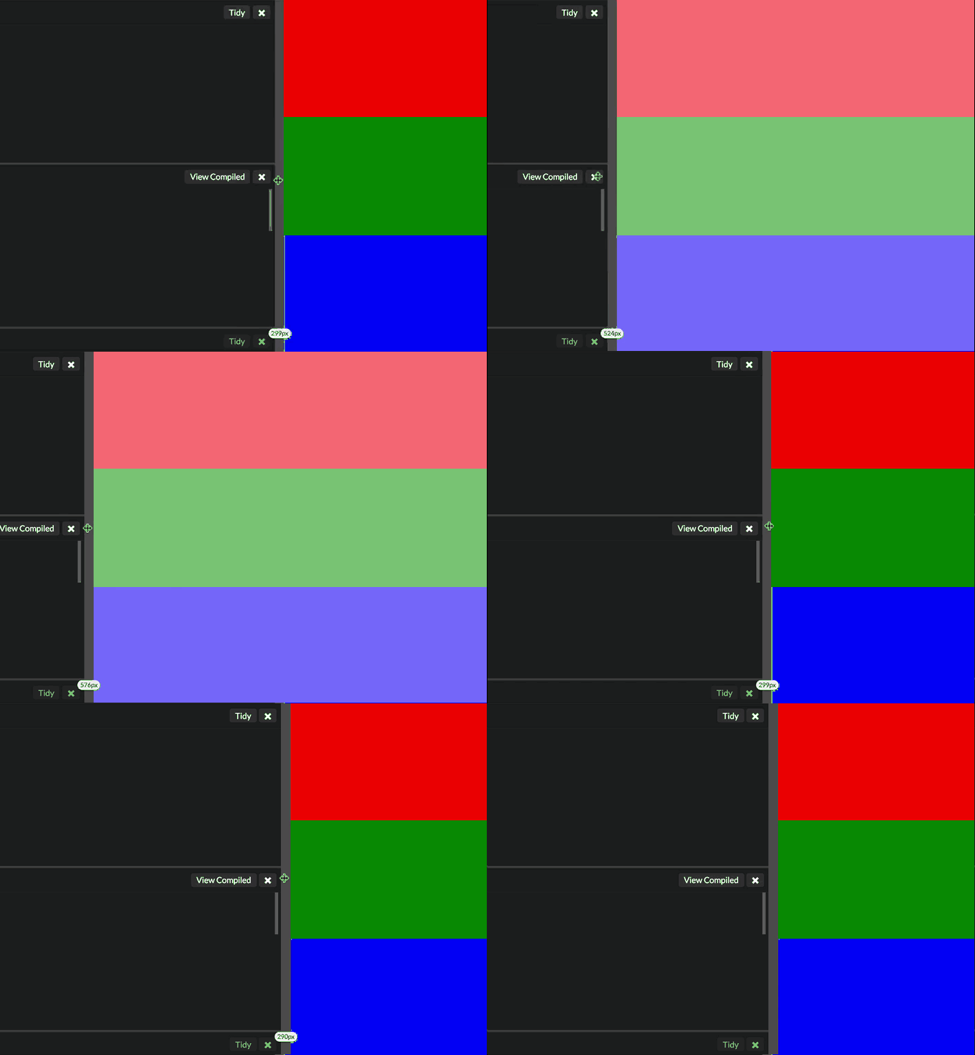
Since all three media queries kicked in at the same breakpoint, we know that there’s no difference between px, em or rem queries at this stage.
After establishing the base experiment, the next step is to test for less ideal conditions where any of the scenarios above occurred. Once again, the scenarios are:
font-sizechanged in<html>- user zoomed in.
- user changed their browser’s font setting.
Let’s go through them one by one.
1. Font-size Changed in HTML
The first scenario is incredibly common. In fact, almost all web pages use this method set the default font-size property in their CSS:
html {
  // setting default font size
  font-size: 200%;
}
Here, I chose to use a font-size of 200% in my test, which means that I’m setting both 1em and 1rem as 32px. If em and rem are affected by this change in font-size, they should only trigger at 800px
Here’s the result: Chrome, Firefox and IE 11 triggered all three media queries at 400px:

This is the correct behavior. em and rem units should not be affected by changes in font-size in the HTML since they’re based on the browser’s internal font-size property.
Unfortunately, we didn’t get the perfect behavior on Safari. It triggered the rem media query at 800px :(

Since this behavior only occurs on Safari, I was curious to see if mobile Safari was affected as well. Turns out, it did.
So, the first scenario already showed us that we shouldn’t use rem media queries. However, let’s continue to put rem in the rest of our experiments to see if anything else comes up.
2. User Zooms In
The second scenario is common as well. If the text on your page isn’t large enough, users may choose to use the zoom function built into their browser to enlarge the text.
The original idea behind em based sizes was due to older browsers not being
able to update pixel values when a user zooms. In this regard, testing the
difference between media query units when a user zooms will help to answer the
question on whether we can use px based media queries now.
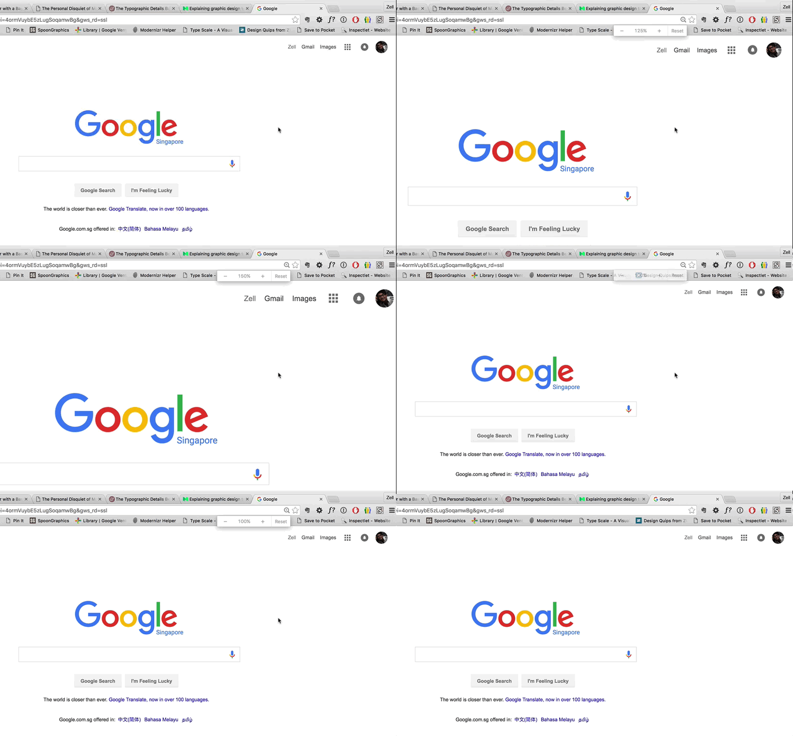
The results from this experiment is that Chrome, Firefox and IE showed the same behavior. px unit queries fired at the same time as em and rem queries.
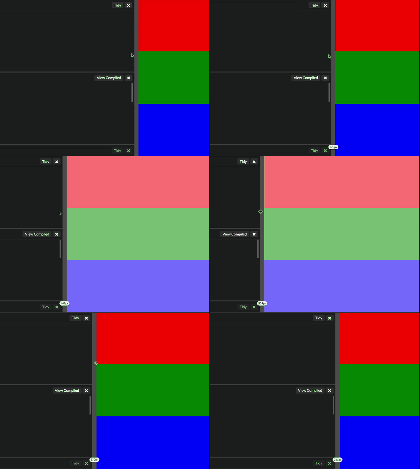
And you guessed it… Safari didn’t :(
Unfortunately, this means that pixel based media queries are out of the question. Safari doesn’t support them properly (unless you decide to forsake Safari?).
Once again, move on to our final experiment to see if anything unexpected comes up still.
3. User Changed Their Browser’s Font Setting.
Many developers like to believe that users don’t change their browser’s font-size since it’s hidden deeeep inside the settings.
Well, it’ll be awesome if all users exhibit this behavior because we don’t have to do this experiment! :)
Unfortunately, there’s no data to prove that users don’t change their browser’s font-sizes, so it’s still our duty as developers to bake the flexibility into our websites.
In this experiment, I enlarged the default font-size of the four browsers I tested with in the following way (incase you wanted to follow along):
- Chrome: Go to
settings,show advanced settings,web-content. - Firefox: Go to
preferences,content,fonts and colors. - Internet Explorer: Click on
page, thentext-size
The only browser I couldn’t figure out where to set the font-size was Safari. So I used a proxy instead. I change the settings such that the smallest font-size is larger than 16px. To do so, go to preferences, advanced, acessibility.
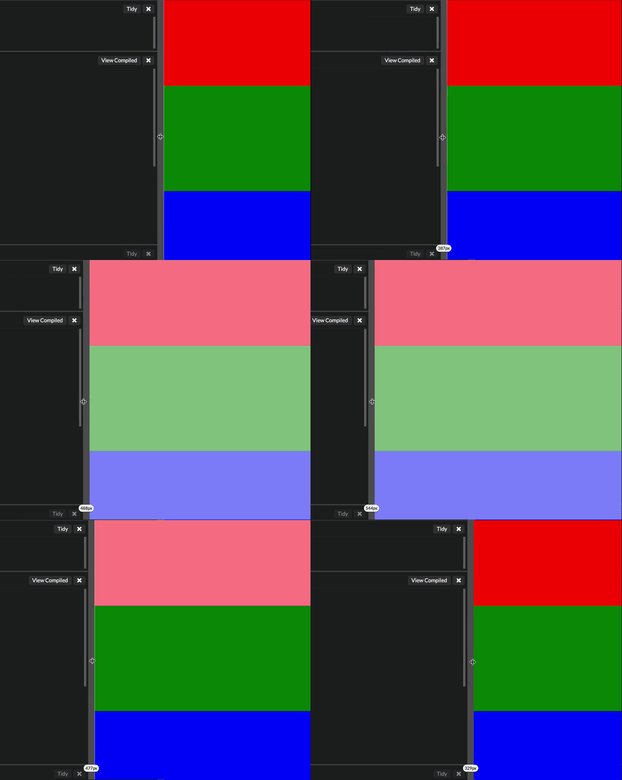
This was the only test that all browsers behaved in the same way:
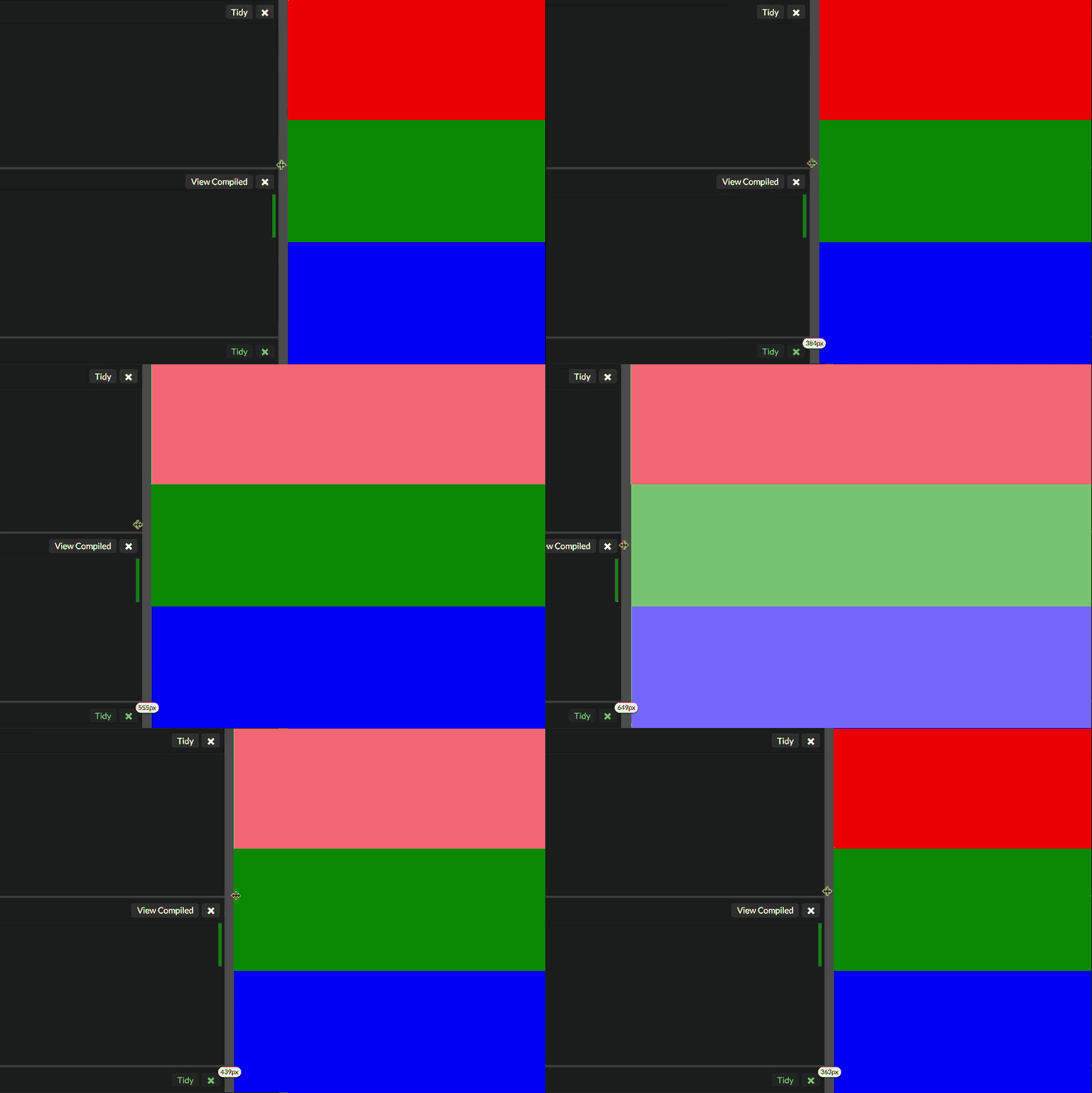
As you can see, the pixel queries triggered earlier than em or rem queries.
There aren’t any bugs here. This is the correct implementation since px are absolute units. The breakpoint should remain at 400px no matter what the user set’s their default font-size to.
em and rem, on the other hand, is based on the font-size of the browser. Hence, their media queries should get updated when the user changes their default font-size setting.
So.. I’m sorry to break your bubble, pixel fans, but it’s a no-go for pixel based queries. 😱😱😱
(Here’s a more detailed explanation for people who found this last experiment confusing.)
Try to imagine you’ve coded up a website that has a breakpoint at 600px. This 600px breakpoint is perfect for a font-size of 16px (the default).
Let’s call the viewport smaller than 600px the small viewport, while that larger than 600px the medium viewport.
Let’s further assume that you only changed the layout at 600px. You used a one-column layout below 600px, and a two-column layout above 600px.
Now, change your browser font-size setting to 20px and look at your website at 650px.
If you used em or rem based media queries, your user would see a one-column layout at 650px. This behavior would be consistent with the first two scenarios.
If you used px based media queries, your user would see a two-column layout at 650px. This behavior would be inconsistent with the above scenarios. (And the design would not fit the screen).
Concluding The Experiments
As you can see from our tests above, the only unit that performed consistently across all four browsers is em. There aren’t any differences between em and rem with the exception of bugs found on Safari.
px media queries performed well in two of the three experiments (with the exception of Safari, again). Unfortunately, px media queries remained at 400px in the third experiment, which makes it a no-go if you intend to support users who change their browser’s font-size value.
Hence, my conclusion after these experiments is: Use em media queries.
If you’re using a library that doesn’t do em media queries, point the developer to this article so they know the implications of their code. Otherwise, feel free to switch to a em based library like Mappy-breakpoints, Breakpoint-sass or sass-mq.

 Formed in 2009, the Archive Team (not to be confused with the archive.org Archive-It Team) is a rogue archivist collective dedicated to saving copies of rapidly dying or deleted websites for the sake of history and digital heritage. The group is 100% composed of volunteers and interested parties, and has expanded into a large amount of related projects for saving online and digital history.
